Content
This is a motherfucking website. And it's tucking bertect. seriousiv, wat tne luck else do you want You probably build websites and think your tive home page is going to get you some lucKIng Awwward banner vou can glue very file and 83 p boner because it finally has box-shadow. Wrong, motherfucker. Let me describe your perfect-ass website: Shit's lightweight and loads fast on all your shitty screens Looks the same in all your shitty browsers ole that visits your site Shit's legible and gets your fucking point across (if you had one instead of just 5mb Well guess what, mothertucker: You. Are. Over-designing Look at this shit. It's a motherfucking website. Why the fuck do you need to animate a fucking trendy-ass banner flag when I hover over that useless piece of shit? You spent hours on it and adde n their iPad with fat sausage fingers will never see that shit. Not nd people will never see that shit, but they don't see any of your shitty shit. You never knew it, but this is your perfect It's fucking lightweight This entire page weighs less than the gradient- Did you seriously load 100kb could say "Hi." at 100px height at the beginni It's responsive You dumbass. You thought you needed media s to whatever It fucking works Look at this shit. You can read it ... that is, if has motherfucking hierarchy. It's using HIML5 tags so you and your bitch-ass browser know what the fuck's in this fucking site. That's semantics mothertucker It has content on the fucking screen. Your sitt s and link t ar dribble account, but you spread it over 7 full screens and make me click some bobbing button to show me how cool the iOnerv ScrollTo pluoir motherlucKer in lLo. I TUcking dare vou This is a website. Look AT IT rollove nev seen one Like the man y who's never grown out his beard rdizations of what should be text nicating a fucking message. This is a reanaked website ook at it.at' Yes, this is fucking satire, you fuck I'm not actually saying your shitty site should look like this. What I'm sayi ing is that all the problems we have with websites are ones we create ourselves. Websites aren't broken by default, they are functional, high-performing, "Good design is as little design as some German motherfucker Epilogue From the philosophies expressed (poorly)

 AI
AI
 AWS
AWS
 Agile
Agile
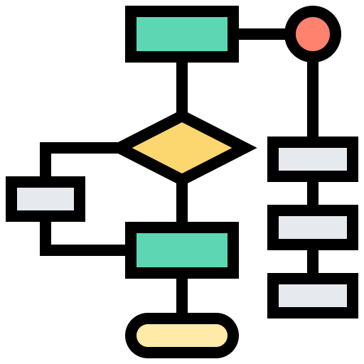 Algorithms
 Android
 Apple
Apple
 Bash
Bash
 C++
C++
 Csharp

