 AI
AI
 AWS
AWS
 Agile
Agile
 Algorithms
 Android
 Apple
Apple
 Azure
Azure
 Bash
Bash
 C++
C++
HTTP 418: I'm a teapot
The server identifies as a teapot now and is on a tea break, brb
HTTP 418: I'm a teapot
The server identifies as a teapot now and is on a tea break, brb
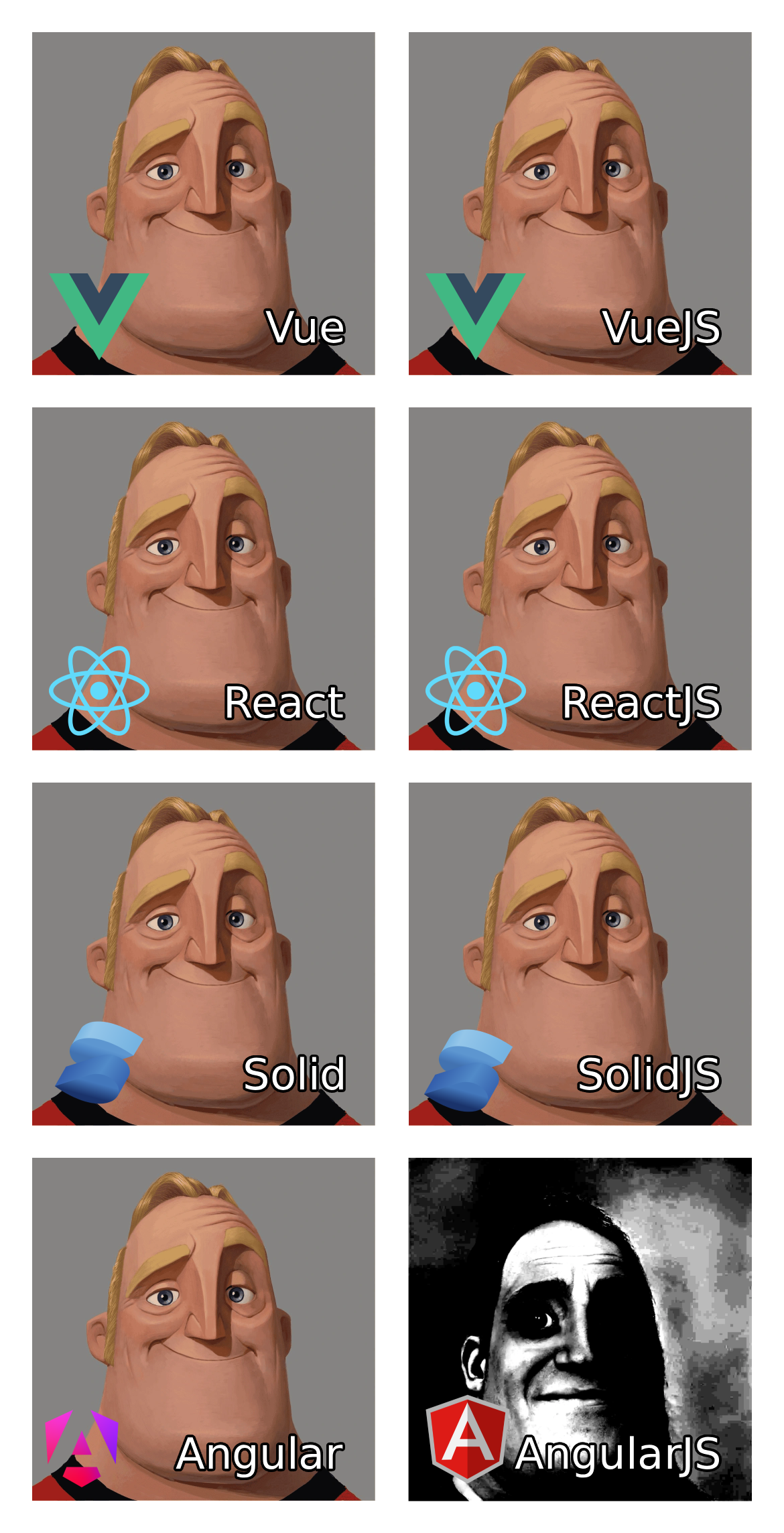
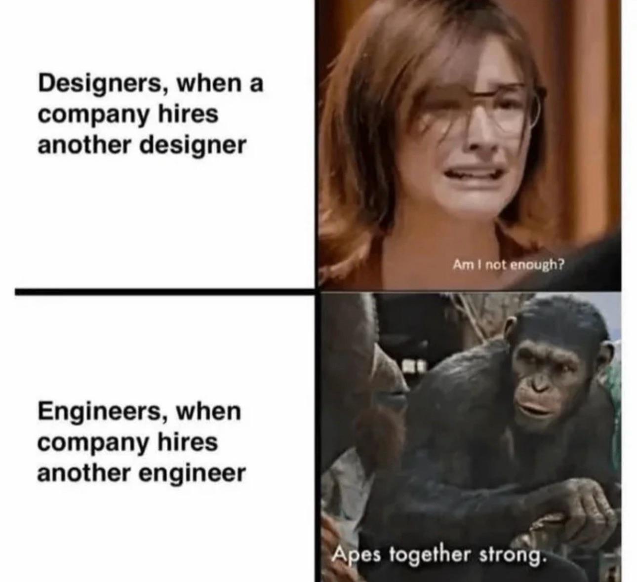
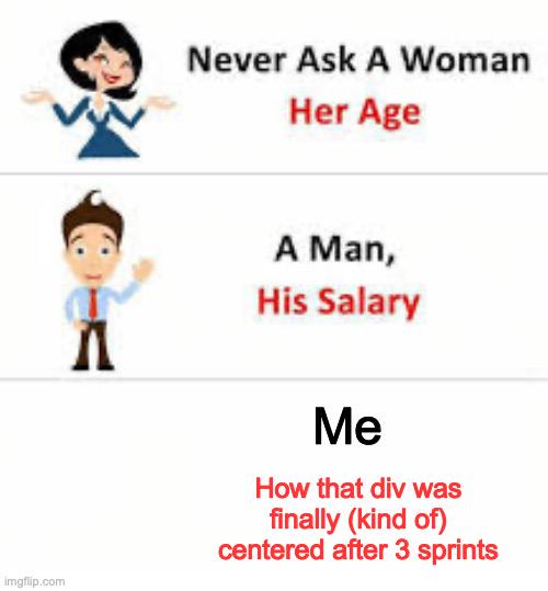
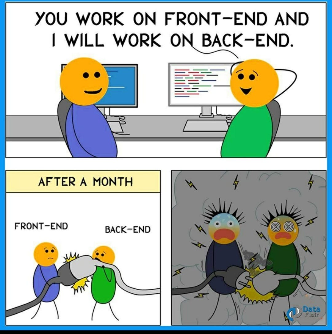
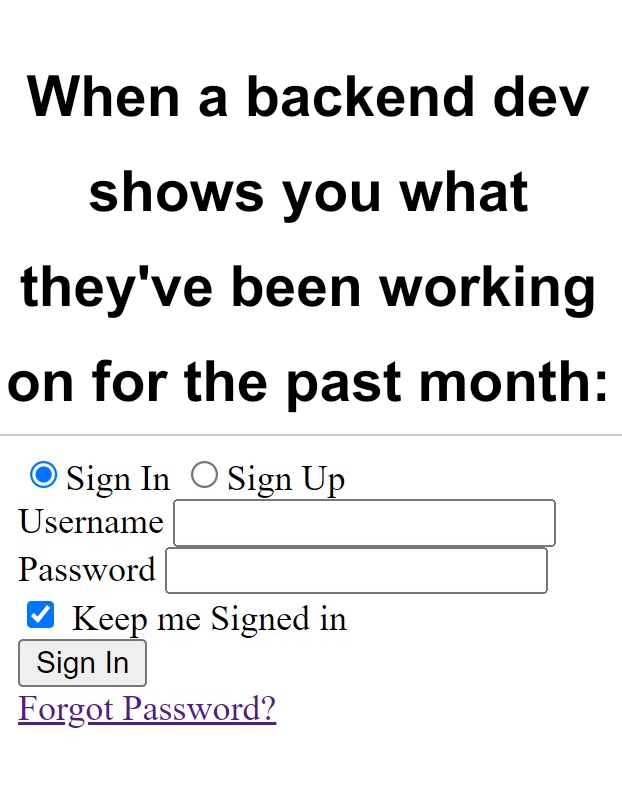
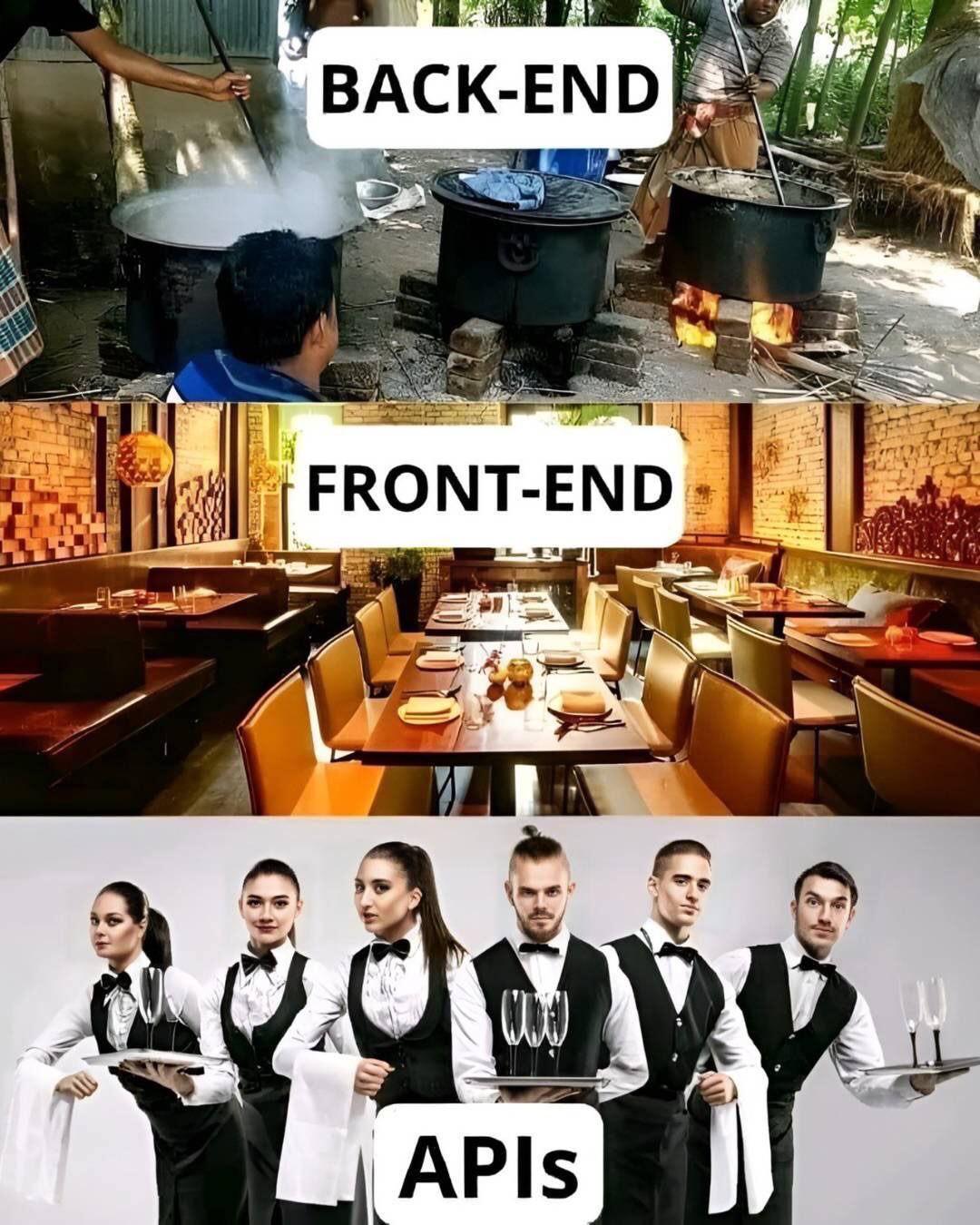
Frontend Memes
Frontend development: where you spend three hours trying to center a div and then your boss asks why you haven't finished the entire website. These memes capture the special joy of browser compatibility issues – 'looks great in Chrome' is both a celebration and an admission of defeat. We've all been there: the design that looks perfect until the client opens it on their ancient iPad, the CSS that works by accident, and the framework churn that makes your resume look like you're collecting JavaScript libraries. If you've ever had nightmares about Safari bugs or explained to a client why their 15MB image is slowing down the site, these memes will be your digital therapy session.