 AI
AI
 AWS
AWS
 Agile
Agile
 Algorithms
 Android
 Apple
Apple
 Azure
Azure
 Bash
Bash
 C++
C++

HTTP 418: I'm a teapot
The server identifies as a teapot now and is on a tea break, brb
HTTP 418: I'm a teapot
The server identifies as a teapot now and is on a tea break, brb
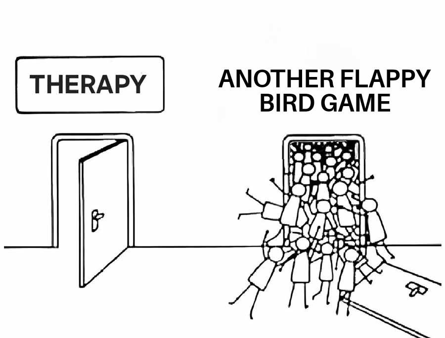
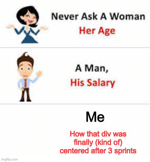
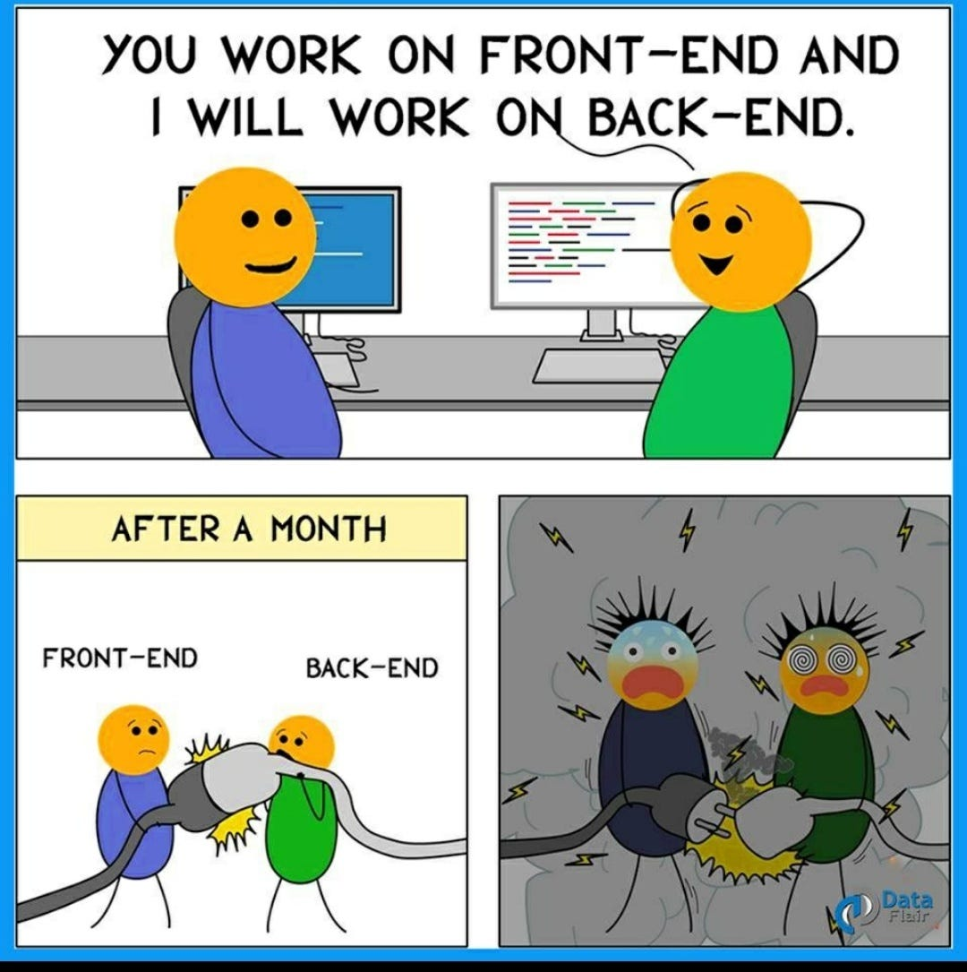
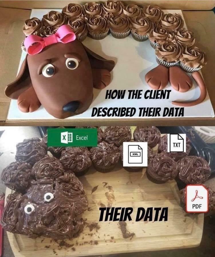
Webdev Memes
Web development: where CSS is somehow both too simple and impossibly complex at the same time. These memes capture the daily struggles of frontend and fullstack developers wrestling with browser compatibility, JavaScript frameworks that multiply faster than rabbits, and CSS that works perfectly until you add one more div. Whether you're celebrating the small victory of centering a div, mourning another npm dependency tree, or explaining to clients why their website can't look exactly like their PowerPoint mockup, this collection offers therapeutic laughs for anyone who's ever refreshed a page hoping their code magically starts working.