 AI
AI
 AWS
AWS
 Agile
Agile
 Algorithms
 Android
 Apple
Apple
 Bash
Bash
 C++
C++
 Csharp
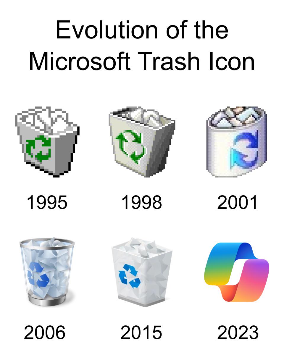
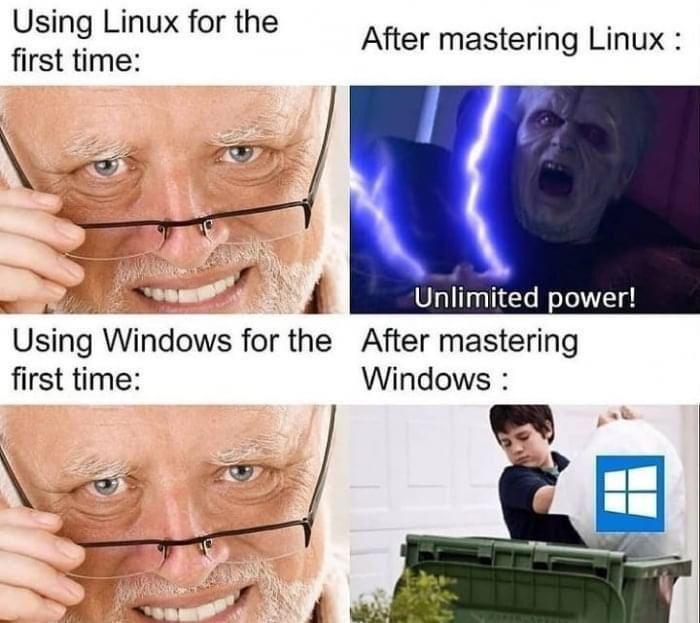
Started with actual trash cans, gradually refined the design with better graphics and transparency effects, and then by 2023 someone in the design department apparently forgot what a trash can looks like and submitted a gradient blob that could literally be an app for meditation, fitness tracking, or launching nuclear missiles.
The real tragedy here is watching Microsoft's icon design team go from "let's make a recognizable trash can" to "what if we made it impossible to identify any icon without hovering over it for the tooltip?" Peak modern UI design: when you need a legend to navigate your own desktop.
Fun fact: The 2023 icon has more colors than a pride parade but somehow conveys less information than the 16-color 1995 version. Progress.