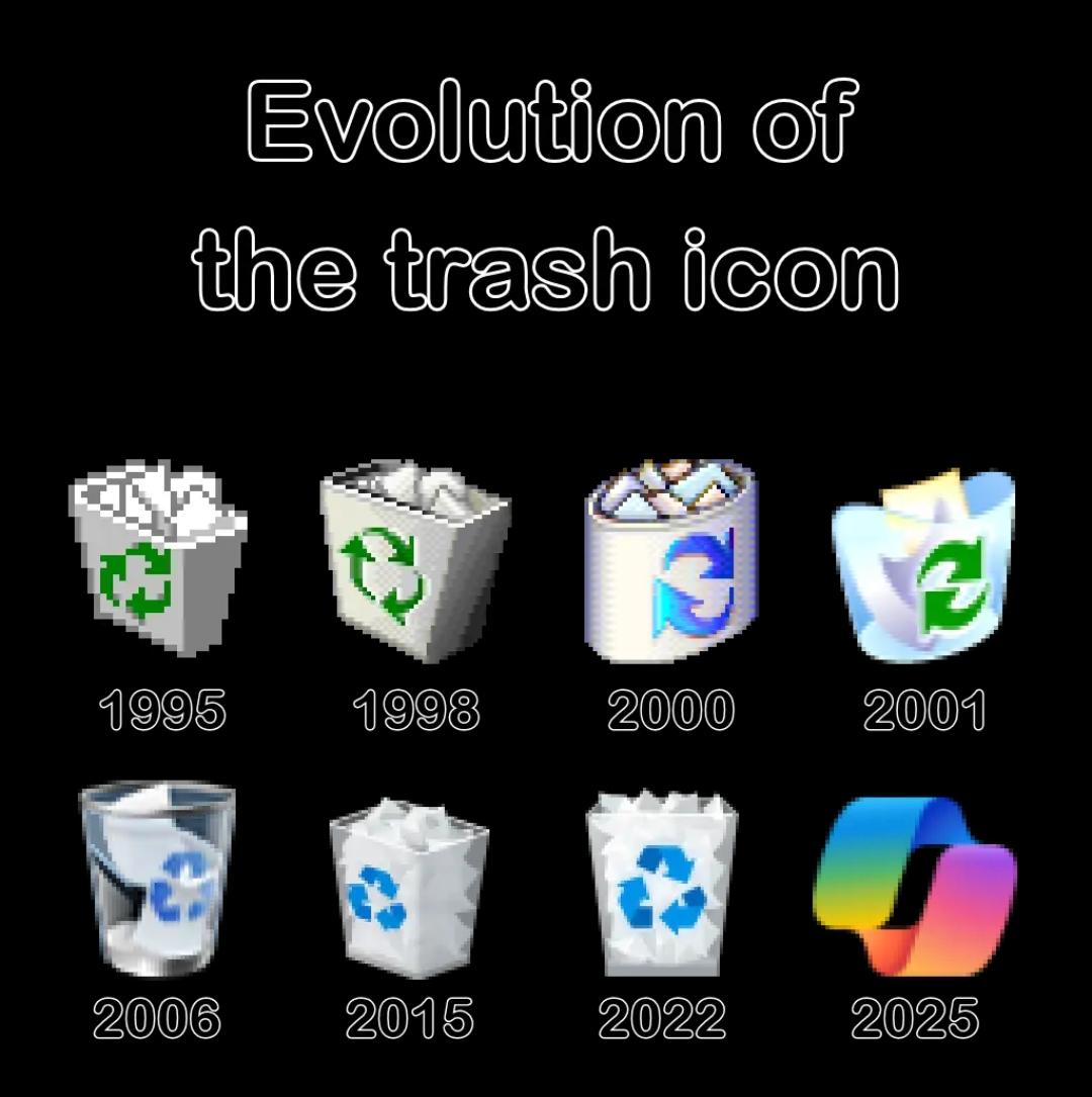
Behold, the majestic journey of the trash icon from "functional pixel art" to "I'm having an identity crisis and also maybe a rainbow smoothie." The progression is absolutely WILD—we started with honest, hardworking pixelated bins that knew their purpose in life, evolved through various Windows eras where Microsoft kept saying "let's make it MORE realistic," and then suddenly 2025 hits and someone in the design department was like "what if the trash can became... abstract art?" That final 2025 icon looks like it's about to ask you to subscribe to its meditation podcast. It's giving "I'm not just a trash can, I'm a LIFESTYLE BRAND." The recycle symbol didn't just leave the chat—it ascended to a higher plane of existence where physical forms are merely suggestions. RIP to the days when a trash icon actually looked like something you'd throw garbage into. Now it's a gradient fever dream that probably costs $12.99/month for premium deletion features.
 AI
AI
 AWS
AWS
 Agile
Agile
 Algorithms
 Android
 Apple
Apple
 Bash
Bash
 C++
C++
 Csharp