 AI
AI
 AWS
AWS
 Agile
Agile
 Algorithms
 Android
 Apple
Apple
 Bash
Bash
 C++
C++
 Csharp
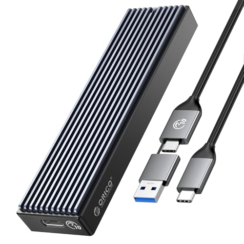
ORICO M.2 NVMe SSD Enclosure, USB 3.1 Gen 2 (10 Gbps) PCIe External Adapter NVMe Case for 2230/2242/2260/2280 M.2 SSD up to 8TB, UASP Supported - M2PV
$14.18
HTTP 418: I'm a teapot
The server identifies as a teapot now and is on a tea break, brb
HTTP 418: I'm a teapot
The server identifies as a teapot now and is on a tea break, brb