 AI
AI
 AWS
AWS
 Agile
Agile
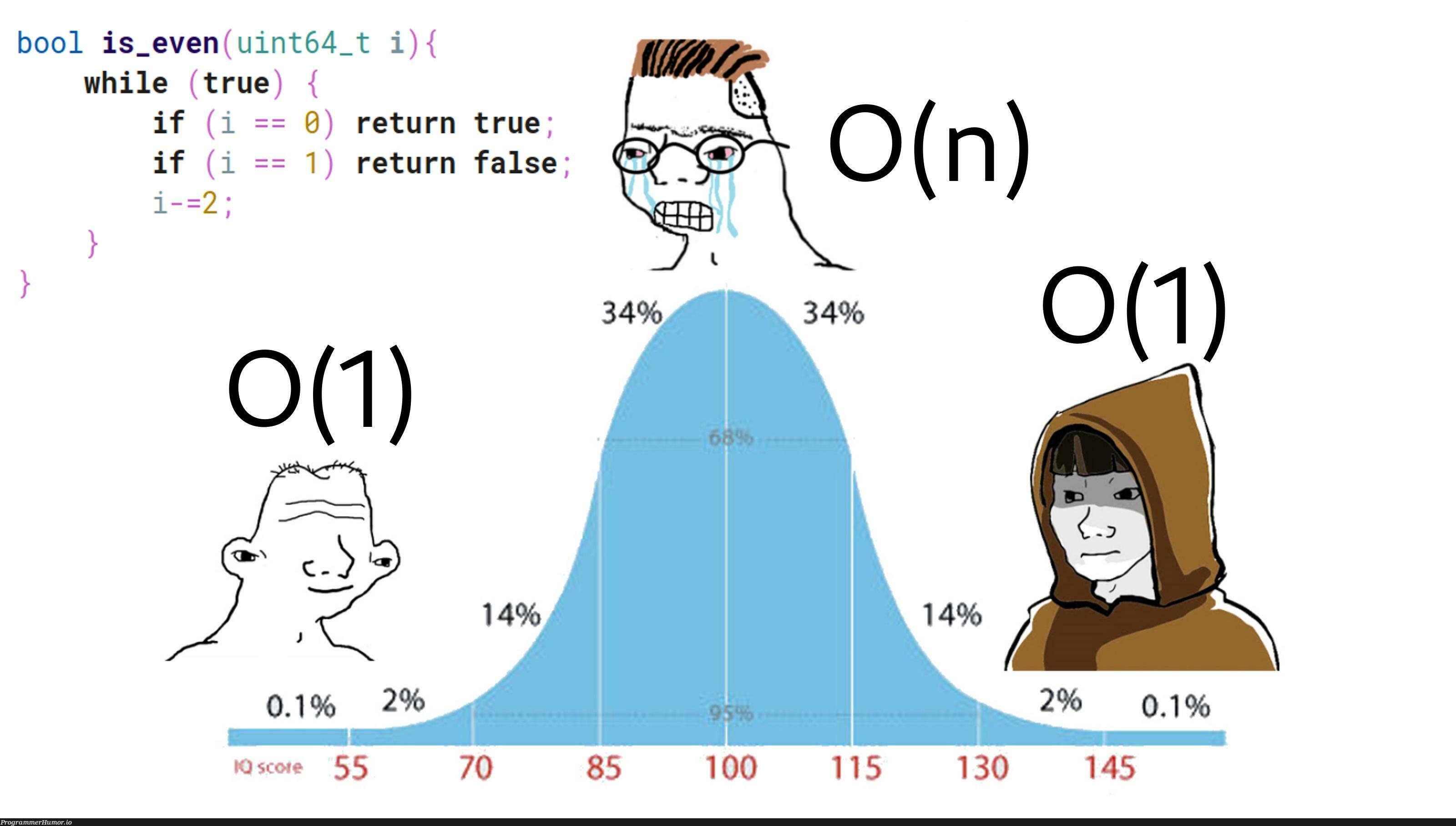
 Algorithms
 Android
 Apple
Apple
 Azure
Azure
 Bash
Bash
 C++
C++

Tech Bro Wants To Enter Semiconductor Race
20.0M views
1 day ago
HTTP 418: I'm a teapot
The server identifies as a teapot now and is on a tea break, brb
HTTP 418: I'm a teapot
The server identifies as a teapot now and is on a tea break, brb