 AI
AI
 AWS
AWS
 Agile
Agile
 Algorithms
 Android
 Apple
Apple
 Backend
 Bash
Bash
 C++
C++
 Cloud
Cloud
 Csharp
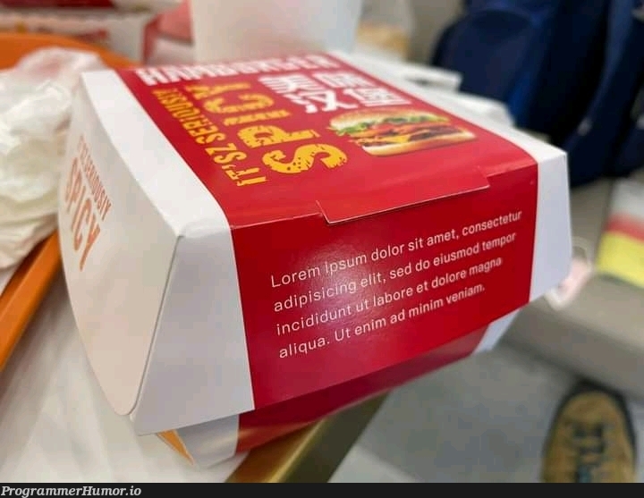
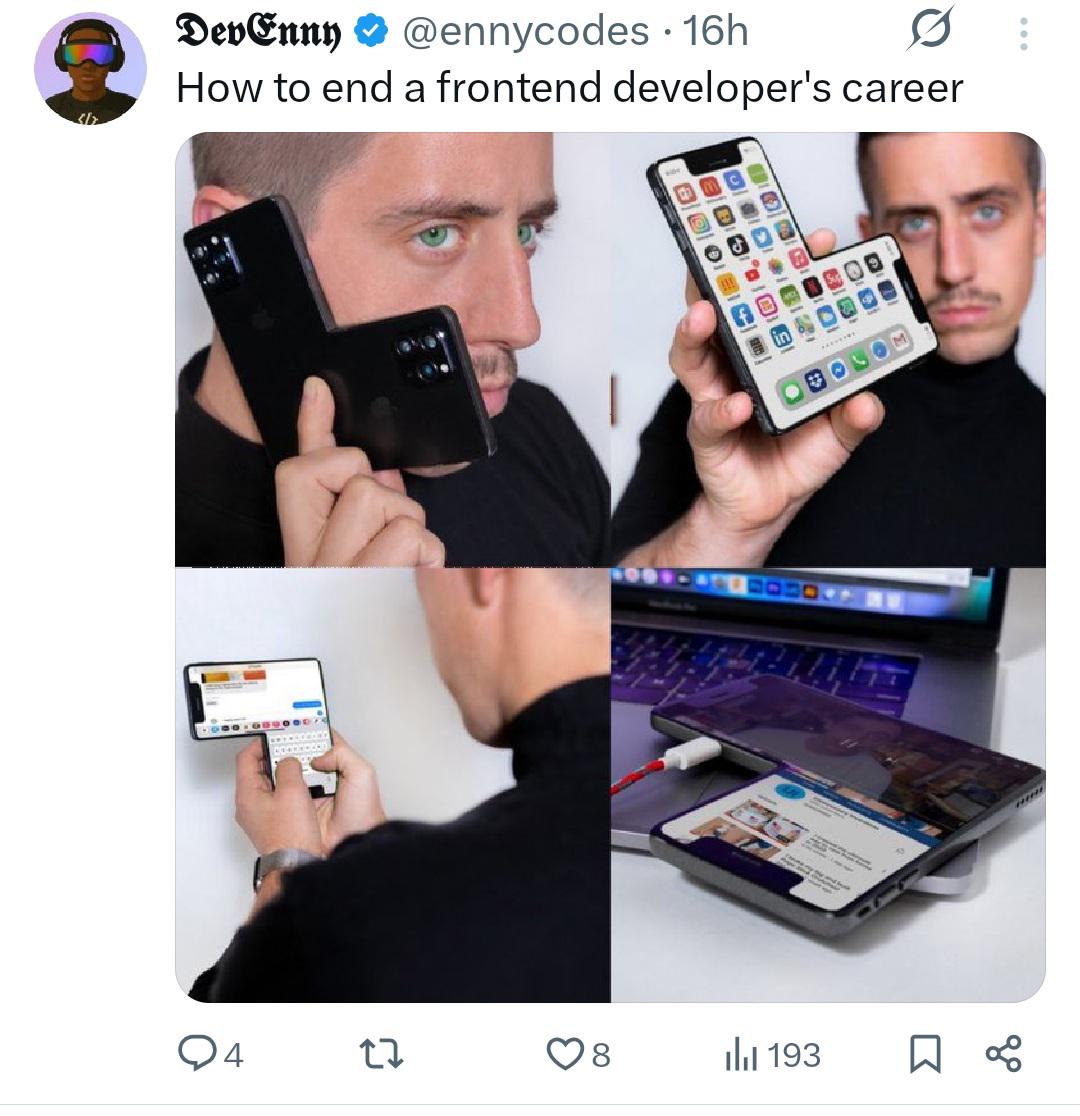
Oh, you sweet summer child, you thought testing on desktop and mobile was enough? WRONG! Welcome to the nightmare dimension where foldable phones exist and your carefully crafted responsive design gets absolutely OBLITERATED. That poor frontend dev is out here testing on regular phones, tablets, laptops, AND NOW A PHONE THAT LITERALLY FOLDS IN HALF like some kind of technological origami from hell. Your media queries? Useless. Your breakpoints? A joke. Your will to live? Rapidly deteriorating. Nothing says "I've made terrible life choices" quite like watching your perfectly aligned navbar turn into abstract art because someone decided to fold their $2000 phone at a 73-degree angle. CSS Grid is crying. Flexbox has left the chat. And somewhere, a designer is asking why the buttons look weird on their Galaxy Z Fold while you're questioning your entire career trajectory.
Media Queries Go Booom
frontend-memes, css-memes, responsive-design-memes, media-queries-memes, web-development-memes | ProgrammerHumor.io
More Like This