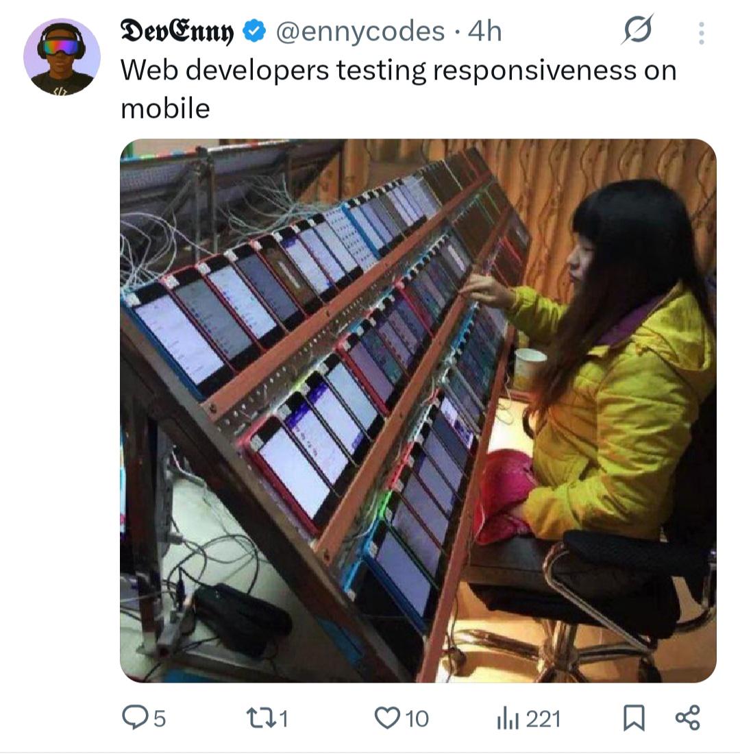
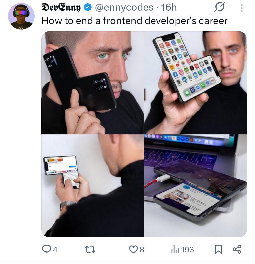
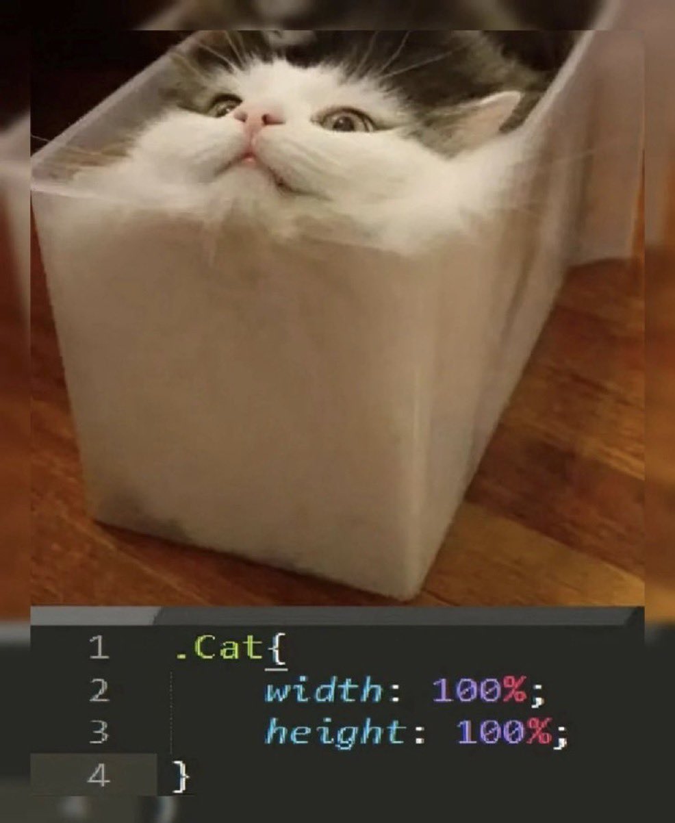
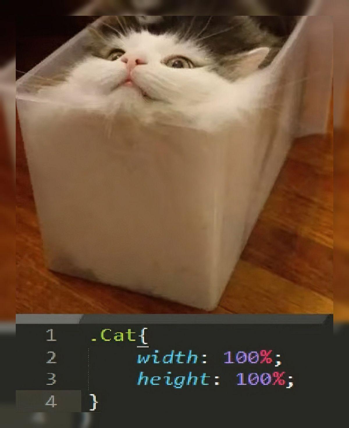
Responsive design Memes

Posts tagged with Responsive design

Is This Peak UI/UX And Frontend

Is This Peak UI/UX And Frontend
The developer equivalent of "Sorry, I wrote this code on a Friday at 4:55 PM." Instead of implementing responsive design (you know, that thing we've been doing for over a decade), this brave soul just slapped a "Go to desktop" message with the most honest excuse in web development history. Somewhere, a UI/UX designer is having heart palpitations while a product manager frantically adds "mobile responsiveness" to next sprint's backlog. Revolutionary approach to work-life balance though!

The Dev Did Not Hesitate

The Dev Did Not Hesitate
The ultimate power move by a frontend dev who chose violence that day. While product managers cry about "mobile-first design" and UX designers preach the gospel of responsive breakpoints, this rebel just said "nope" and hardcoded their way to freedom. It's the digital equivalent of putting up an "Out of Order" sign on the office coffee machine because you don't feel like refilling it. Somewhere, a Bootstrap developer is having heart palpitations while this site's creator is enjoying their extra 40 hours of free time not spent debugging media queries.

A Terrible Dream For Frontend Devs

A Terrible Dream For Frontend Devs
That moment when the client shows off their new 86-inch ultra-wide monitor and your responsive design sweats nervously in the background. Five years of media queries and you still didn't prepare for THIS edge case. Tomorrow's standup will be fun: "So yeah, turns out our beautiful UI looks like a stretched piece of gum on the CEO's new ridiculous display." The best part? They'll blame the framework, not the absurdity of coding for every possible screen dimension known to mankind.

How To End A Frontend Developer's Career

How To End A Frontend Developer's Career
Ah, the four-step career assassination tutorial! Nothing sends a frontend developer into existential crisis faster than watching someone test their "responsive" design by actually... *checks notes*... using different devices. The psychological warfare begins with showing off multiple devices, continues with the developer watching in horror as their beautiful creation morphs into an eldritch abomination across screens, and culminates with the coup de grâce: printing the monstrosity to immortalize their shame. Somewhere, a CSS media query is crying. Somewhere else, a Bootstrap developer is pouring another drink.

And Then QA Started Testing On Samsung Fridge

And Then QA Started Testing On Samsung Fridge
Developer: "I F***ING HATE YOU AND HOPE YOU DIE" QA: "I will rotate phone to test new feature" Ah, the beautiful relationship between devs and QA. Dev just finished building a pixel-perfect UI that works flawlessly in portrait mode. Then QA comes along with their diabolical testing methods, like *checks notes* rotating the phone. Suddenly everything's broken, overflow errors everywhere, buttons disappear into the void. The dev's masterpiece crumbles because someone dared to use the device as intended. Classic.

The Responsive Design Paradox

The Responsive Design Paradox
Ah, the irony of modern web development. First panel: "How to make a responsive website" - presented with all the confidence of someone who just discovered media queries yesterday. Second panel: The same "expert's" actual website demanding you increase your window size or switch to desktop because apparently their definition of "responsive" is "works exclusively on screens the size of a small billboard." Nothing says frontend expertise quite like telling mobile users their devices are the problem. The digital equivalent of "you're holding it wrong."

I Hate CSS But Flexbox Is My Savior

I Hate CSS But Flexbox Is My Savior
When CSS gets mildly annoying, my brain immediately abandons all logic and jumps straight to flexbox – that magical layout tool we barely understand but desperately hope will fix everything. It's the developer equivalent of hitting your TV when it stops working. The lizard brain takes over, and suddenly we're throwing display: flex at problems that don't even need it. "My button is 2px off? FLEXBOX. Text not centered? FLEXBOX. Computer on fire? You better believe that's a flexbox."

CSS: Cascading Style Surprises

CSS: Cascading Style Surprises
SWEET MOTHER OF MARGIN COLLAPSE! You change ONE TINY PIXEL of padding and suddenly your entire website looks like it was hit by a nuclear CSS bomb! 💥 That moment when you're like "I'll just tweak this little margin real quick" and your layout transforms into a shocked Pikachu face. The CSS gods are LAUGHING at your pathetic attempts to control the chaos. One semicolon out of place and suddenly you're in an alternate dimension where nothing makes sense and everything is just... BROKEN. And yet we keep coming back for more punishment. Frontend masochism at its finest!

Centering Divs: The Hardcoded Nightmare

Centering Divs: The Hardcoded Nightmare
SWEET MERCIFUL CSS GODS! Instead of actually learning proper flexbox or grid layouts like a functioning adult, this GENIUS solution just hardcodes absolute positioning based on screen resolution! 😱 The sheer AUDACITY of telling users to buy specific monitors just because you couldn't be bothered to write responsive code! It's the equivalent of solving world hunger by saying "just eat cake!" I'm DYING at how this perfectly captures the existential dread of frontend development!

Border Radius Cat

Border Radius Cat
CSS's most powerful trick: making cats conform to containers. The border-radius property creates those perfectly rounded corners that designers obsess over, and apparently, cats naturally adapt to them. Nature imitating web design, or web design imitating nature? Either way, this cat has mastered the art of fluid layout better than most junior developers. No media queries needed - just add cardboard.

Folding Phones: The Web Developer's New Nightmare

Folding Phones: The Web Developer's New Nightmare
Folding phones: "Look at our revolutionary technology!" Web developers: *existential crisis intensifies* Just when we finally convinced clients that websites don't need to look identical on every device, Samsung drops these origami nightmares. Responsive design was hard enough with rectangles. Now we're debugging layouts that fold like a lawn chair. Media queries don't have a "bent in half" setting yet.

Just Ship It, No One's Using An 86" Screen... Right?

Just Ship It, No One's Using An 86" Screen... Right?
When the product manager proudly announces support for 86-inch displays while the frontend devs are sweating bullets trying to figure out how to make that responsive layout not explode. Nothing quite captures the silent horror of realizing your carefully crafted CSS is about to be stretched across a display the size of a small country. The PM's excitement is directly proportional to the developer's existential dread. Meanwhile, somewhere in the codebase: max-width: 1200px; /* nobody will ever need more than this */