 AI
AI
 AWS
AWS
 Agile
Agile
 Algorithms
 Android
 Apple
Apple
 Backend
 Bash
Bash
 C++
C++
 Cloud
Cloud
 Csharp
HTTP 418: I'm a teapot
The server identifies as a teapot now and is on a tea break, brb
HTTP 418: I'm a teapot
The server identifies as a teapot now and is on a tea break, brb
Media queries Memes
Posts tagged with Media queries


HTTP 418: I'm a teapot
The server identifies as a teapot now and is on a tea break, brb
HTTP 418: I'm a teapot
The server identifies as a teapot now and is on a tea break, brb


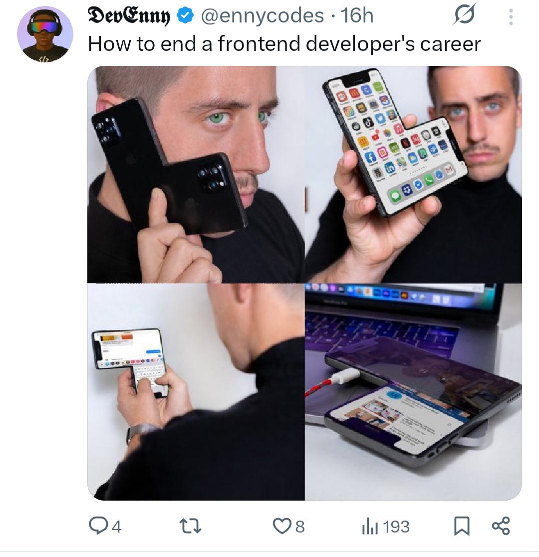
![[IMAGE] True story](https://i.programmerhumor.io/2021/10/programmerhumor-io-programming-memes-6818179ee47cbfd.jpg)