 AI
AI
 AWS
AWS
 Agile
Agile
 Algorithms
 Android
 Apple
Apple
 Azure
Azure
 Bash
Bash
 C++
C++
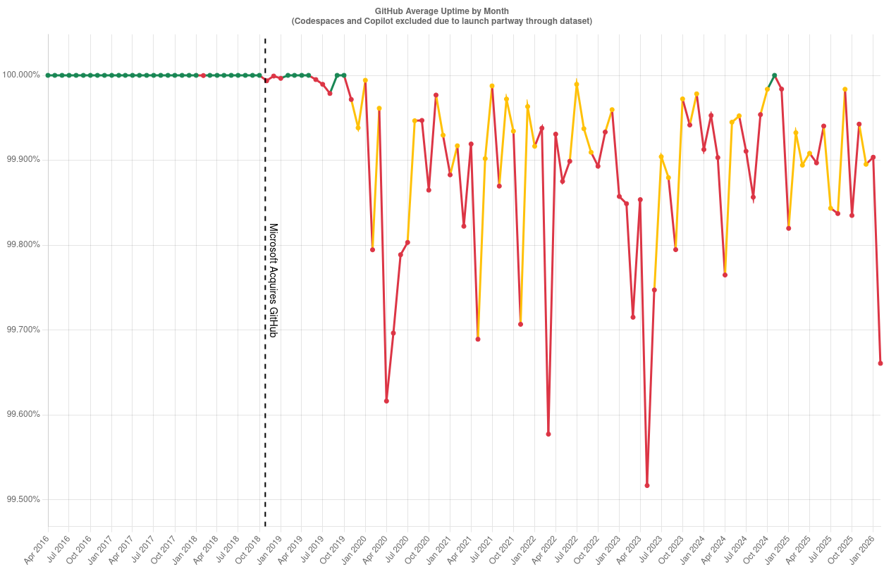
So GitHub was basically rock-solid for years until Microsoft acquired them in 2018, and suddenly the uptime chart looks like my heart rate monitor during a production deployment. That vertical line marking the acquisition is doing some heavy lifting here—it's literally the moment everything went from "five nines" to "five why's."
The green line (pre-Microsoft) is flatter than a junior dev's learning curve, while the post-acquisition rainbow spaghetti of red and yellow is giving major "we migrated to Azure" vibes. Nothing says enterprise acquisition quite like turning a stable platform into a reliability roulette wheel.
Fun fact: "Microslop" has been a beloved nickname in tech circles since the 90s, but charts like these keep it eternally relevant. At least they're consistent at being inconsistent.