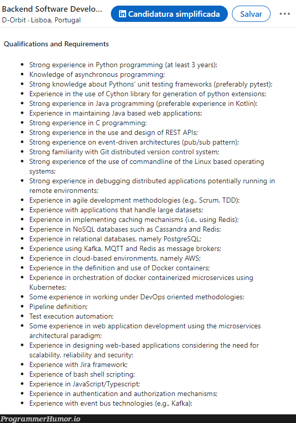
Content Backend Software Develo... D-Orbit Lisboa, Portugal in Candidatura simplificada Salvar Qualifications and Requirements Strong experience in Python programming (at least 3 years): Knowledge of asynchronous programming: Strong knowledge about Pythons' unit testing frameworks (preferably pytest); Experience in the use of Cython library for generation of python extensions; Strong experience in Java programming (preferable experience in Kotlin): Experience in maintaining Java based web applications: Strong experience in C programming; Strong experience in the use and design of REST APIs; Strong experience on event-driven architectures (pubsub pattern); Strong familiarity with Git distributed version control system; Strong experience of the use of commandline of the Linux based operating systems; Strong experience in debugging distributed applications potentially running in remote environments: Experience in agile development methodologies (e.g.. Scrum, TDD); Experience with applications that handle large datasets: Experience in implementing caching mechanisms (i.e., using Redis); Experience in NoSQL databases such as Cassandra and Redis; Experience in relational databases, namely PostgreSQL: Experience using Kafka, MQTT and Redis as message brokers: Experience in cloud-based environments, namely AWS; Experience in the definition and use of Docker containers; Experience in orchestration of docker containerized microservices using Kubernetes; Some experience in working under DevOps oriented methodologies: Pipeline definition: Test execution automation; Some experience in web application development using the microservices architectural paradigm; Experience in designing web-based applications considering the need for scalability, reliability and security; Experience with Jira framework: Experience of bash shell scripting; Experience in JavaScriptTypescript: Experience in authentication and authorization mechanisms; Experience with event bus technologies (e.g., Kafka);
 AI
AI
 AWS
AWS
 Agile
Agile
 Algorithms
 Android
 Apple
Apple
 Backend
 Bash
Bash
 C++
C++
 Cloud
Cloud
 Csharp