 AI
AI
 AWS
AWS
 Agile
Agile
 Algorithms
 Android
 Apple
Apple
 Azure
Azure
 Backend
 Bash
Bash
 C++
C++
 Cloud
Cloud
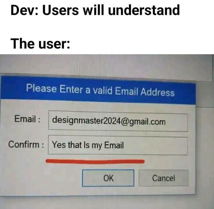
When you spend HOURS crafting the perfect form with crystal-clear labels, helpful placeholders, and validation messages that even your grandma could understand... and then the user treats your "Confirm Email" field like it's a philosophical question about existence itself.
Like bestie, when we ask you to "confirm your email," we're looking for you to TYPE THE EMAIL AGAIN, not write a heartfelt affirmation that yes, you do indeed possess an email address. This is the equivalent of a recipe saying "add salt" and someone responding "Yes, salt exists in my kitchen."
Developers really out here thinking users will follow basic instructions while users are operating on a completely different wavelength. We're speaking English, they're speaking... whatever dimension this response came from. And this is why we can't have nice things—or simple forms without 47 validation checks.
Instructions Unclear
user-experience-memes, form-validation-memes, frontend-problems-memes, ux-design-memes, user-testing-memes | ProgrammerHumor.io
More Like This