
User testing Memes

Posts tagged with User testing
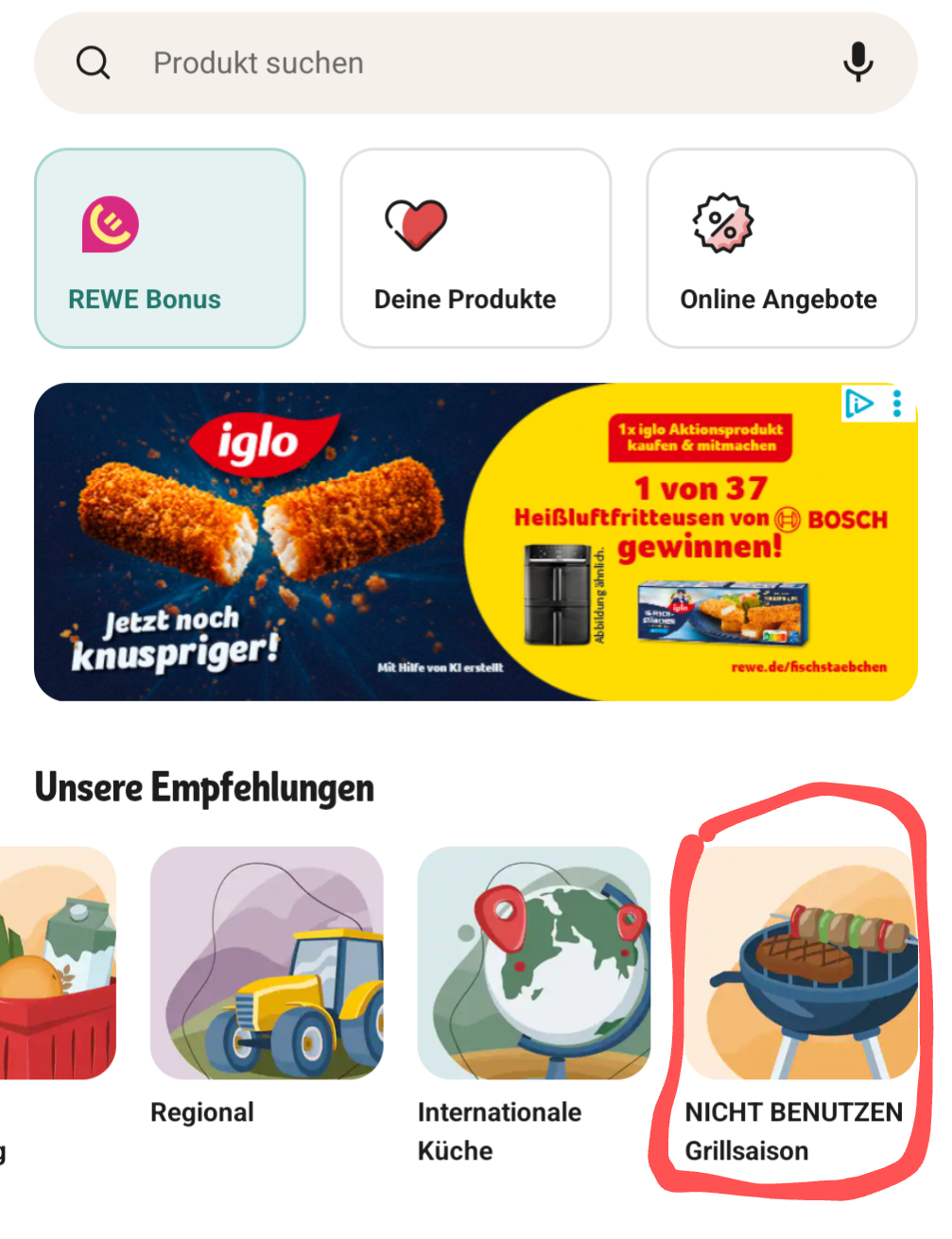
Of Course I Would Never Click That

Of Course I Would Never Click That
You know that feeling when you're browsing a shopping app and there's a big red warning label screaming "NICHT BENUTZEN" (DO NOT USE) on the grilling season category? Yeah, that's basically a dare at that point. It's the digital equivalent of putting a "Wet Paint" sign next to a wall—suddenly everyone becomes a quality assurance tester. The UI designer probably thought they were being helpful by marking it as unavailable, but they clearly underestimated the irresistible pull of forbidden buttons. Production bugs? Nah, those are just surprise features waiting to be discovered by curious users who definitely won't click the clearly marked thing they shouldn't click. The red circle around it makes it even better—like highlighting the exact spot where chaos lives. Chef's kiss for whoever took this screenshot right before inevitably tapping it anyway.

Instructions Unclear

Instructions Unclear
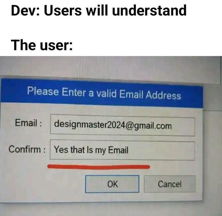
When you spend HOURS crafting the perfect form with crystal-clear labels, helpful placeholders, and validation messages that even your grandma could understand... and then the user treats your "Confirm Email" field like it's a philosophical question about existence itself. Like bestie, when we ask you to "confirm your email," we're looking for you to TYPE THE EMAIL AGAIN, not write a heartfelt affirmation that yes, you do indeed possess an email address. This is the equivalent of a recipe saying "add salt" and someone responding "Yes, salt exists in my kitchen." Developers really out here thinking users will follow basic instructions while users are operating on a completely different wavelength. We're speaking English, they're speaking... whatever dimension this response came from. And this is why we can't have nice things—or simple forms without 47 validation checks.

Is This A Bug Or A Feature

Is This A Bug Or A Feature
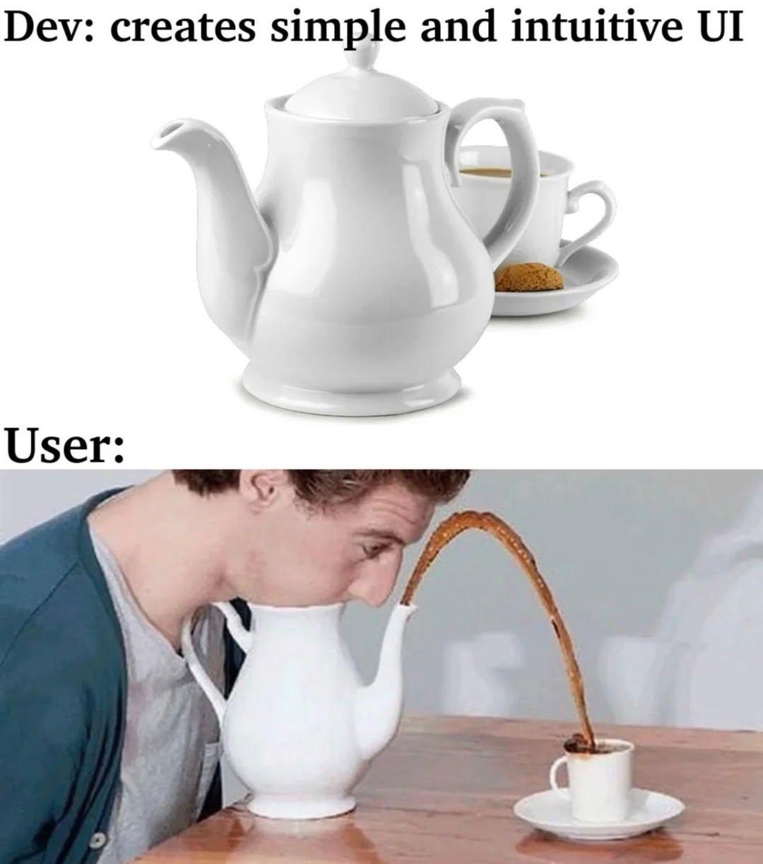
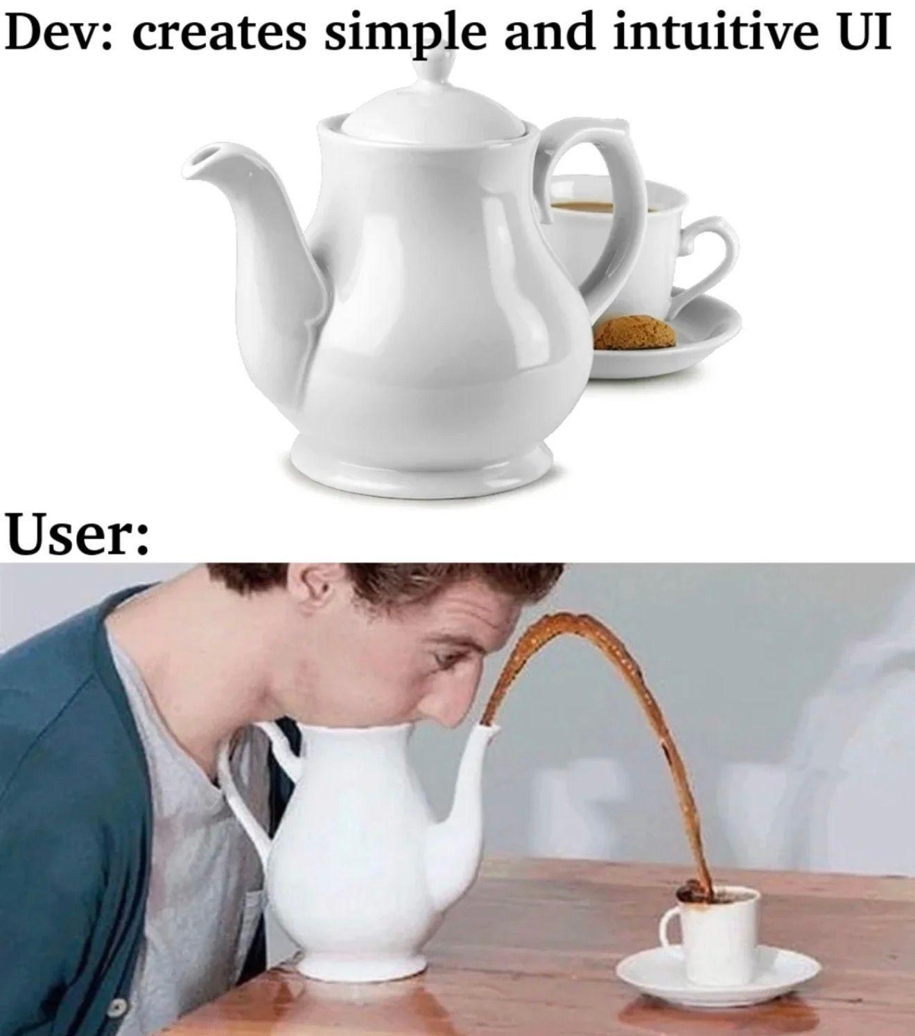
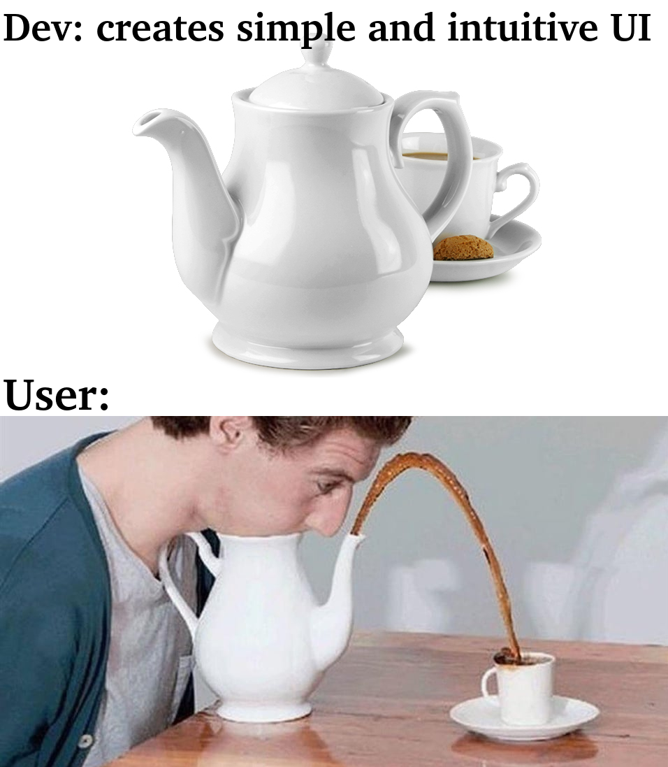
You spent hours crafting the perfect UI with clean lines, proper spacing, and intuitive user flows. Everything works exactly as designed. Then users show up and somehow manage to use it in ways that defy all laws of physics and common sense. The teapot here perfectly captures the gap between developer intent and user behavior. Sure, the spout is technically functional, but nobody said users would actually use it correctly. They'll find the most creative, inefficient, and downright bizarre way to interact with your interface. You added a button? They'll right-click it. You made a dropdown? They'll type in it. You designed a teapot? They'll pour from the handle hole. The real kicker? When you point out they're doing it wrong, they'll file a bug report saying your UI is "confusing" and "not user-friendly." Welcome to frontend development, where user testing reveals that humans are the ultimate edge case.

Try Not To Laugh

Try Not To Laugh
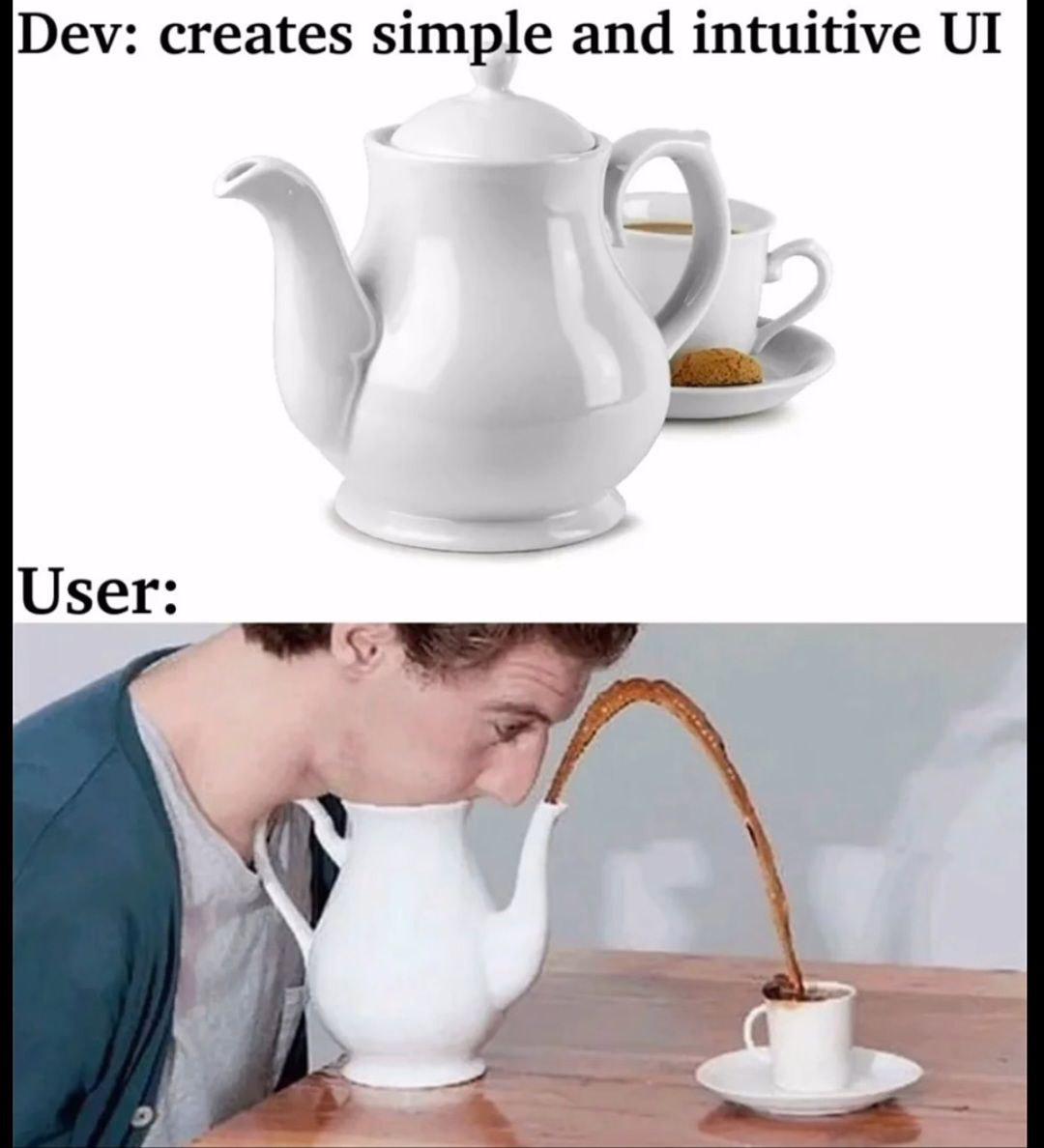
You spend weeks crafting the perfect user experience with clean navigation, logical flows, and intuitive controls. Then you watch in horror as users find the most creative ways to break your carefully designed interface. That teapot? It's supposed to pour into the cup. But nope, users will tilt their entire head sideways before they figure out the obvious interaction pattern. The eternal struggle: developers think in logic trees and edge cases, while users think in... well, nobody really knows what users think in. They'll ignore your perfectly placed "Click Here" button to somehow right-click the logo seventeen times. You can lead a user to water, but they'll try to drink from the spout while standing on their head. Pro tip: If you think your UI is idiot-proof, the universe will just create a better idiot. Every. Single. Time.

Panvola Fuck Off I Mean Good Morning Sarcastic Gifts To Coworkers Friends Family Classmates Sarcasm Novelty Drinkware Ceramic Mug 11 oz (Classic, Black)

Panvola Fuck Off I Mean Good Morning Sarcastic Gifts To Coworkers Friends Family Classmates Sarcasm Novelty Drinkware Ceramic Mug 11 oz (Classic, Black)
Ultimate Gift Mug That Stands Out From the Rest: Give a gift that creates a lasting impression. Your loved ones and family can now enjoy their favorite coffee drinks and other beverages with this fun…

Quality "Assurance"

Quality "Assurance"
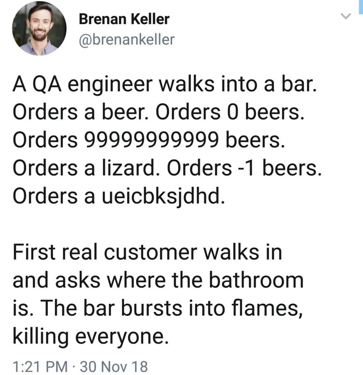
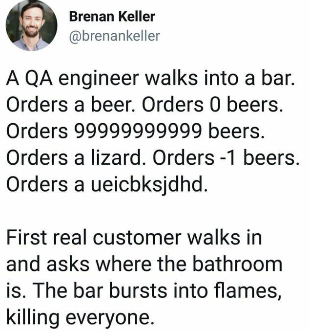
The classic QA mindset in action: test all the edge cases but somehow miss the one thing actual users will do. The progression is *chef's kiss* perfect—ordering zero beers tests the boundary condition, 99999999999 beers checks for integer overflow, a lizard validates type safety, and random keyboard mashing (uelcbksjdhd) ensures the input sanitization works. But then production happens. Someone asks a completely reasonable question—"where's the bathroom?"—and the whole system implodes because nobody thought to test the happy path where users might, you know, actually use the app like a normal human being instead of a chaos agent. The punchline hits different when you realize QA tested everything EXCEPT the basic user flow. It's the software equivalent of building a tank that can survive a nuclear blast but breaks when you open the door normally. Production bugs aren't found in the weird stuff—they're hiding in plain sight, waiting for Karen to ask where the restroom is.

Intuitive User Interface

Intuitive User Interface
When developers think they've achieved UX perfection by making something "simple and intuitive," but users somehow find a way to use it in the most spectacularly wrong manner possible. That teapot has a perfectly functional spout, yet here we are watching tea arc through the air like some kind of caffeinated fountain. The gap between developer intent and user behavior is wider than the Pacific Ocean. You can spend weeks perfecting the user flow, adding tooltips, writing documentation, and conducting usability tests... only to watch users confidently ignore every design decision you made and create their own chaos. Pro tip: If you ever want to test your UI, don't give it to other developers. Give it to your non-technical relatives and prepare for your soul to leave your body.

Developers Vs Users

Developers Vs Users
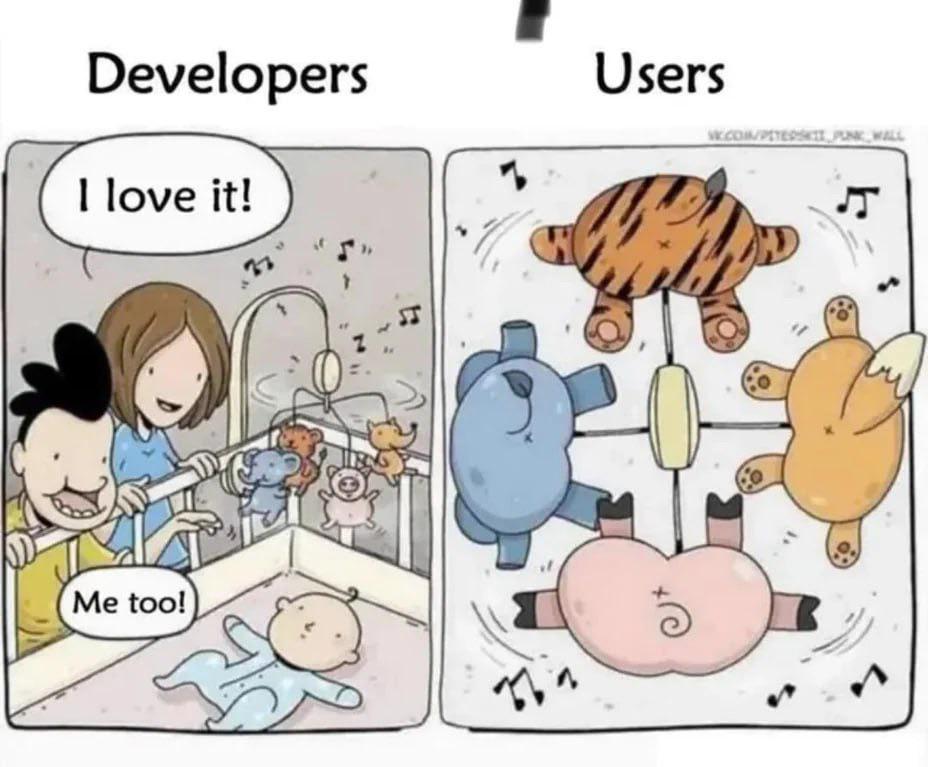
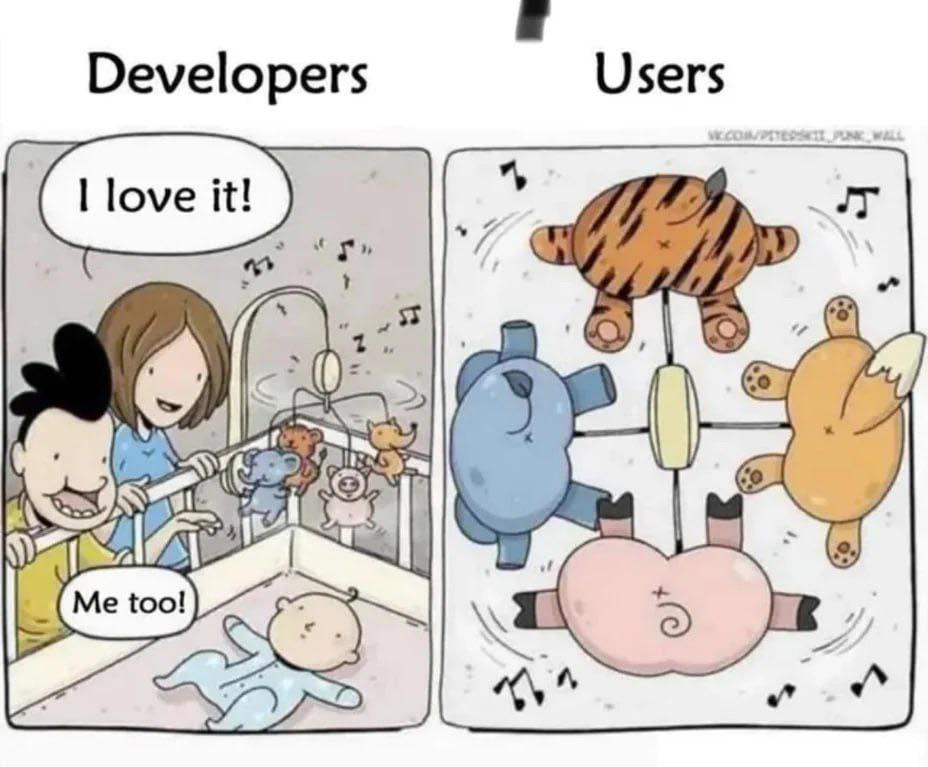
Developers gently place their features in a crib, admiring the elegant architecture and clean code like proud parents. Users? They're out here playing whack-a-mole with the UI, launching stuffed animals into orbit, and somehow managing to break things that shouldn't even be breakable. You spent three sprints building a robust system with proper error handling, and they still found a way to input "🦆" into a numeric field. The gap between how you think your app will be used versus how it's actually used is wider than the Grand Canyon. Ship it anyway.

Developers Vs Users

Developers Vs Users
You spend three months architecting the perfect mobile experience with smooth animations, intuitive gestures, and delightful micro-interactions. The team celebrates. The stakeholders are thrilled. Then you watch actual users through analytics and they're just... spinning the entire app upside down, tapping everything with their forehead, somehow managing to trigger edge cases you didn't even know existed. The eternal struggle: developers gently cradling their creation like a newborn, while users are out there treating it like a stress ball at a particularly intense sprint retrospective. And somehow they'll still find a way to blame YOU when things break. Classic.

One Of The Most Favorite

One Of The Most Favorite
Classic QA engineer joke that never gets old because it's painfully accurate. We test for zero beers, integer overflow, negative values, random gibberish input—basically everything except "where's the bathroom?" because that's what actual users do. They don't follow your happy path; they ask questions your system wasn't designed to answer and suddenly your entire architecture is on fire. The real tragedy? QA finds 47 edge cases, you fix them all, feel like a hero, then production explodes because someone tried to use the app while their phone was upside down during a leap year. You can't win. The users will always find that one scenario you never imagined, and it'll be the dumbest thing you've ever heard, yet completely valid.

All Cases Covered

All Cases Covered
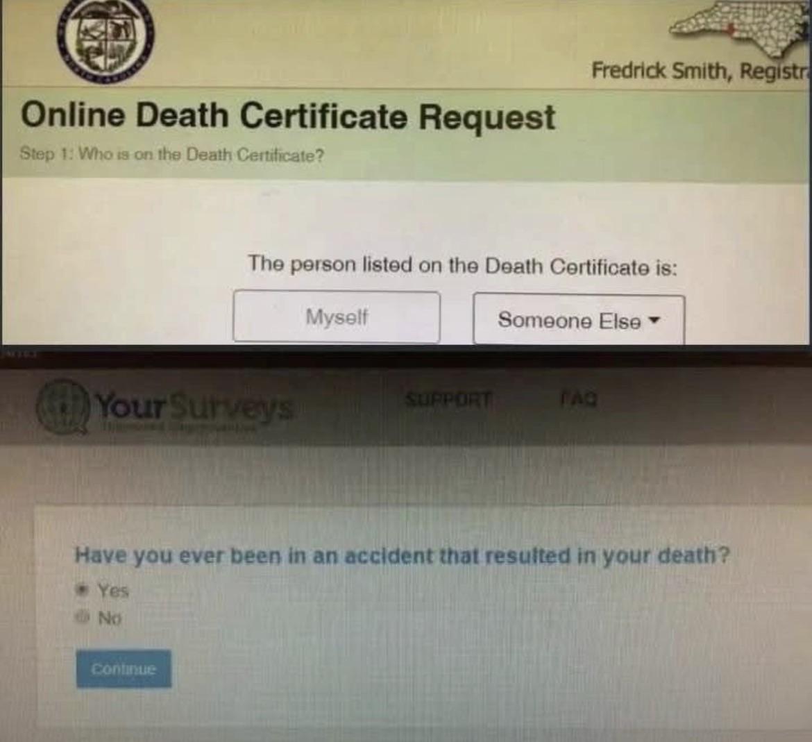
The perfect example of form validation nobody thought to test. Nothing says "robust error handling" like asking a dead person if they've died before. Somewhere, a developer is patting themselves on the back for covering all logical possibilities while their QA team contemplates a career change. The ghost of proper user experience design weeps silently in the background. It's the digital equivalent of "Press 1 if you're not here." The kind of edge case that makes you question your life choices as a developer. Bonus points if the "Yes" option triggers a "Please provide death certificate as proof" upload field.

NordVPN

NordVPN
Encrypt your traffic on public Wi-Fi, stream from anywhere, and cover up to ten devices with one plan. 30-day money-back guarantee.

Don't Make Me Think

Don't Make Me Think
Ah, the classic UX principle "Don't Make Me Think" meets reality. The developer proudly creates what they believe is an elegant, intuitive teapot UI. Meanwhile, the user gets a face full of coffee trying to figure out which obscure spout actually pours the liquid. It's the perfect metaphor for when developers build "user-friendly" interfaces that somehow require a PhD to operate. The road to unusable software is paved with developers who never watched a single user test.

One Week Five Seconds

One Week Five Seconds
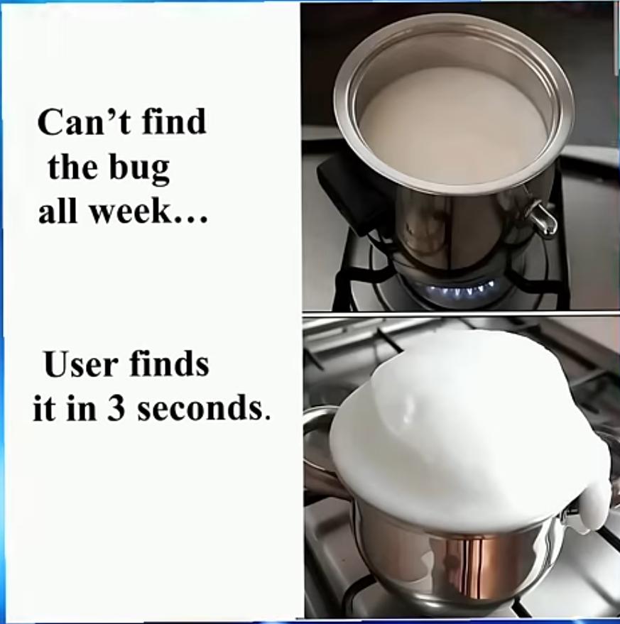
Ah, the classic "spend a week hunting an elusive bug only for some random user to stumble upon it immediately" phenomenon. It's like milk on the stove – everything's fine until you look away for 5 seconds, then BOOM – overflowing disaster. The debugging universe has one rule: the harder you look for a problem, the more it hides. But the second you deploy to production? That's when your code decides to perform its most spectacular failure for everyone to see. It's almost poetic how the universe ensures maximum embarrassment for developers.