 AI
AI
 AWS
AWS
 Agile
Agile
 Algorithms
 Android
 Apple
Apple
 Azure
Azure
 Backend
 Bash
Bash
 C++
C++
 Cloud
Cloud
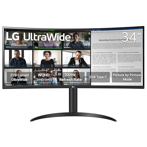
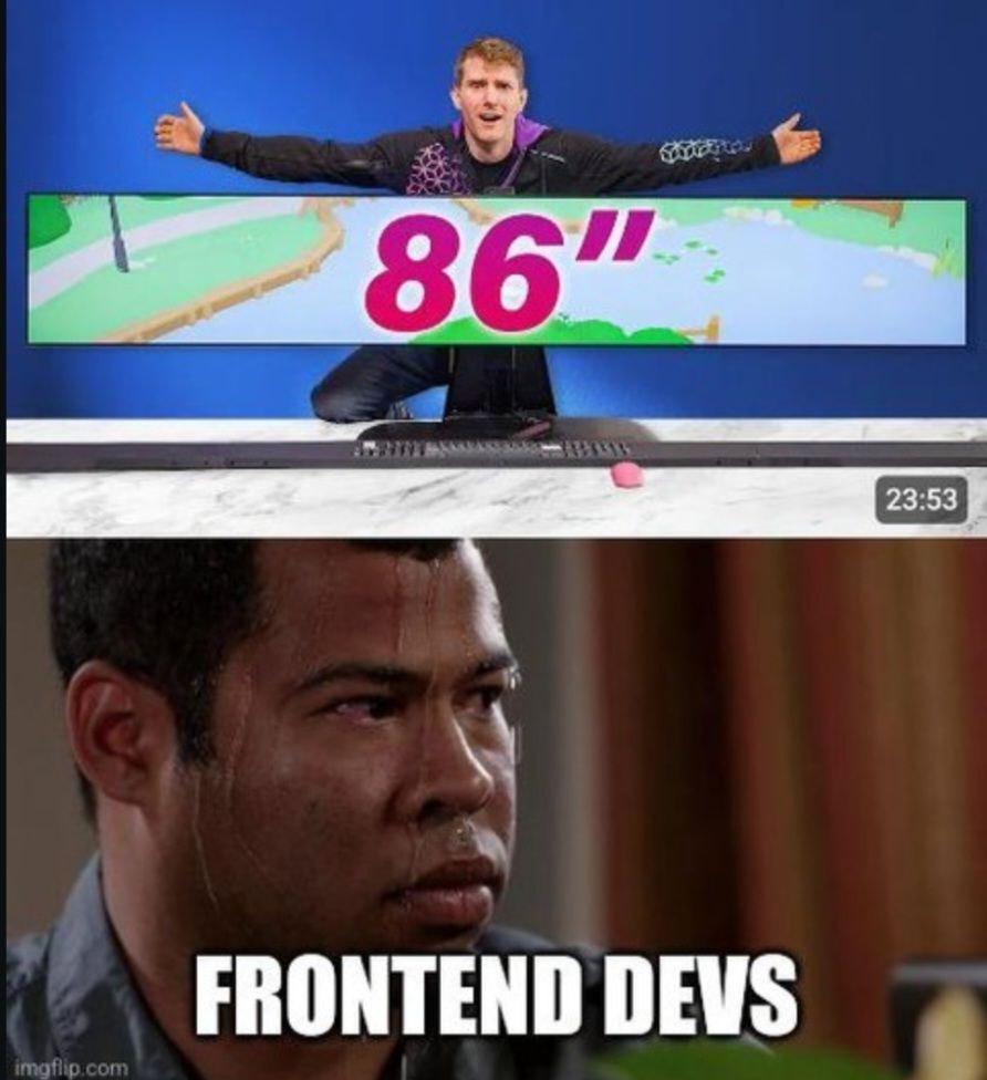
That moment when the client shows off their new 86-inch ultra-wide monitor and your responsive design sweats nervously in the background. Five years of media queries and you still didn't prepare for THIS edge case. Tomorrow's standup will be fun: "So yeah, turns out our beautiful UI looks like a stretched piece of gum on the CEO's new ridiculous display." The best part? They'll blame the framework, not the absurdity of coding for every possible screen dimension known to mankind.
A Terrible Dream For Frontend Devs
responsive-design-memes, frontend-memes, css-memes, media-queries-memes, ultrawide-memes | ProgrammerHumor.io
More Like This