

Minimalism Memes

Posts tagged with Minimalism

Best Repo On Github So Far

Best Repo On Github So Far
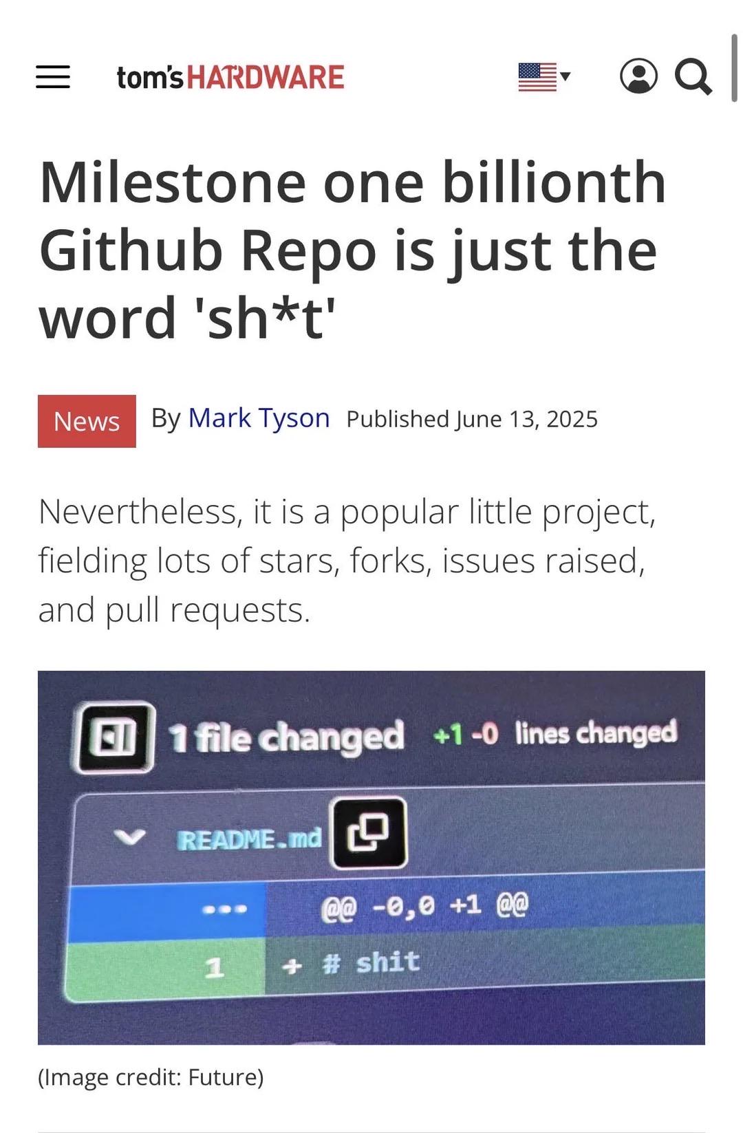
Someone created a GitHub repo containing literally just the word "shit" in the README, and it somehow reached one billion repos on GitHub. The commit shows "+1 -0 lines changed" which means they added exactly one line of profound wisdom to humanity's collective codebase. The article notes it's "popular" with lots of stars, forks, issues, and pull requests. What could people possibly be forking? Alternative spellings? Bug reports about missing profanity? Pull requests to add more expletives? The entire concept is beautifully pointless. Sometimes the most honest documentation is just a single word that sums up your feelings about the codebase. No elaborate setup instructions, no contributing guidelines, no CI/CD pipeline. Just pure, unfiltered developer sentiment in its rawest form.

A Distinguished Gentleman's PC

A Distinguished Gentleman's PC
We all go through that phase where RGB lighting is the pinnacle of PC building achievement. Rainbow vomit everywhere, fans glowing like a rave, enough LEDs to guide aircraft. Then you grow up, realize your electricity bill exists, and suddenly that sleek all-black minimalist build with maybe— maybe —a subtle white LED strip becomes the epitome of sophistication. It's like going from drinking energy drinks at 2 AM to appreciating a good cup of black coffee. Your performance didn't change, but your aesthetic sensibilities sure did. Welcome to adulthood, where your PC looks like it could be in an architecture magazine instead of a gaming tournament.

A Box Of Buttholes

A Box Of Buttholes
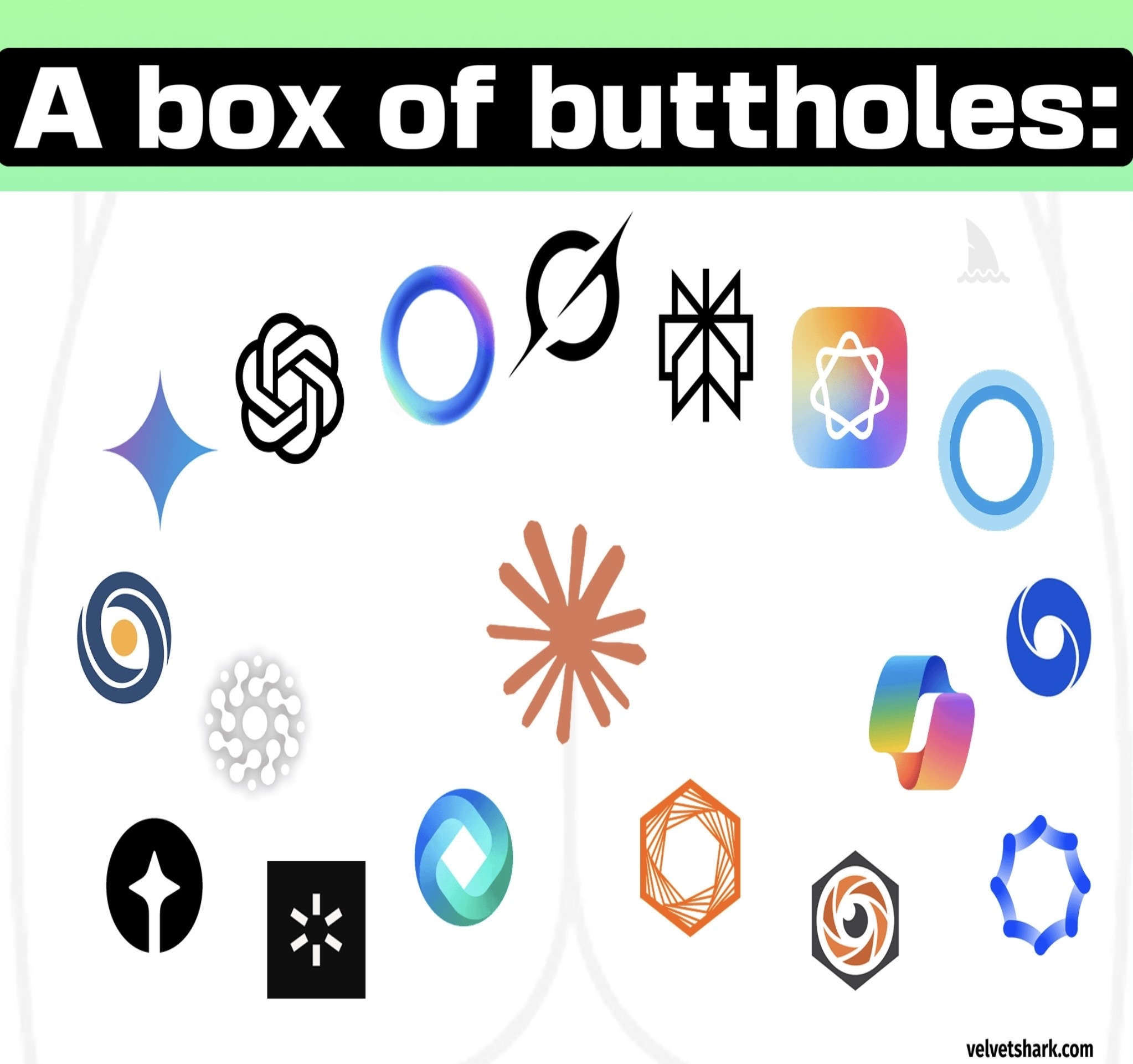
Someone finally said it. Modern AI company logos have achieved peak geometric minimalism to the point where they all look like variations of sphincters and orifices. We've got OpenAI's swirly butthole, Anthropic's geometric butthole, Gemini's gradient butthole, and about a dozen other companies that apparently hired the same designer who only knows how to draw circular/oval shapes with varying degrees of abstraction. The tech industry went from skeuomorphic designs to flat design, and now we've reached the "abstract hole" era. Every AI startup's branding meeting probably goes: "Make it look futuristic, minimalist, and vaguely circular. Bonus points if it looks like a portal to another dimension or, you know, an anus." The gradient overlays don't help either—they just make the buttholes look more premium.

Just Something I Noticed

Just Something I Noticed
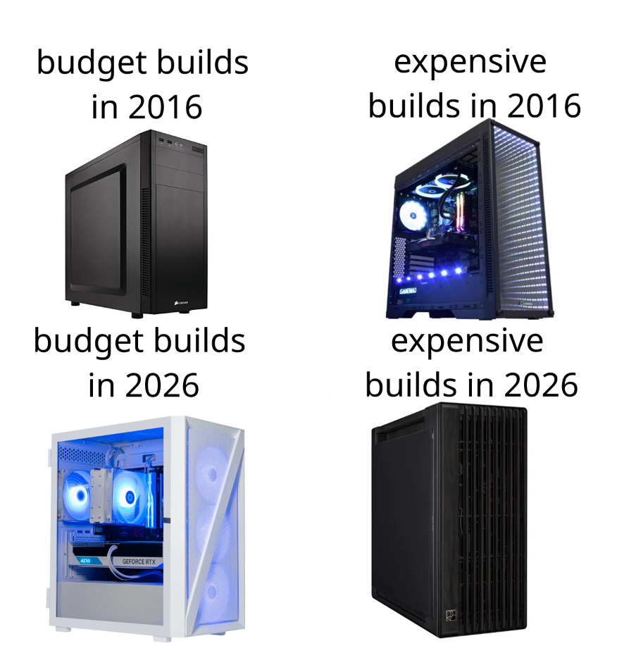
The PC building aesthetic has done a complete 180. Back in 2016, if you wanted a "serious" expensive build, you'd get a flashy RGB lightshow with a glass panel that screamed "look at my liquid cooling!" Meanwhile, budget builds were just... black boxes. Functional. Boring. No windows, no RGB, just vibes. Fast forward to 2026, and suddenly minimalism is the new flex. High-end builds are now sleek, understated monoliths that look like they belong in a Scandinavian design catalog. No RGB circus, no tempered glass—just pure, refined elegance. Meanwhile, budget builders have inherited all the RGB bling and glass panels from the previous generation because those parts got cheap enough for everyone. It's like when luxury fashion goes minimal and suddenly everyone else picks up the loud logos. The PC building world has matured from "gamer aesthetic" to "I'm too sophisticated for your light pollution." Function over flash is the new status symbol.

RGB Vs Void Build

RGB Vs Void Build
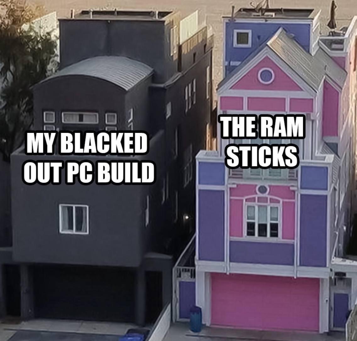
You spent $3000 on RGB fans, tempered glass, and custom cable sleeves that match your gaming chair. Your neighbor bought the same CPU and GPU, stuck them in a beige box from 2003, and gets the exact same FPS as you. The all-black stealth build is the programming equivalent of writing clean, minimal code that just works. No flashy libraries, no unnecessary dependencies, just pure function. Meanwhile the RGB house is like that React app with 47 npm packages for a todo list. Sure it looks pretty, but at what cost? Fun fact: RGB lighting adds exactly 0 FPS but increases perceived performance by 200% when your friends are watching. The RAM sticks in both builds probably cost the same though, which is the real tragedy here.

Bose QuietComfort Headphones - Wireless Bluetooth Headphones, Active Over Ear Noise Cancelling and Mic, USB-C Charging, Deep Bass, Up to 24 Hours of Playtime, Petal Pink - Limited Edition Color

Bose QuietComfort Headphones - Wireless Bluetooth Headphones, Active Over Ear Noise Cancelling and Mic, USB-C Charging, Deep Bass, Up to 24 Hours of Playtime, Petal Pink - Limited Edition Color
NOISE CANCELLING HEADPHONES: Effortlessly combines noise cancellation technology with passive features so you can shut off the outside world, quiet distractions, and take music beyond the beat · COMF…

We Really Lost Diamonds

We Really Lost Diamonds
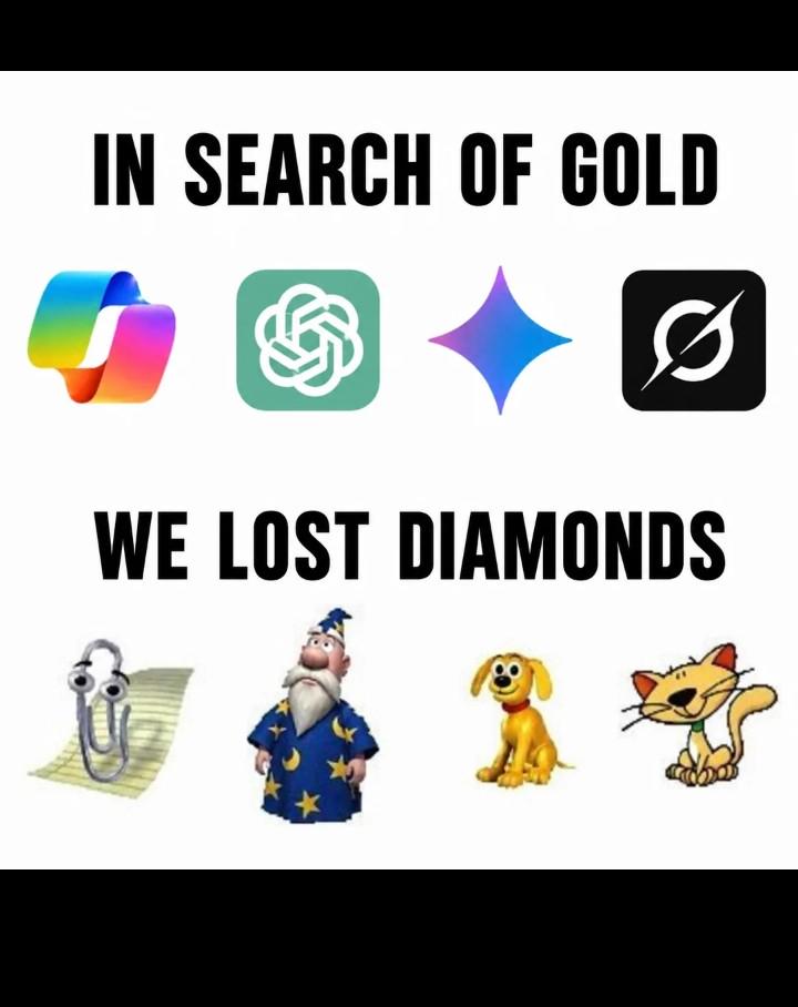
The tech industry's obsession with sleek, minimalist design has reached peak absurdity. We went from iconic, personality-packed mascots and UI elements that had soul to gradient blobs that all look like they came from the same corporate design workshop. Remember when software had character? Clippy might've been annoying, but at least you remembered him. That wizard screensaver? Legendary. Now we get... a teal knot? A purple sparkle? Icons so generic you need to read the label to know what app you're opening. The "gold" represents modern design—technically polished, aesthetically "clean," but utterly soulless. Meanwhile, the "diamonds" were those quirky, memorable elements that made computing feel less like interacting with a sterile machine and more like having actual personality in your digital life. We traded charm for conformity, and honestly? The ROI on that decision is questionable at best.

It Has Two Buttons Btw

It Has Two Buttons Btw
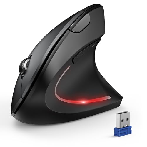
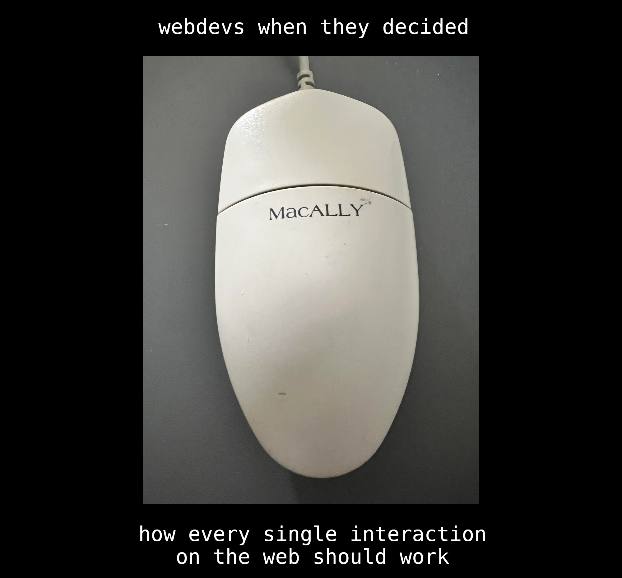
The eternal quest for minimalism has led webdevs to the promised land: a mouse so smooth and buttonless that it might as well be a bar of soap. Because why would users need something as archaic as visible, tactile buttons when they can just... guess? Click anywhere and hope for the best. It's like designing a website where every element is a mystery meat navigation—except now it's your actual hardware. The "MaCaLLY" branding really seals the deal here. Nothing screams "premium user experience" like a peripheral that requires a PhD to operate. Sure, it has two buttons—they're just hiding somewhere in the quantum realm between the top and bottom surfaces. Revolutionary? Absolutely. Usable? That's a different sprint story. Fun fact: Apple's Magic Mouse actually does this too, with its touch-sensitive surface replacing physical buttons. Turns out when you prioritize aesthetics over ergonomics, you get a device that looks great in photos but makes your hand cramp after 10 minutes. But hey, at least it's elegant .

Less Ports

Less Ports
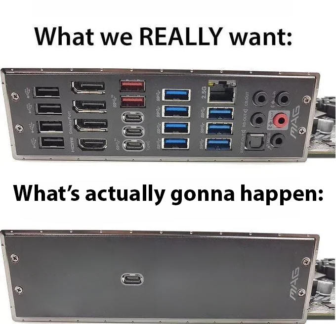
Remember when you could plug in literally anything without needing a dongle? Yeah, those days are gone. Tech companies heard "minimalism" once and decided the solution was to remove every useful port from existence. You've got USB-A, USB-C, HDMI, DisplayPort, Ethernet, and audio jacks all living in harmony on that beautiful I/O panel. It's a developer's dream—plug in your keyboard, mouse, three monitors, external drives, and still have ports left over for that random Arduino project. But no. Instead we get one lonely USB-C port that does everything and nothing at the same time. Need to charge your laptop while using an external monitor and transferring files? Better invest in a $200 hub that'll break in six months. The irony is they call it "innovation" while selling you back the functionality you already had, just with extra steps and adapters.

Introducing Fractal South

Introducing Fractal South
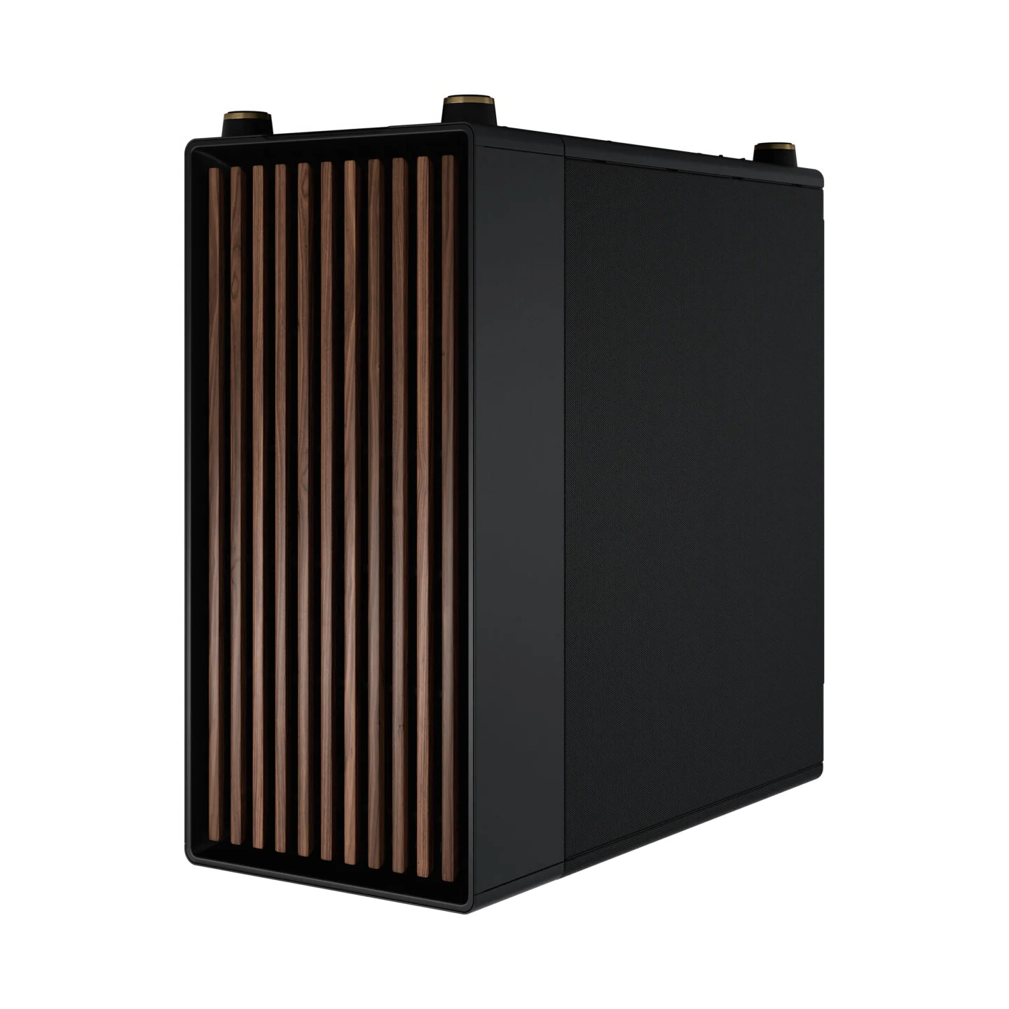
When your PC case manufacturer decides that "airflow" is just a social construct and goes full minimalist aesthetic. Behold the Fractal South – because who needs ventilation when you can have *vibes*? The front panel is smoother than a fresh git repo, completely sealed off like it's protecting state secrets. Meanwhile, your CPU is in there having a full meltdown, literally cooking itself to death while looking absolutely GORGEOUS doing it. It's the tech equivalent of wearing a turtleneck in the Sahara desert because fashion > function. Your components are screaming for oxygen but hey, at least it matches your desk setup!

Rip Ports

Rip Ports
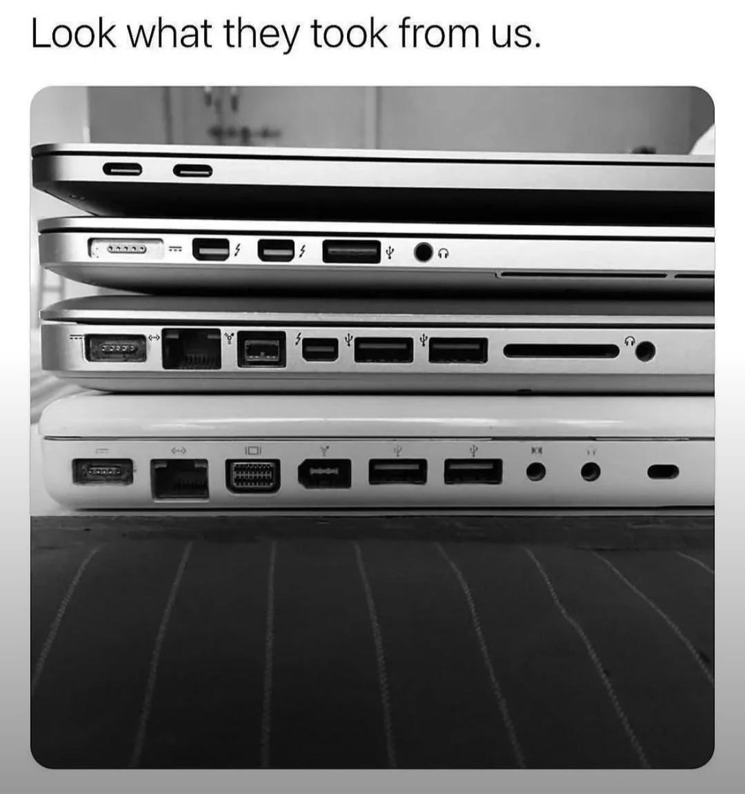
Behold the tragic evolution of Apple's MacBook lineup, where each generation is blessed with FEWER ports than the last, like some kind of twisted minimalist nightmare. We went from a glorious buffet of USB-A, HDMI, Ethernet, Thunderbolt, SD card slots, and headphone jacks to... *checks notes* ...two measly USB-C ports. COURAGE, they called it. Meanwhile, developers are out here carrying around a dongle collection that rivals a janitor's keychain just to plug in a mouse and an external monitor simultaneously. The top MacBook is basically screaming "look what they took from you!" while flexing its port abundance like a bodybuilder showing off gains. RIP to the days when you could actually connect things to your laptop without needing a PhD in adapter logistics or a second mortgage for dongles.

NordVPN

NordVPN
Encrypt your traffic on public Wi-Fi, stream from anywhere, and cover up to ten devices with one plan. 30-day money-back guarantee.

No Rgb Please

No Rgb Please
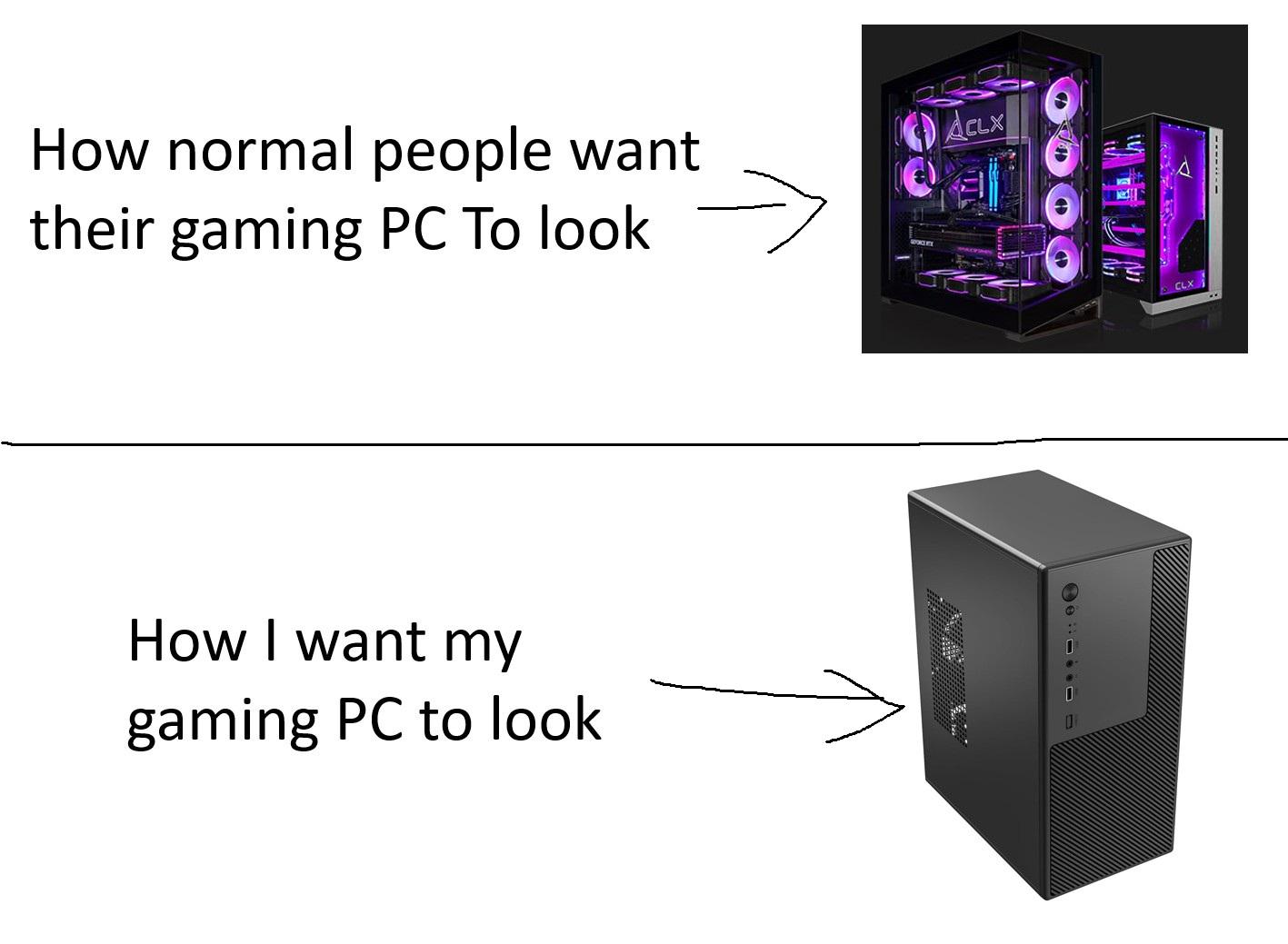
While the gaming industry collectively decided that RGB lighting equals performance gains (spoiler: it doesn't), some of us still believe in the radical concept of a computer that doesn't double as a nightclub. The top rig looks like it's hosting a rave for silicon chips with enough purple LEDs to guide aircraft, while the bottom one is just... a box. A beautiful, minimalist, "I'm here to compile code not blind my retinas" kind of box. There's something deeply satisfying about a sleek, monolithic case that whispers "professional" instead of screaming "LOOK AT MY GAMING SETUP MOM!" Plus, when you're debugging at 2 AM, the last thing you need is your PC reminding you that you're inside a cyberpunk fever dream. Function over flash, baby.

My New Static, Multi-Page Calendar Application

My New Static, Multi-Page Calendar Application
Someone just discovered that a physical paper calendar hanging on their wall technically qualifies as a "static, multi-page application." Zero dependencies, no build process, works offline, and the UI is literally bulletproof. The best part? It's already been paid for and deployed to production (their wall). The handwritten "PAID" entries are the real MVP here—manual database updates using the most reliable storage medium known to humanity: ink on paper. No ORM needed, no migration scripts, and the data persistence is guaranteed for at least a year. Sure, the refresh rate is terrible and you can't implement dark mode, but at least you'll never get a CORS error or worry about browser compatibility. This is what peak minimalism looks like. While everyone else is spinning up React calendars with 500MB of node_modules, this developer went full analog. Sometimes the best code is no code at all.