 AI
AI
 AWS
AWS
 Agile
Agile
 Algorithms
 Android
 Apple
Apple
 Azure
Azure
 Backend
 Bash
Bash
 C++
C++
 Cloud
Cloud
Oh look, Microsoft's grand vision for the future: making the logo progressively MORE BORING with each release! Windows 10 had that vibrant, confident blue that screamed "I'm a functional operating system!" Meanwhile, Windows 11 rolled up with its washed-out, pastel aesthetic that whispers "I'm having an identity crisis and also I moved the Start button for no reason." The face says it all – going from mildly optimistic to dead inside, which honestly tracks with the user experience of mandatory updates at the worst possible times.
Windows
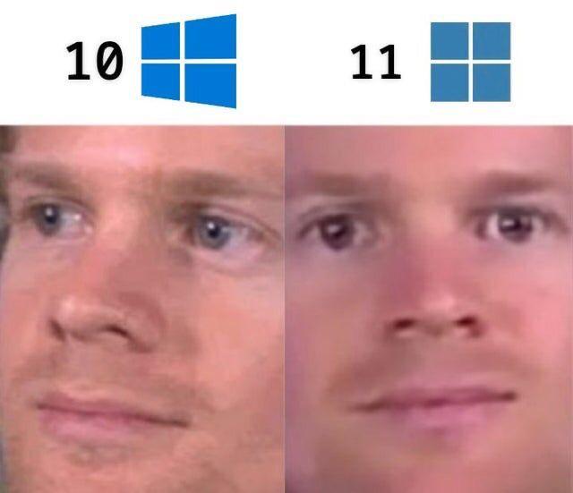
windows-memes, windows10-memes, windows11-memes, microsoft-memes, ui-design-memes | ProgrammerHumor.io
More Like This