

Logo design Memes

Posts tagged with Logo design
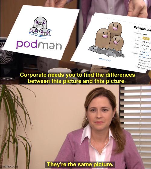
Don't Search Logo Of OpenBao

Don't Search Logo Of OpenBao
Someone on the OpenBao branding team definitely had Pokémon on their mind when designing their logo. Podman's logo features cute little pod creatures (get it? Pods? Containers?), while OpenBao apparently went with what looks suspiciously like Dugtrio—three adorable ground-type Pokémon popping out of the dirt. The resemblance is so uncanny that corporate literally can't spot the difference, and honestly? Same energy, same vibe, same "let's make our infrastructure tooling inexplicably adorable" philosophy. Fun fact: OpenBao is a HashiCorp Vault fork created after HashiCorp switched to the Business Source License, because nothing says open-source drama like forking a secrets management tool. At least they kept the branding game strong with their totally-not-Dugtrio mascot.

Windows

Windows
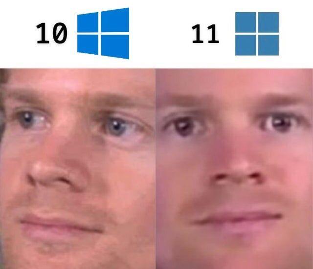
Oh look, Microsoft's grand vision for the future: making the logo progressively MORE BORING with each release! Windows 10 had that vibrant, confident blue that screamed "I'm a functional operating system!" Meanwhile, Windows 11 rolled up with its washed-out, pastel aesthetic that whispers "I'm having an identity crisis and also I moved the Start button for no reason." The face says it all – going from mildly optimistic to dead inside, which honestly tracks with the user experience of mandatory updates at the worst possible times.

A Box Of Buttholes

A Box Of Buttholes
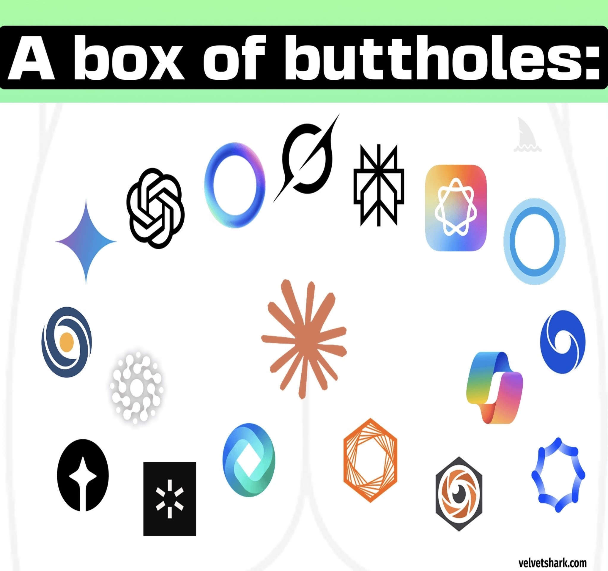
Someone finally said it. Modern AI company logos have achieved peak geometric minimalism to the point where they all look like variations of sphincters and orifices. We've got OpenAI's swirly butthole, Anthropic's geometric butthole, Gemini's gradient butthole, and about a dozen other companies that apparently hired the same designer who only knows how to draw circular/oval shapes with varying degrees of abstraction. The tech industry went from skeuomorphic designs to flat design, and now we've reached the "abstract hole" era. Every AI startup's branding meeting probably goes: "Make it look futuristic, minimalist, and vaguely circular. Bonus points if it looks like a portal to another dimension or, you know, an anus." The gradient overlays don't help either—they just make the buttholes look more premium.

Because They Produce Crap

Because They Produce Crap
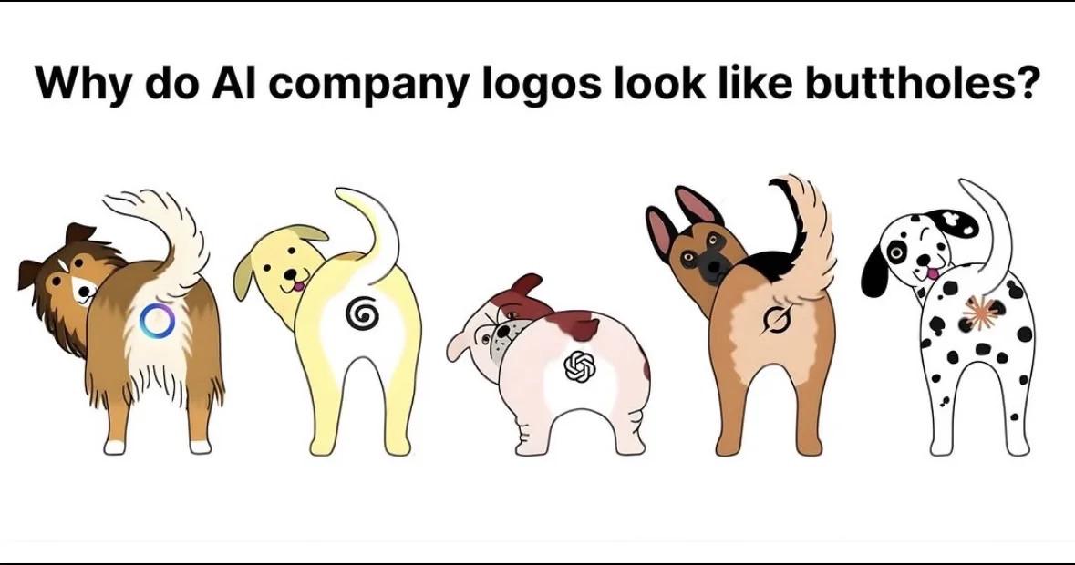
You know those sleek, minimalist AI company logos with their perfect circles, spirals, and abstract shapes? Turns out they're all just dog butts from behind. The punchline hits different when you realize every AI startup's $50k branding package is basically the same view your dog gives you on walks. The irony is chef's kiss—these companies spend millions on "innovative" design while their logos literally look like where waste comes from. Fitting metaphor for AI-generated content, honestly. Someone's design agency is laughing all the way to the bank while we're out here debugging hallucinations and explaining to stakeholders why the LLM just made up an entire API that doesn't exist.

I Don't Know Why This Exists...

I Don't Know Why This Exists...
The Python logo, but it's clearly just a blue snake and a yellow snake having an awkward cuddle session. Whoever designed this absolutely knew what they were doing. It's like they pitched "two snakes forming a logo" but secretly created the most suggestive programming language symbol in history. Next time you're debugging at midnight, you'll never unsee it. The real reason Python has such high adoption rates? Developers just want to be part of the joke.

V VCOM M.2 NVMe SSD Enclosure,USB C External Adapter, USB 3.2 Gen2 (10Gbps) with UASP, Trim Support - M-Key(B+M Key) for 2230/2242/2260/2280 SSDs

V VCOM M.2 NVMe SSD Enclosure,USB C External Adapter, USB 3.2 Gen2 (10Gbps) with UASP, Trim Support - M-Key(B+M Key) for 2230/2242/2260/2280 SSDs
【ONLY SUITABLE FOR PCIe NVMe M.2 SSD】The nvme enclosure ONLY supports NVMe SSD (M Key/B+M Key) . Applicable with SSD in sizes 2230/2242/2260/2280, compatible with Crucial WD Kingston Integral, etc. N…

Why Google Why

Why Google Why
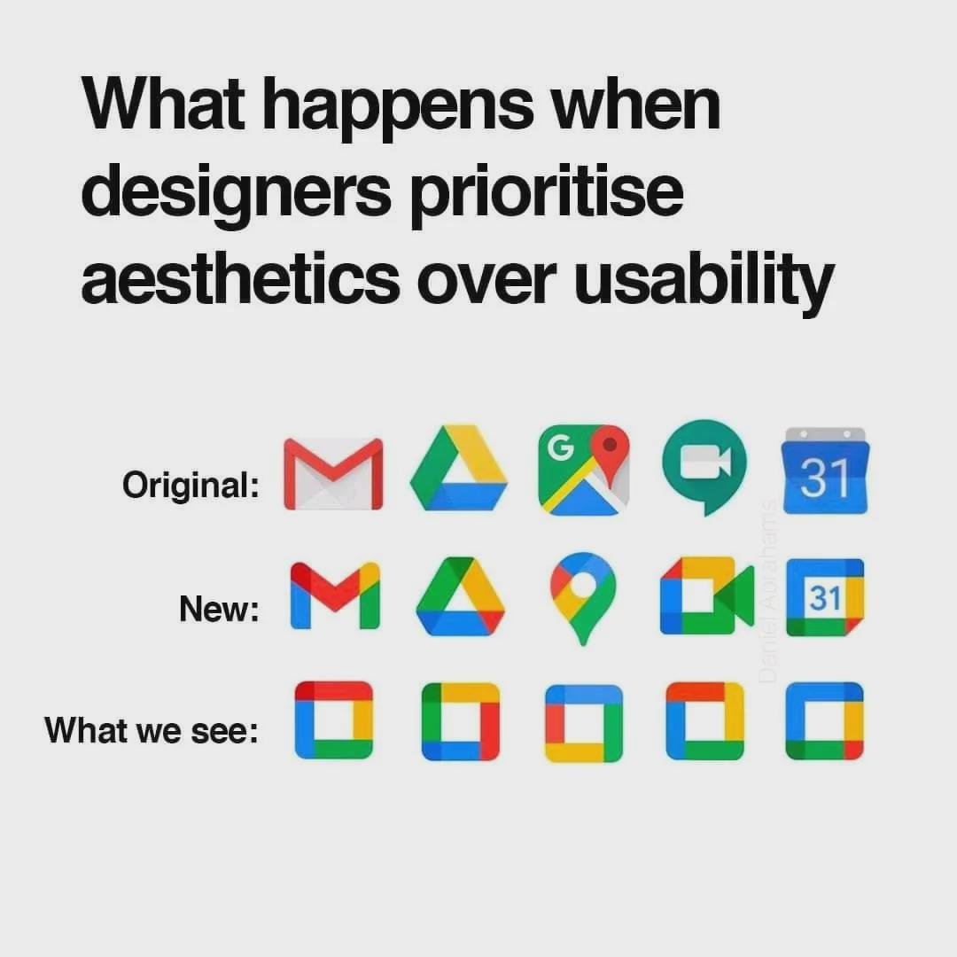
Google's design team strikes again! Remember when you could instantly recognize Gmail from Drive at a glance? Now we're playing "corporate logo roulette" every time we need to send an email. The evolution from distinct, functional icons to these homogeneous color squares is like watching your codebase after a junior dev discovers design patterns. "Let's refactor everything to be consistent !" Sure, kid. Consistency is great until all your function names are AbstractFactoryBuilderServiceImpl. Now I'm squinting at my phone trying to figure out if I'm about to open my calendar or accidentally join that meeting I've been avoiding. Thanks for the extra cognitive load, Google. Just what my burnout needed.

Perfect Logo For Your AI Vaporware

Perfect Logo For Your AI Vaporware
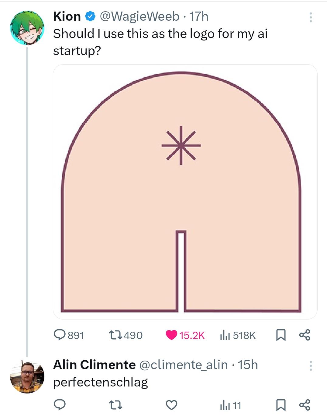
Nothing says "I'm a serious AI startup" like using the universal symbol for "loading" as your logo. The German reply "perfectenschlag" is perfect - it's what Dwight from The Office used to describe "perfect pork anus" but also "perfect day." Just like this logo perfectly represents what most AI startups deliver - an eternal loading screen with nothing behind it. Venture capitalists, please form an orderly queue.