 AI
AI
 AWS
AWS
 Agile
Agile
 Algorithms
 Android
 Apple
Apple
 Backend
 Bash
Bash
 C++
C++
 Cloud
Cloud
 Csharp
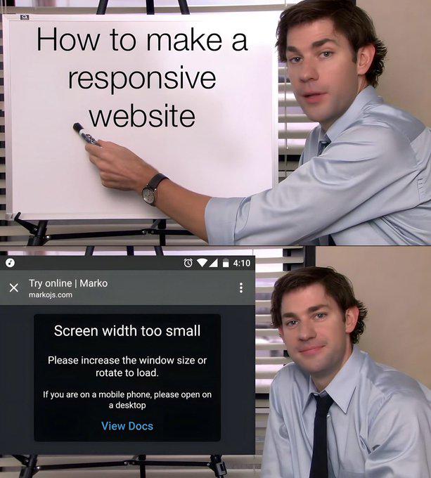
Top panel: "How to make a responsive website" written on a whiteboard by someone who's about to drop some knowledge bombs.
Bottom panel: Their actual website telling mobile users "Screen width too small. Please increase the window size or rotate to load. If you are on a mobile phone, please open on a desktop."
Nothing says "I'm a responsive design expert" quite like a website that doesn't work on mobile. It's the digital equivalent of a swimming instructor who can't swim but has a really nice PowerPoint about water.
Works All The Time (On Desktop Only)
responsive-design-memes, frontend-memes, mobile-first-memes, irony-memes, web-development-memes | ProgrammerHumor.io
More Like This