 AI
AI
 AWS
AWS
 Agile
Agile
 Algorithms
 Android
 Apple
Apple
 Azure
Azure
 Backend
 Bash
Bash
 C++
C++
 Cloud
Cloud
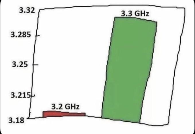
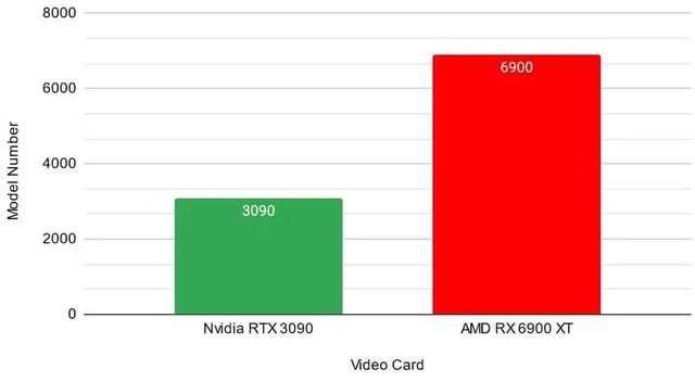
When your competitor is running at 3.2 GHz and you've somehow managed to squeeze out 3.3 GHz, marketing demands a chart that makes it look like you've just invented warp drive. Never mind that the difference is roughly 3% - that bar needs to be 10x taller to properly convey your technological superiority.
The Y-axis starts at 3.18 instead of zero because who needs honest data visualization when you're disrupting the industry? This is the same energy as benchmarking your new JavaScript framework against one from 2012 and claiming revolutionary performance gains.
Bonus points if this chart was presented on a minimalist slide with a sans-serif font at a product launch where someone unironically said "game-changer."