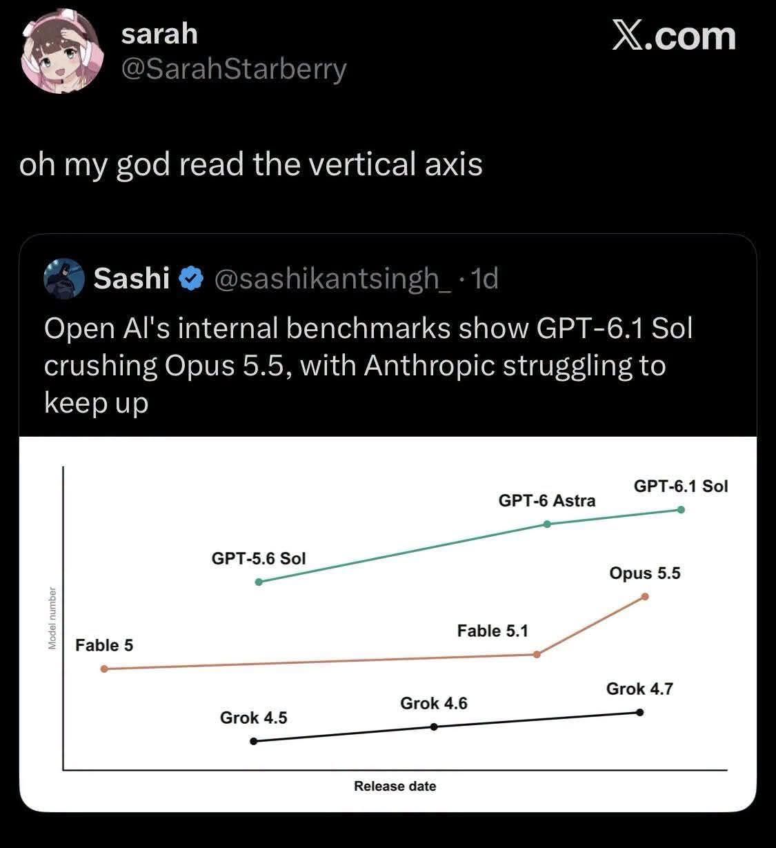
Someone made a chart showing AI model performance over time and forgot that the Y-axis exists. OpenAI's GPT-6.1 Sol is sitting way up top looking impressive, while Anthropic's Opus 5.5 is chilling in the middle, and Grok is barely crawling along the bottom. But here's the kicker: there's no scale on the vertical axis, so for all we know, the difference between them could be 0.2% or 200%. It's like those pharma ads showing a bar chart where one bar is twice as tall as another, but they conveniently forgot to label what the bars actually measure. Could be measuring anything from "times hallucinated about being sentient" to "ability to write Python that actually runs." Classic data visualization malpractice that would get you roasted in any code review, but somehow makes it to Twitter with a verified checkmark.
 AI
AI
 AWS
AWS
 Agile
Agile
 Algorithms
 Android
 Apple
Apple
 Azure
Azure
 Backend
 Bash
Bash
 C++
C++
 Cloud
Cloud