 AI
AI
 AWS
AWS
 Agile
Agile
 Algorithms
 Android
 Apple
Apple
 Azure
Azure
 Backend
 Bash
Bash
 C++
C++
 Cloud
Cloud
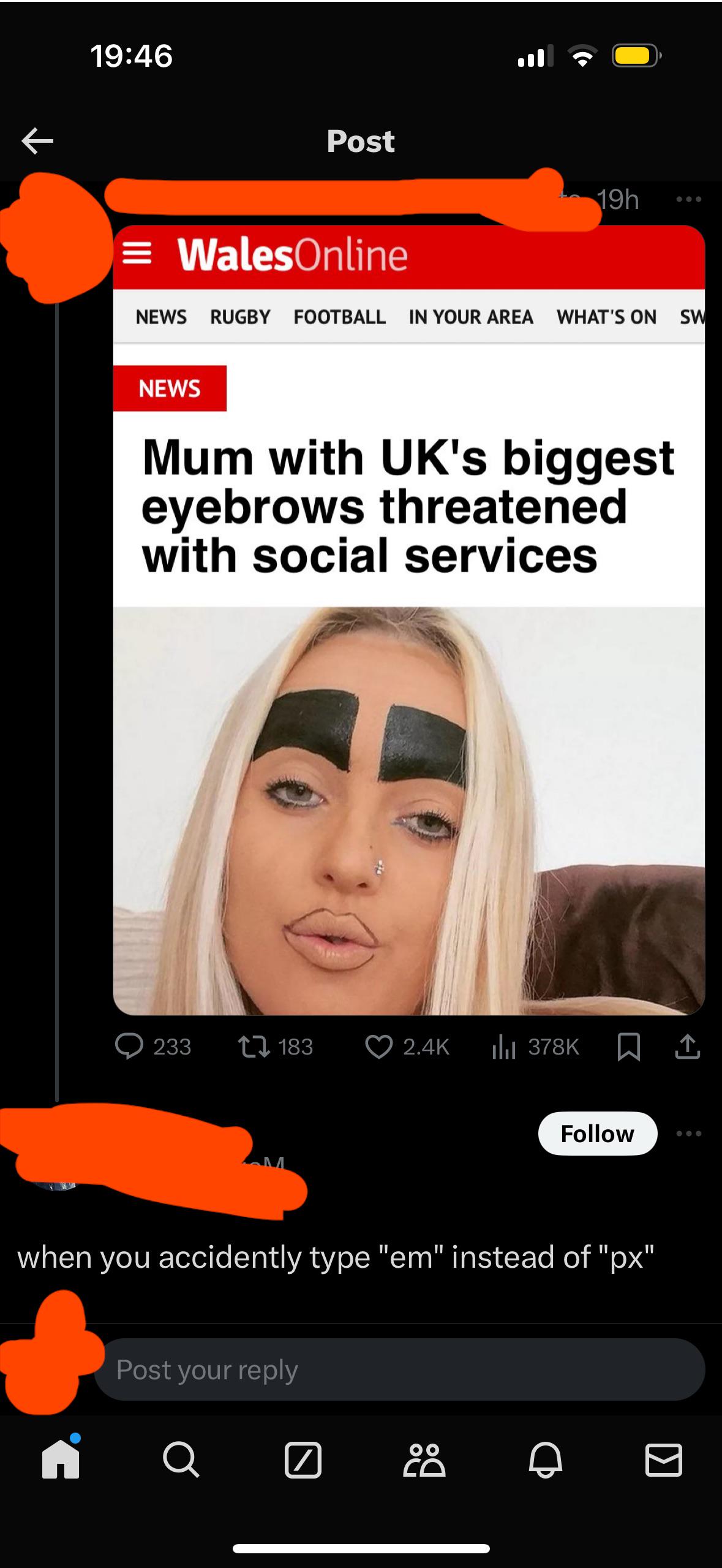
The eternal CSS unit struggle claims another victim! Type "200px" for a nice, predictable border width... but hit "200em" and suddenly your eyebrows are consuming half the viewport. That's not responsive design, that's responsive disaster. The difference between "looks fine on my machine" and "summoning social services" is literally one character. And they wonder why frontend developers drink.
When You Accidentally Type Em Instead Of Px
css-memes, frontend-memes, em-vs-px-memes, responsive-design-memes, web-development-memes | ProgrammerHumor.io
More Like This