

Branding Memes

Posts tagged with Branding
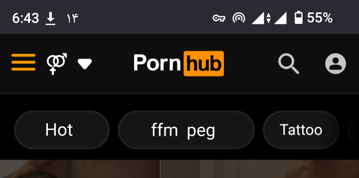
Imagine Your Product Being A Category On Pornhub

Imagine Your Product Being A Category On Pornhub
When your framework gets so popular that it becomes a legitimate category on adult websites, you know you've either made it or cursed an entire generation of developers. "peg" sitting right there between the mainstream categories is the kind of brand recognition most startups dream about – just maybe not in this exact context. For context: Peg.js is a parser generator for JavaScript, and seeing it casually listed as a category is the ultimate "task failed successfully" moment. The devs probably wanted widespread adoption, but I'm guessing this wasn't part of the marketing roadmap. Then again, any publicity is good publicity, right? Right? Nothing says "we've penetrated the market" quite like literally being on Pornhub's navigation bar. The SEO team must be having a field day trying to explain those traffic spikes.

McDonald's Theme In Text Editor

McDonald's Theme In Text Editor
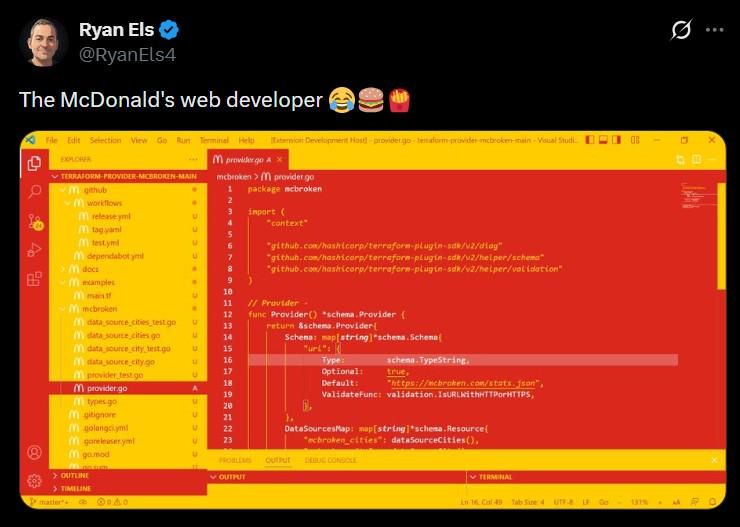
Some absolute LEGEND at McDonald's decided that coding in a text editor themed with the exact colors of a Big Mac was the peak of aesthetic excellence. Yellow sidebars, red code panels—it's like your IDE ate at McDonald's and became McDonald's. The dedication to brand consistency is honestly terrifying. This developer probably dreams in golden arches and debugs with a side of fries. Their syntax highlighting doesn't just show errors—it asks if you want to supersize them. Nothing says "professional web development" quite like staring at code that makes you crave a McFlurry every 30 seconds. Ba da ba ba ba... I'm hating it (but also kind of loving it).

Don't Search Logo Of OpenBao

Don't Search Logo Of OpenBao
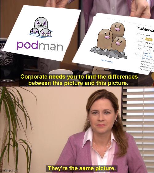
Someone on the OpenBao branding team definitely had Pokémon on their mind when designing their logo. Podman's logo features cute little pod creatures (get it? Pods? Containers?), while OpenBao apparently went with what looks suspiciously like Dugtrio—three adorable ground-type Pokémon popping out of the dirt. The resemblance is so uncanny that corporate literally can't spot the difference, and honestly? Same energy, same vibe, same "let's make our infrastructure tooling inexplicably adorable" philosophy. Fun fact: OpenBao is a HashiCorp Vault fork created after HashiCorp switched to the Business Source License, because nothing says open-source drama like forking a secrets management tool. At least they kept the branding game strong with their totally-not-Dugtrio mascot.

A Box Of Buttholes

A Box Of Buttholes
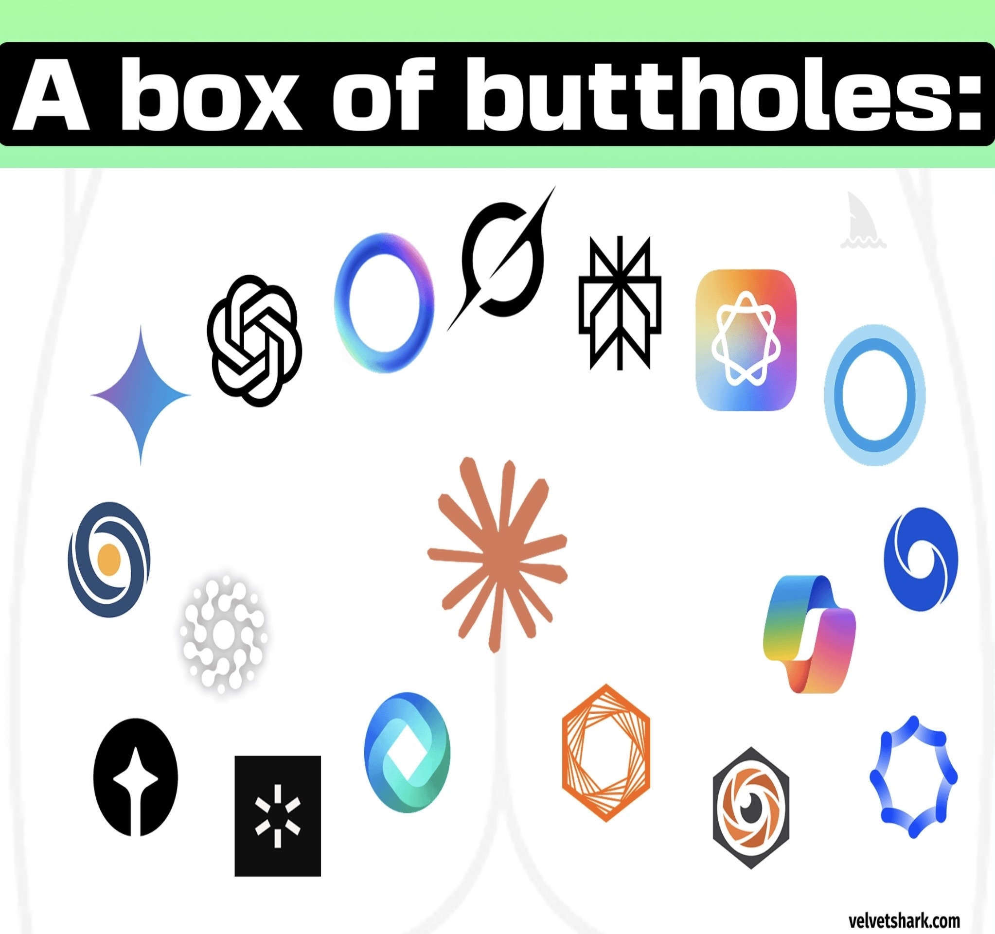
Someone finally said it. Modern AI company logos have achieved peak geometric minimalism to the point where they all look like variations of sphincters and orifices. We've got OpenAI's swirly butthole, Anthropic's geometric butthole, Gemini's gradient butthole, and about a dozen other companies that apparently hired the same designer who only knows how to draw circular/oval shapes with varying degrees of abstraction. The tech industry went from skeuomorphic designs to flat design, and now we've reached the "abstract hole" era. Every AI startup's branding meeting probably goes: "Make it look futuristic, minimalist, and vaguely circular. Bonus points if it looks like a portal to another dimension or, you know, an anus." The gradient overlays don't help either—they just make the buttholes look more premium.

Grift Push Force

Grift Push Force
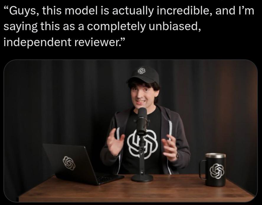
Every AI startup founder ever, sitting in their podcast studio with merch they definitely didn't order 10,000 units of before getting any users. The setup screams "I raised a seed round and immediately spent it on branding." That laptop sticker, the matching mug, the hat—all featuring a logo that probably cost more than your annual AWS bill. The "completely unbiased, independent reviewer" line is chef's kiss. Nothing says independent like being surrounded by branded swag while reading from talking points that sound suspiciously like they came from a pitch deck. The tech industry's version of "I'm not like other girls." Bonus points if their "incredible model" is just a fine-tuned GPT wrapper with a $29/month subscription tier.

New Fable Logo Proposal

New Fable Logo Proposal
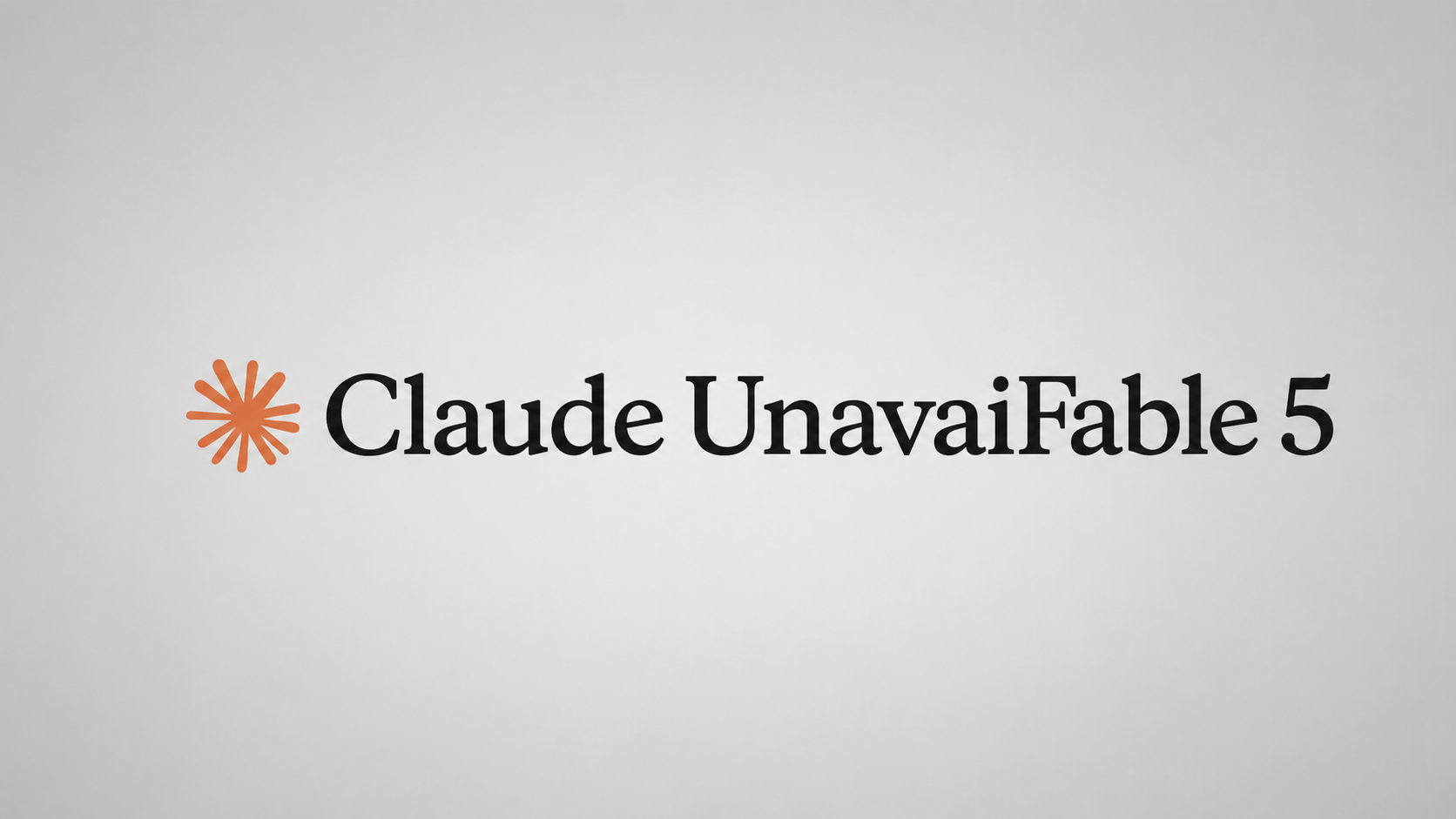
Oh, the AUDACITY of this wordplay! Someone took Anthropic's shiny AI assistant Claude and mashed it together with "unavailable" to create the most brutally honest tech branding ever: Claude UnavailFable 5 . Because nothing says "cutting-edge AI" quite like admitting your service is down more often than it's up. The logo perfectly mimics Claude's aesthetic, except instead of promising helpful AI conversations, it's promising you'll be staring at error messages while your deadline looms. It's like naming your cloud service "Amazon Occasionally Works" or your database "MongoDB Sometimes." The "5" at the end really seals the deal—because why stop at being unavailable once when you can make it a whole version release? Chef's kiss for truth in advertising! 💀

ASUS Cobble M.2 SSD Enclosure, Tool-Free USB-C 10Gbps External NVMe/SATA Case, Aluminum Cooling, IP55 Water & Dust Resistant, Supports M.2 2230–2280, for PS5, MacBook & Windows, Black, 1 year warranty

ASUS Cobble M.2 SSD Enclosure, Tool-Free USB-C 10Gbps External NVMe/SATA Case, Aluminum Cooling, IP55 Water & Dust Resistant, Supports M.2 2230–2280, for PS5, MacBook & Windows, Black, 1 year warranty
Sustained 10Gbps Performance: USB-C 3.2 Gen 2x1 delivers zero-throttling 10Gbps bandwidth to ensure stable 4K ProRes recording and large-file transfers, eliminating performance drops common in budget…

I Love Purple And I Cannot Lie

I Love Purple And I Cannot Lie
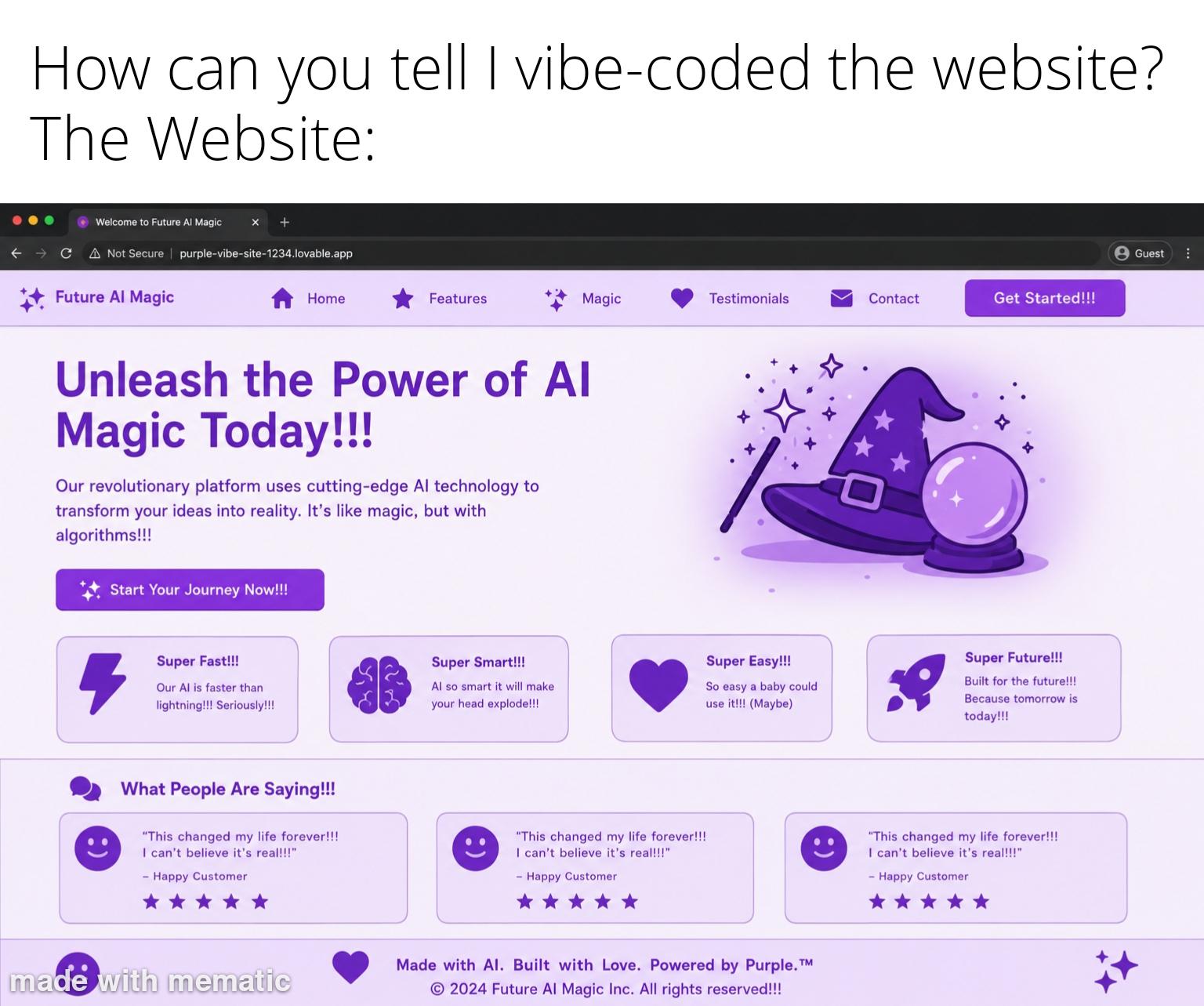
You know you've achieved peak design when every single element on your site is drowning in the same shade of purple. Navigation icons? Purple. Buttons? Purple. Testimonials? Purple. The wizard hat illustration? Surprisingly, also purple. Someone clearly discovered the color picker tool and decided that brand consistency means using literally one color for everything. The "Super Easy!!!" card claims a baby could use it—probably because babies love staring at monochromatic surfaces. The URL "purple-vibe-site-1234.lovable.app" is the cherry on top. Nothing says "professional AI platform" quite like a subdomain that sounds like a MySpace page from 2006. At least they're honest about their vibe. Fun fact: Studies show that overusing a single color can cause "brand fatigue," but who needs studies when you have algorithms ?

We Really Lost Diamonds

We Really Lost Diamonds
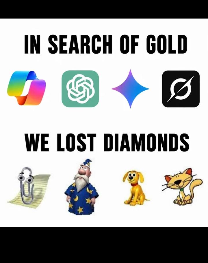
The tech industry's obsession with sleek, minimalist design has reached peak absurdity. We went from iconic, personality-packed mascots and UI elements that had soul to gradient blobs that all look like they came from the same corporate design workshop. Remember when software had character? Clippy might've been annoying, but at least you remembered him. That wizard screensaver? Legendary. Now we get... a teal knot? A purple sparkle? Icons so generic you need to read the label to know what app you're opening. The "gold" represents modern design—technically polished, aesthetically "clean," but utterly soulless. Meanwhile, the "diamonds" were those quirky, memorable elements that made computing feel less like interacting with a sterile machine and more like having actual personality in your digital life. We traded charm for conformity, and honestly? The ROI on that decision is questionable at best.

Because They Produce Crap

Because They Produce Crap
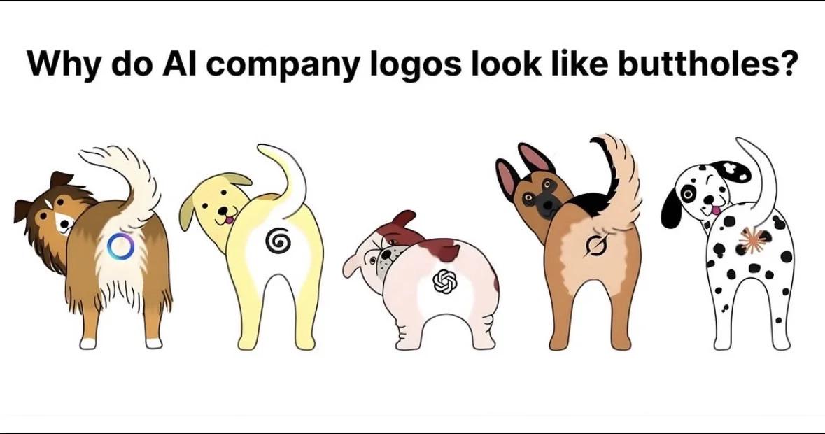
You know those sleek, minimalist AI company logos with their perfect circles, spirals, and abstract shapes? Turns out they're all just dog butts from behind. The punchline hits different when you realize every AI startup's $50k branding package is basically the same view your dog gives you on walks. The irony is chef's kiss—these companies spend millions on "innovative" design while their logos literally look like where waste comes from. Fitting metaphor for AI-generated content, honestly. Someone's design agency is laughing all the way to the bank while we're out here debugging hallucinations and explaining to stakeholders why the LLM just made up an entire API that doesn't exist.

Xbox's New Official Mascot: Visual Studio In Disguise

Xbox's New Official Mascot: Visual Studio In Disguise
STOP EVERYTHING! The character is wearing BLUE and sitting against a YELLOW background! It's the Visual Studio mascot being passed off as Xbox's new face! The audacity! The betrayal! Microsoft really said "why create new characters when we can just recycle our dev tools icons?" Next thing you know, Clippy will be announcing the next Halo game and the Windows paperclip will be demanding $70 for the base edition. The corporate synergy is just TOO MUCH to handle!

Missed Marketing Opportunity

Missed Marketing Opportunity
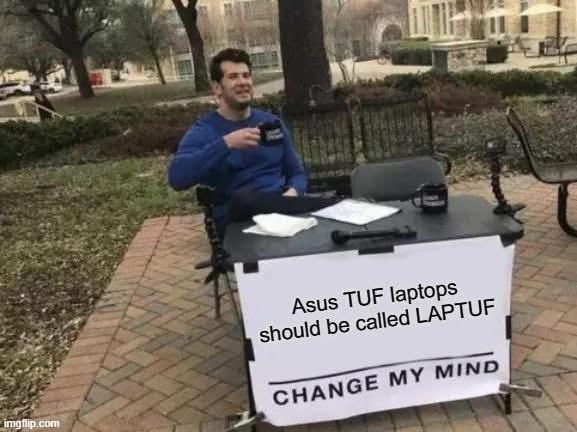
The naming department at Asus clearly missed a golden opportunity here. They created a gaming laptop line called "TUF" (The Ultimate Force) but failed to see the most obvious pun staring them in the face. It's like watching someone build an entire database system but forget to add an index on the primary key. Some marketing exec is probably sitting in a corner, quietly sobbing into their mechanical keyboard after seeing this meme.

Fluke 17B+ Digital Multimeter, for Electrical Applications, Measures AC/DC Voltage 1000V, Current Measurements to 10A, Resistance, Continuity, Diode, Capacitance, Frequency, and Temperature Testing

Fluke 17B+ Digital Multimeter, for Electrical Applications, Measures AC/DC Voltage 1000V, Current Measurements to 10A, Resistance, Continuity, Diode, Capacitance, Frequency, and Temperature Testing
CAT III 600V Safety Rating: Ensuring your safety when working on electrical systems in common residential, commercial, and industrial settings. · AC/DC Voltage and Current Measurements up to 1000V an…

Why Google Why

Why Google Why
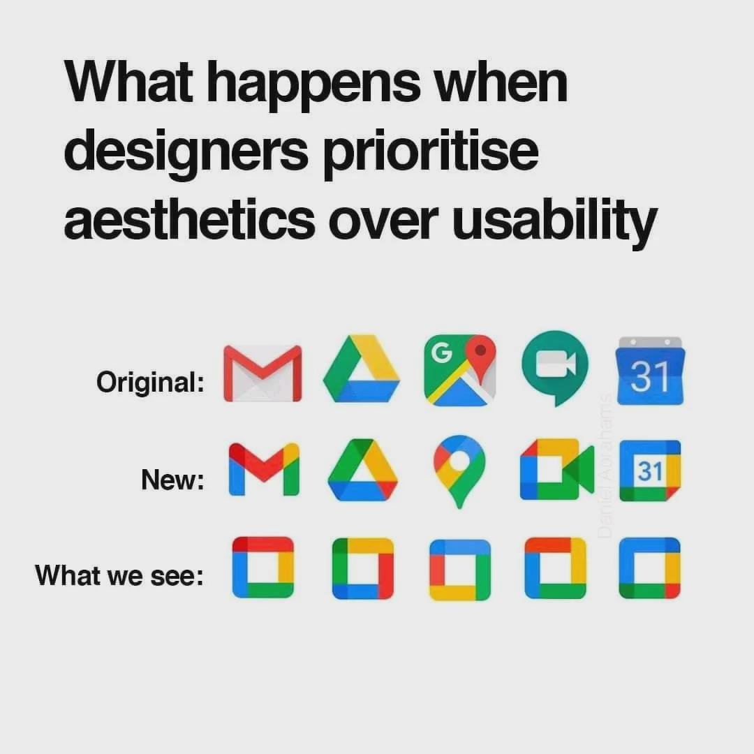
Google's design team strikes again! Remember when you could instantly recognize Gmail from Drive at a glance? Now we're playing "corporate logo roulette" every time we need to send an email. The evolution from distinct, functional icons to these homogeneous color squares is like watching your codebase after a junior dev discovers design patterns. "Let's refactor everything to be consistent !" Sure, kid. Consistency is great until all your function names are AbstractFactoryBuilderServiceImpl. Now I'm squinting at my phone trying to figure out if I'm about to open my calendar or accidentally join that meeting I've been avoiding. Thanks for the extra cognitive load, Google. Just what my burnout needed.