 AI
AI
 AWS
AWS
 Agile
Agile
 Algorithms
 Android
 Apple
Apple
 Backend
 Bash
Bash
 C++
C++
 Cloud
Cloud
 Csharp
Oh, you thought you could just slap width: 100% and height: 100% on something and call it "responsive"? Congratulations, you've just created a perfectly square cat that has absolutely zero regard for its container's aspect ratio! The cat is literally molding itself into a cube because that's what happens when you force both dimensions to 100% without considering the parent element. It's like telling someone to be "as tall as the room AND as wide as the room" – sure, they'll try, but the results will be... geometrically questionable. This is peak CSS logic where everything is technically working as intended, but the outcome is pure chaos. The cat accepted the assignment and became a perfect cube of fluff and regret.
Responsive Layout
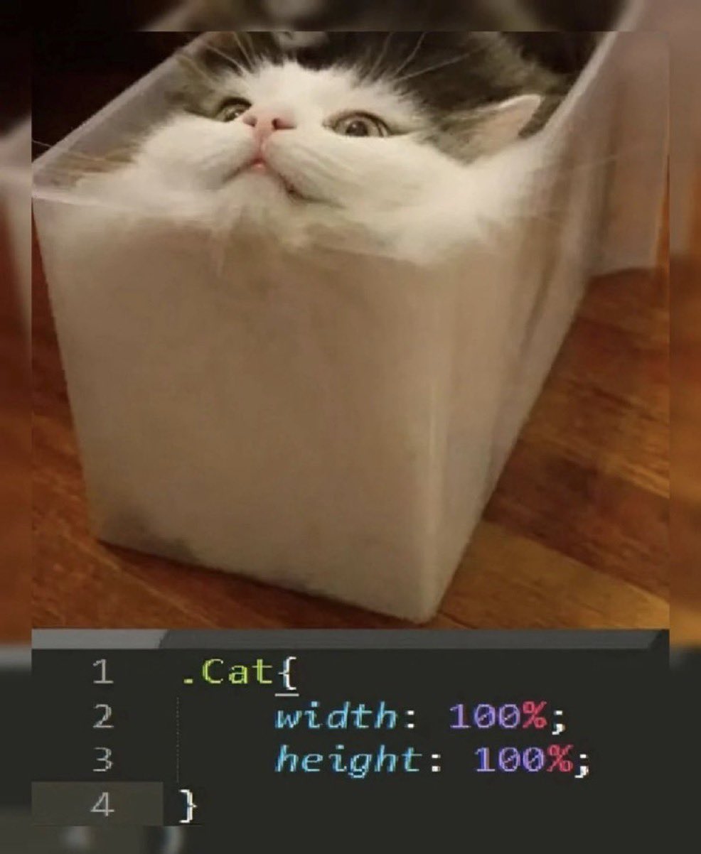
css-memes, responsive-design-memes, frontend-memes, web-development-memes, css-humor-memes | ProgrammerHumor.io
More Like This