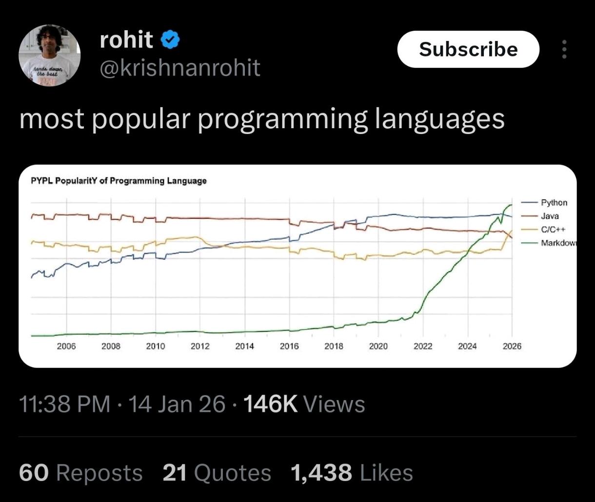
So Markdown just casually went from "barely registering on the chart" to "I'm about to end Python's whole career" in like 2 years? Someone's clearly been feeding their README files steroids. The graph shows Markdown's popularity shooting up at a near-vertical angle around 2022, threatening to overtake every actual programming language on the chart. Plot twist: Markdown isn't even a programming language. It's a markup language. That's like saying Microsoft Word is competing with C++ because people write documentation in it. But hey, according to PYPL (PopularitY of Programming Language), apparently writing **bold text** and # headers now qualifies you as a software engineer. The real question: Did someone accidentally include every GitHub README, Stack Overflow post, and Discord message in their dataset? Because that's the only way this makes sense. Next year's chart will probably show HTML as the "hottest new programming language" with SQL making a surprise comeback as "the future of coding."
 AI
AI
 AWS
AWS
 Agile
Agile
 Algorithms
 Android
 Apple
Apple
 Bash
Bash
 C++
C++
 Csharp