 AI
AI
 AWS
AWS
 Agile
Agile
 Algorithms
 Android
 Apple
Apple
 Azure
Azure
 Bash
Bash
 C++
C++
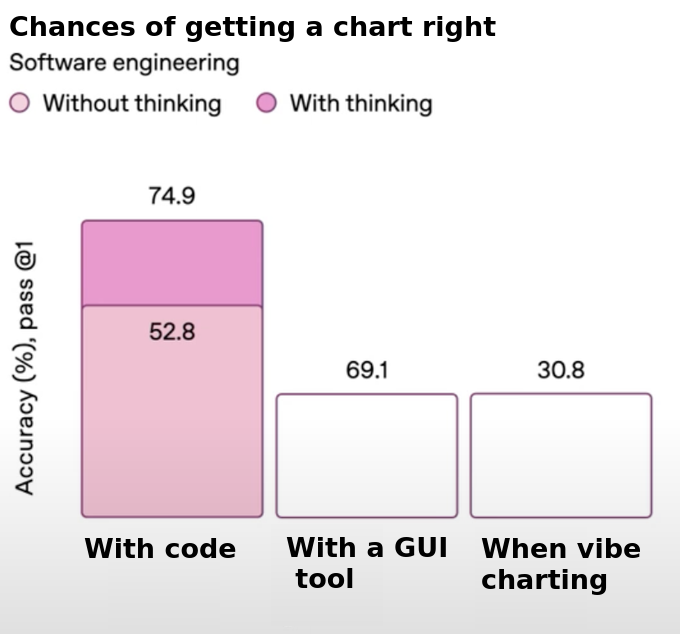
The chart itself is a masterclass in irony—a completely broken visualization about chart accuracy. Notice how the x-axis and y-axis don't even make sense together? That's the joke swallowing its own tail.
Apparently, coding your visualization gives you a 74.9% chance of success if you think (but only 52.8% if you don't bother with that pesky thinking process). Meanwhile, GUI tools clock in at 69.1%, and "vibe charting"—that scientific approach where you just go with whatever looks pretty—nets you a solid 30.8%.
The supreme irony? This chart about chart accuracy is itself a statistical abomination. Different categories on the x-axis, percentages that don't relate to each other, and a complete disregard for data visualization principles. It's like watching someone give a PowerPoint presentation about public speaking while tripping over their own shoelaces.