 AI
AI
 AWS
AWS
 Agile
Agile
 Algorithms
 Android
 Apple
Apple
 Azure
Azure
 Backend
 Bash
Bash
 C++
C++
 Cloud
Cloud
When you set both width and height to 100% and your element decides to become a PERFECT CUBE OF CHAOS. This cat has literally achieved what every frontend dev fears—the dreaded aspect ratio nightmare where your carefully crafted design just... expands in ALL directions simultaneously. No max-width, no aspect-ratio property, no media queries to save you—just pure, unfiltered geometric horror. The cat's face says it all: "I have become the container, destroyer of layouts." This is what happens when you forget that 100% means 100% of the PARENT, and apparently this cat's parent was a Rubik's Cube. Someone call a CSS exorcist.
Responsive Design, But It's A Cat
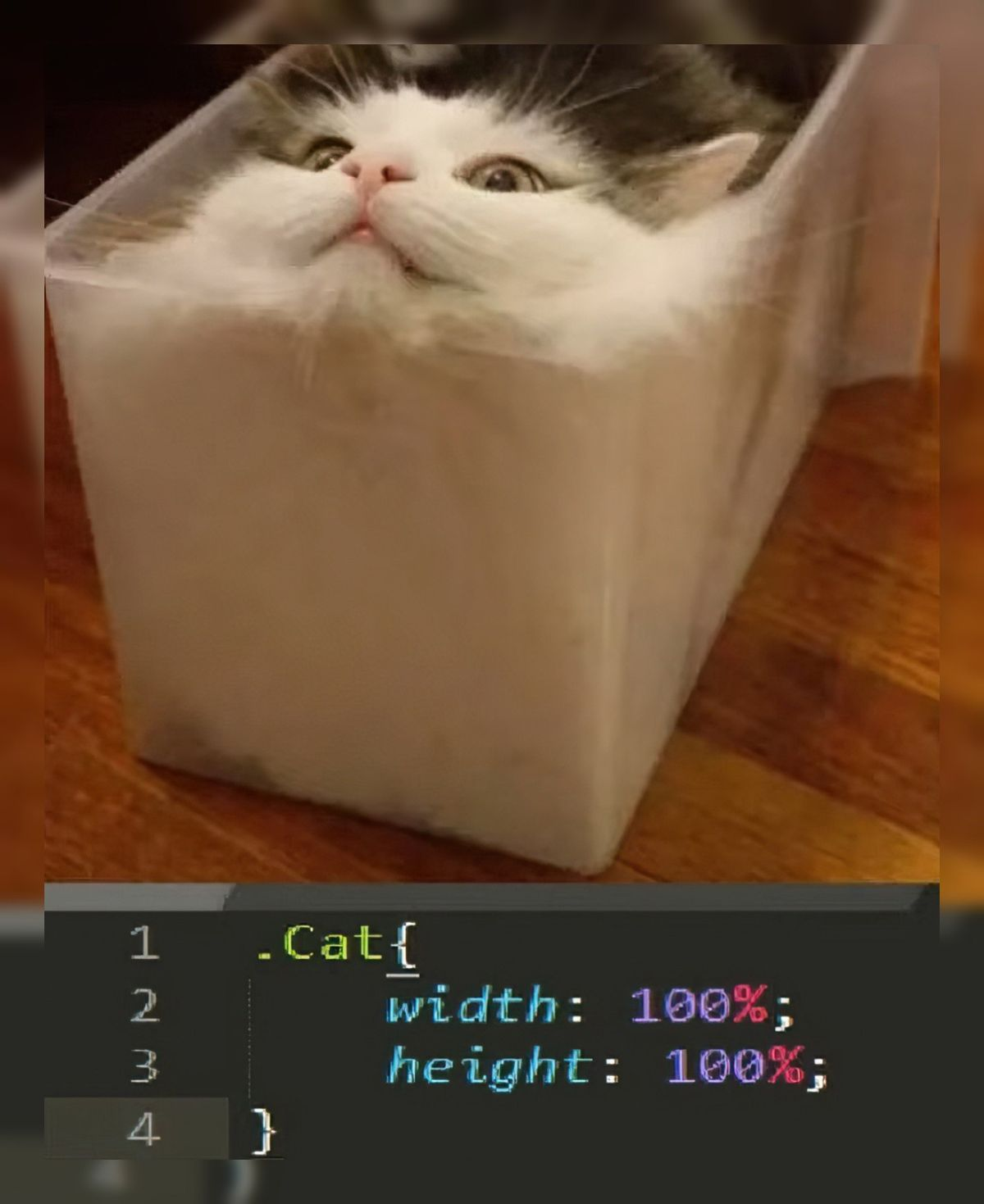
responsive-design-memes, css-memes, frontend-memes, web-development-memes, aspect-ratio-memes | ProgrammerHumor.io
More Like This