

Typography Memes

Posts tagged with Typography
The Alphabet Was A Mistake

The Alphabet Was A Mistake
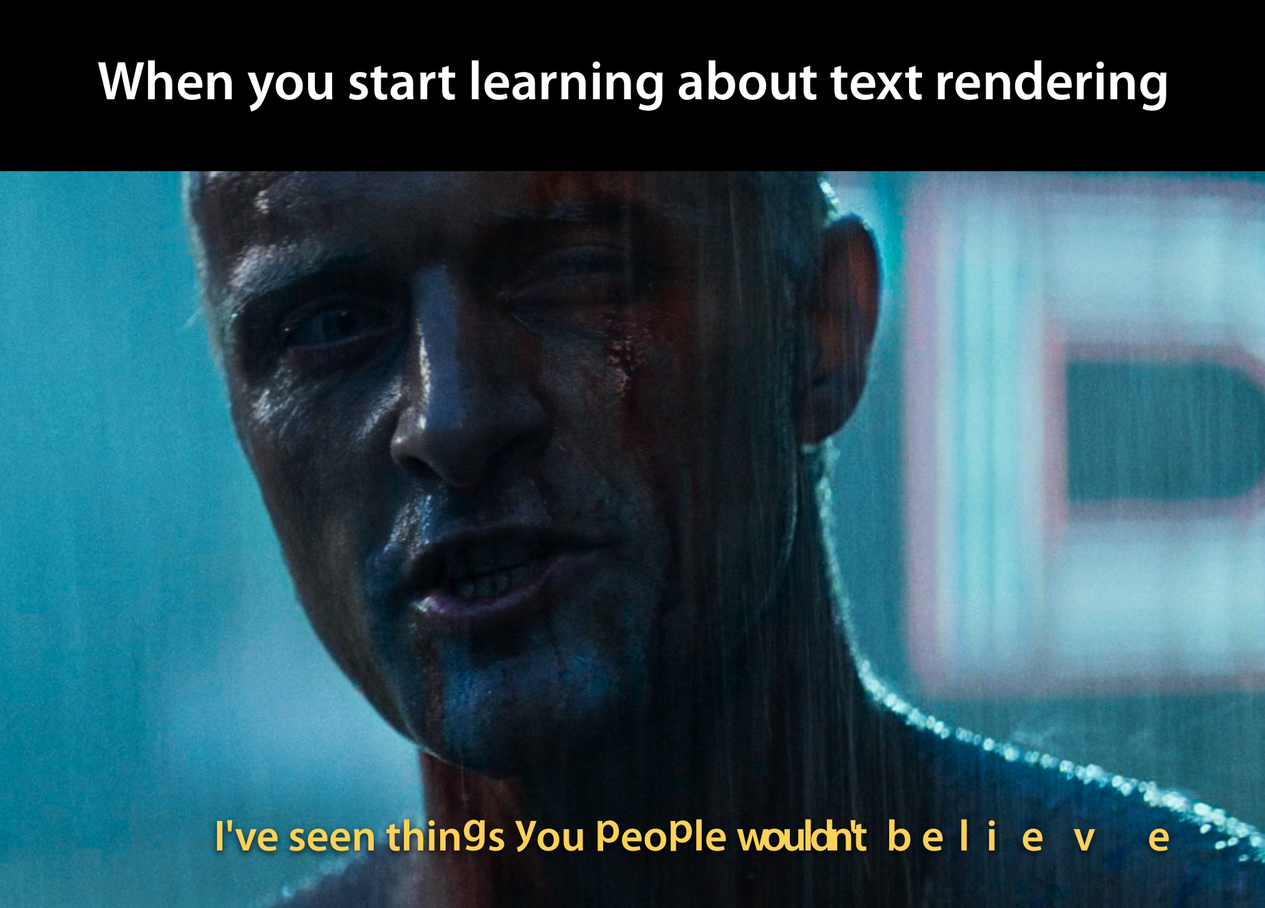
You think you know how text works until you dive into text rendering and suddenly discover that letters aren't just letters—they're existential nightmares. Kerning, ligatures, right-to-left languages, combining diacritics, zero-width joiners... the list goes on. That innocent "wouldn't believe" in the subtitle? Watch it disintegrate into individual glyphs with random spacing like it's having an identity crisis. Welcome to the rabbit hole where you realize every font is held together by dark magic and the collective prayers of typography engineers. Unicode was supposed to save us, but instead it gave us 149,186 characters and counting. Should've stuck with ASCII and called it a day.

What If I Told You This Part Two

What If I Told You This Part Two
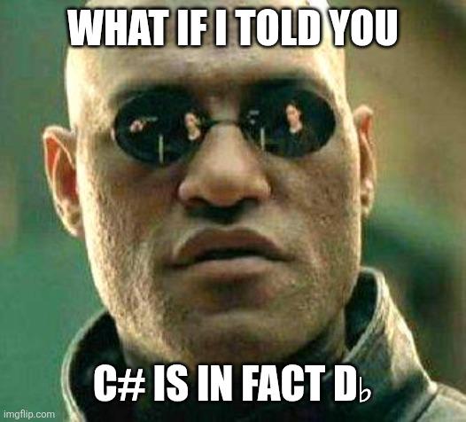
C# developers have been living a lie. The language is literally called "C Sharp" but the sharp symbol (♯) isn't even on most keyboards, so everyone just types C# with the pound/hash sign. But here's the kicker: that's technically the musical flat symbol (♭) rotated 90 degrees if you squint hard enough. Or is it? The symbol # is neither a sharp nor a flat—it's just a number sign doing its best impression. So yeah, we've all been writing "C-pound" or "C-hash" this whole time and pretending it's sophisticated. The Matrix has you, and it's written in a language whose name you can't even type correctly.

Death Of The Em Dash

Death Of The Em Dash
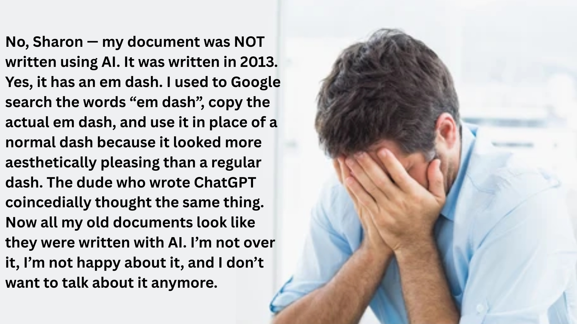
Imagine being so dedicated to typography that you literally Googled "em dash", copy-pasted that beautiful long dash character into your documents for YEARS, just to make your writing look fancy — only to have AI come along and casually use the same quirk. Now everyone thinks your 2013 masterpiece was ChatGPT-generated. The betrayal! The AUDACITY! Turns out the ChatGPT developers were also typography nerds who appreciated the aesthetic superiority of the em dash (—) over the peasant hyphen (-). So now this poor soul's carefully crafted, lovingly formatted documents from the pre-AI era are getting flagged as AI-written because they share the same fancy punctuation habits. Talk about being ahead of your time becoming a curse. Your attention to detail just became circumstantial evidence of robot authorship. Chef's kiss of irony right there.

First They Came For The Em Dashes

First They Came For The Em Dashes
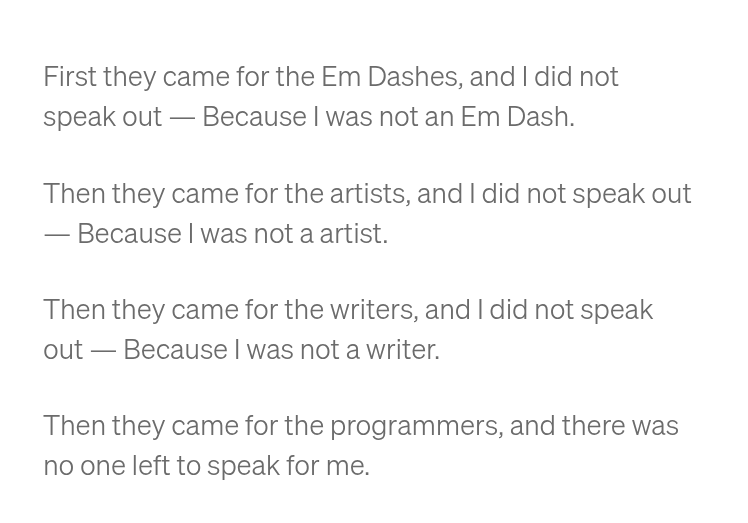
OMG, this is the MOST DRAMATIC poem of programmer persecution complex I've ever seen! 😭 It's a parody of the famous "First they came..." Holocaust poem but about PUNCTUATION and CODING, which is just SO EXTRA I can't even! The meme tragically chronicles the downfall of civilization through typography—first the em dashes (—) disappear, then the artists, then writers, until finally... THE PROGRAMMERS! And by then there's no one left to create a Stack Overflow thread about it! The absolute TRAGEDY of it all! *faints dramatically onto keyboard*

When Mugs Understand Web Development Better Than Junior Devs

When Mugs Understand Web Development Better Than Junior Devs
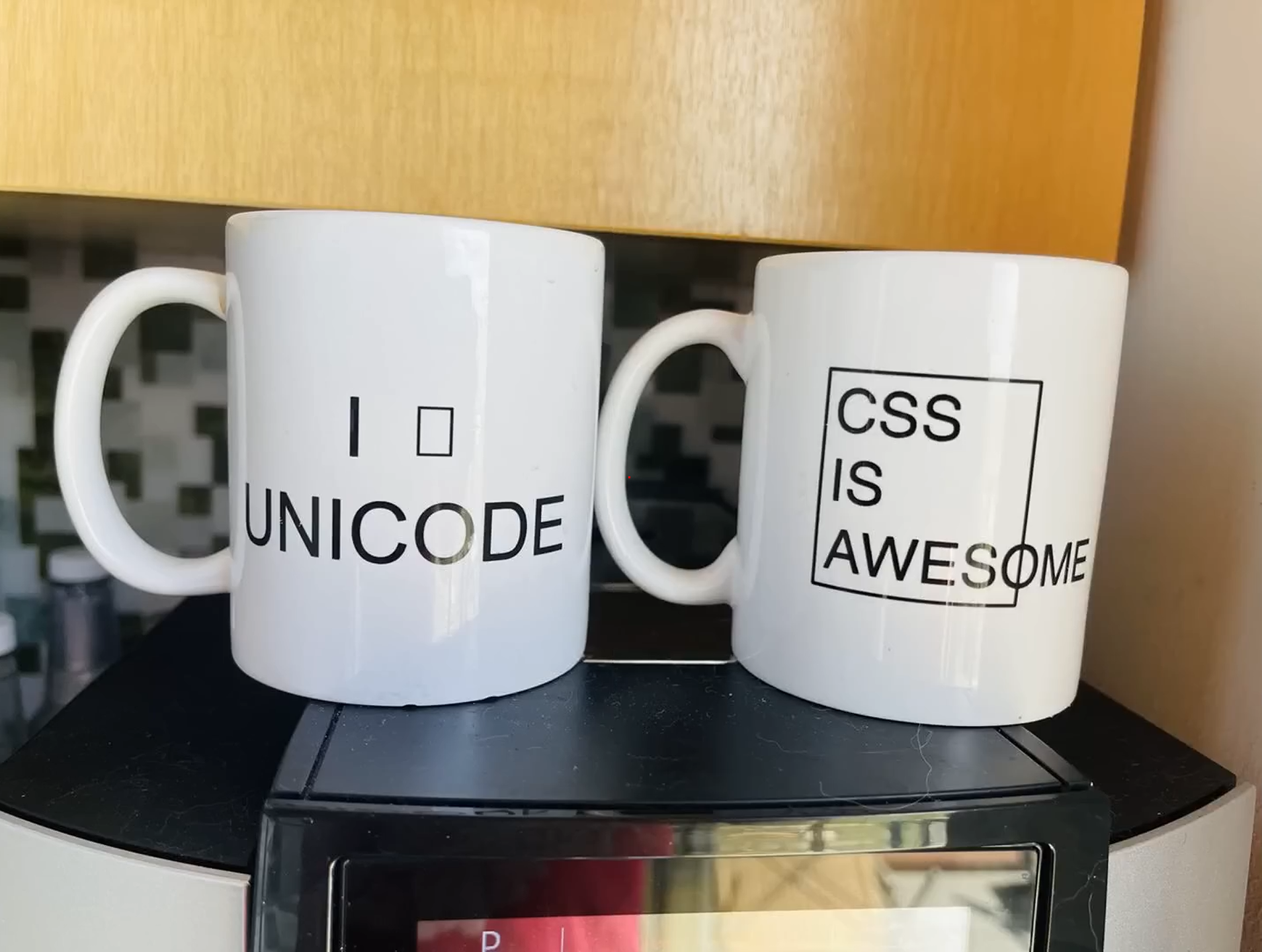
The genius of these mugs is *chef's kiss* perfection. Left mug: "I □ UNICODE" where the square is literally the Unicode character U+25A1 (White Square). Right mug: "CSS IS AWESOME" with text overflowing its container box—the quintessential CSS alignment nightmare that haunts frontend devs at 2AM. It's like watching two mortal enemies battle it out in ceramic form. Unicode smugly displays its character rendering prowess while CSS demonstrates why Stack Overflow exists.

I Heart Regex Bold Typography Design T-Shirt, Men, White, Large

I Heart Regex Bold Typography Design T-Shirt, Men, White, Large
Features a bold crimson heart glyph within clean sans-serif typography — a distinctive take on 'I Heart Regex' for code lovers · Ideal for developers, data scientists, and tech enthusiasts — perfect …

What The Font

What The Font
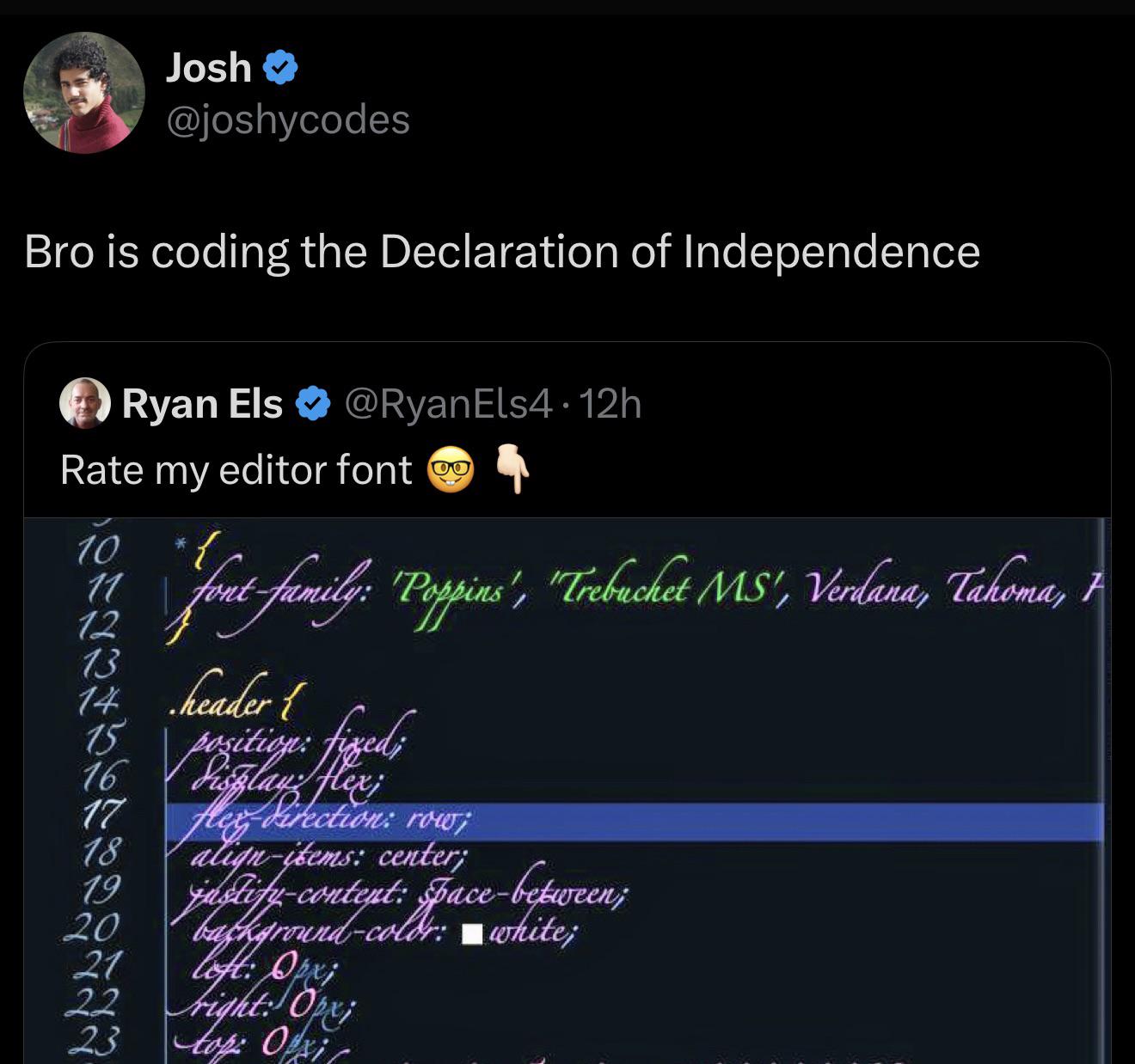
When you ask a frontend dev to show their CSS and they hit you with a calligraphy lesson instead. This dude's code looks like it belongs in a museum, not a text editor. The irony of using fancy cursive font to write CSS that's supposed to style a website is just *chef's kiss*. It's like writing your grocery list in Shakespearean English. Sure, it technically works, but good luck debugging that masterpiece at 4:59 PM on a Friday when production is down.

The 20px Eyebrow Incident

The 20px Eyebrow Incident
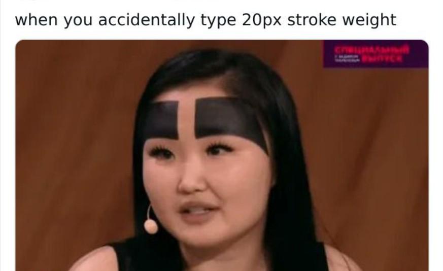
One pixel of CSS stroke-weight difference and suddenly your website looks like it's ready to judge your code quality. That moment when you hit save and your elegant design turns into a character from a medieval manuscript. The worst part? Your designer friend will notice it before you've even pushed to production.