

Performance metrics Memes

Posts tagged with Performance metrics

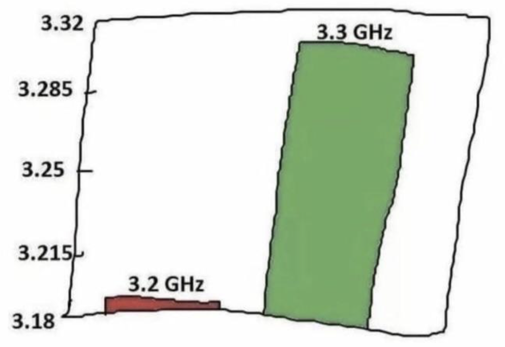
Literally Every Silicon Valley Product Comparison Chart

Literally Every Silicon Valley Product Comparison Chart
When your competitor's product is 3.2 GHz and yours is 3.3 GHz, you zoom into that Y-axis until it looks like you're 10x better. Classic marketing move where a 3% improvement gets visualized like you just invented cold fusion. The bar chart equivalent of "technically correct, the best kind of correct." Tech companies love this trick because investors can't be bothered to check the actual scale. Just slap some misleading axes on there and watch the venture capital roll in. The difference between 3.2 and 3.3 GHz in real-world performance? About as noticeable as a single grain of sand on a beach, but hey, gotta justify that Series B somehow.

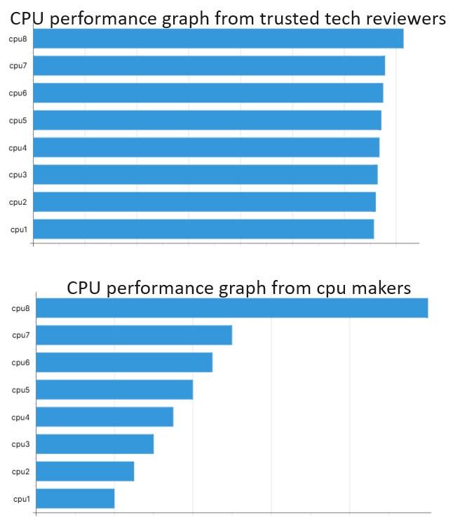
Understanding Graph Axis Is Important

Understanding Graph Axis Is Important
Ah, the classic tale of two graphs! The top one from "trusted tech reviewers" shows all CPUs performing nearly identically - because they've zoomed in so much on a tiny performance difference that everything looks the same. Meanwhile, the CPU makers' graph looks like CPU8 is performing interstellar travel while CPU1 is struggling to cross the street. Same data, wildly different impression. It's the graphical equivalent of saying "technically I didn't lie" while completely misleading everyone. Next time your manager asks why your code isn't 500% faster than last sprint, just adjust your y-axis accordingly!

The Accidental Telltale FPS Counter

The Accidental Telltale FPS Counter
The real bug in your code isn't a syntax error - it's that FPS counter permanently burned into your screenshots. Nothing says "I'm debugging while gaming" like accidentally sending your boss a screenshot with CPU: 47%, RAM: 4GB, and FPS: 112. That black cat is just judging your life choices from the corner, wondering why you're troubleshooting production issues during your Elden Ring session.