

Ui-ux Memes

Posts tagged with Ui-ux
Yes, It's That Game You're Thinking Of

Yes, It's That Game You're Thinking Of
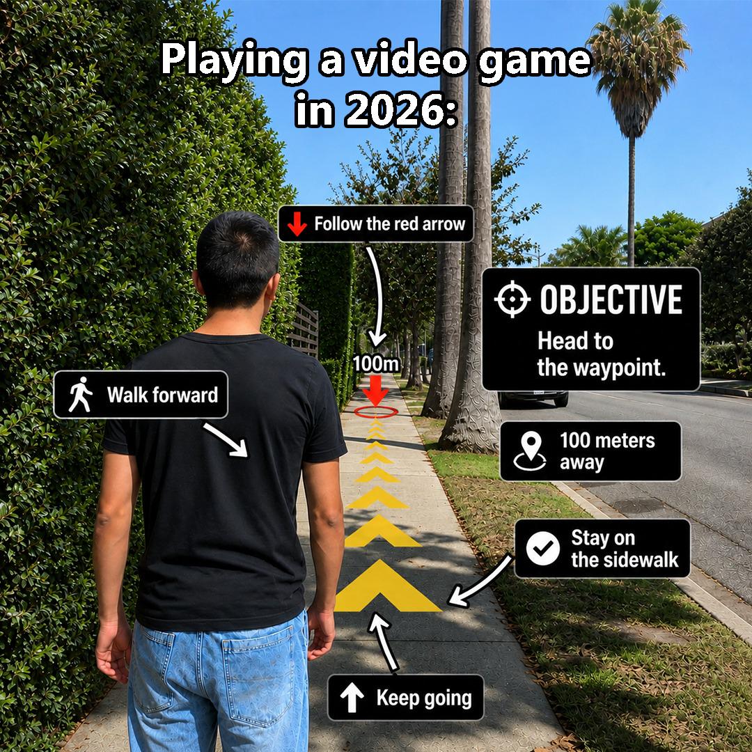
You know your tutorial design has achieved legendary status when people are still roasting it two years later. The excessive hand-holding, the patronizing waypoint markers, the "follow the giant glowing arrow for 100 meters" gameplay loop—it's like the game thinks you've never used a controller before. Modern AAA games have become so terrified of players getting lost for 0.3 seconds that they've turned into interactive GPS systems with occasional combat. Remember when games let you figure things out? When exploration meant actually exploring instead of following a golden breadcrumb trail? Now we get five different UI elements screaming "WALK FORWARD" like we're toddlers learning object permanence. The real kicker is that devs spend millions on gorgeous open worlds, then force you down a linear hallway decorated with arrows. It's like buying a sports car and having the manufacturer weld the steering wheel in place. At least by 2026, maybe we'll get an achievement for successfully following a waypoint without getting distracted. Progress!

Perfectly Cloning The Microsoft Teams Experience

Perfectly Cloning The Microsoft Teams Experience
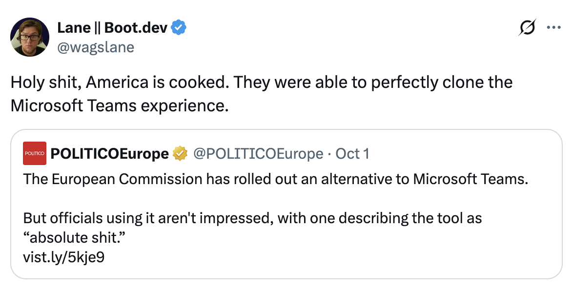
The European Commission tried to build an alternative to Microsoft Teams, and officials are calling it "absolute shit." The joke here? They've somehow achieved feature parity with the original product. It's like trying to make a knockoff that's worse than the original, but accidentally nailing the exact same level of mediocrity. Teams is already infamous for being a resource-hogging, notification-spamming, UI-confusing mess that somehow became the corporate standard. So when your clone gets the same reception, congratulations—you've perfectly replicated the user experience nobody asked for twice.

Pulling Out Google Lens With Tears In My Eyes

Pulling Out Google Lens With Tears In My Eyes
Picture it: You're setting up a game, feeling confident, and then you accidentally select Mandarin instead of English. Now you're trapped in a foreign language menu, desperately hunting for the "undo" button like it's the Holy Grail. But here's the kicker—you can't READ anything because it's all in characters you don't understand. So there you are, phone in hand, using Google Lens to translate your screen like some kind of digital archaeologist deciphering ancient hieroglyphics just to get back to square one. The sheer panic mixed with the absurdity of photographing your own screen to understand it? *Chef's kiss* of modern suffering. Pro tip: memorize where that settings icon is BEFORE you start clicking random buttons.

They Just Had To Use Black Text…

They Just Had To Use Black Text…
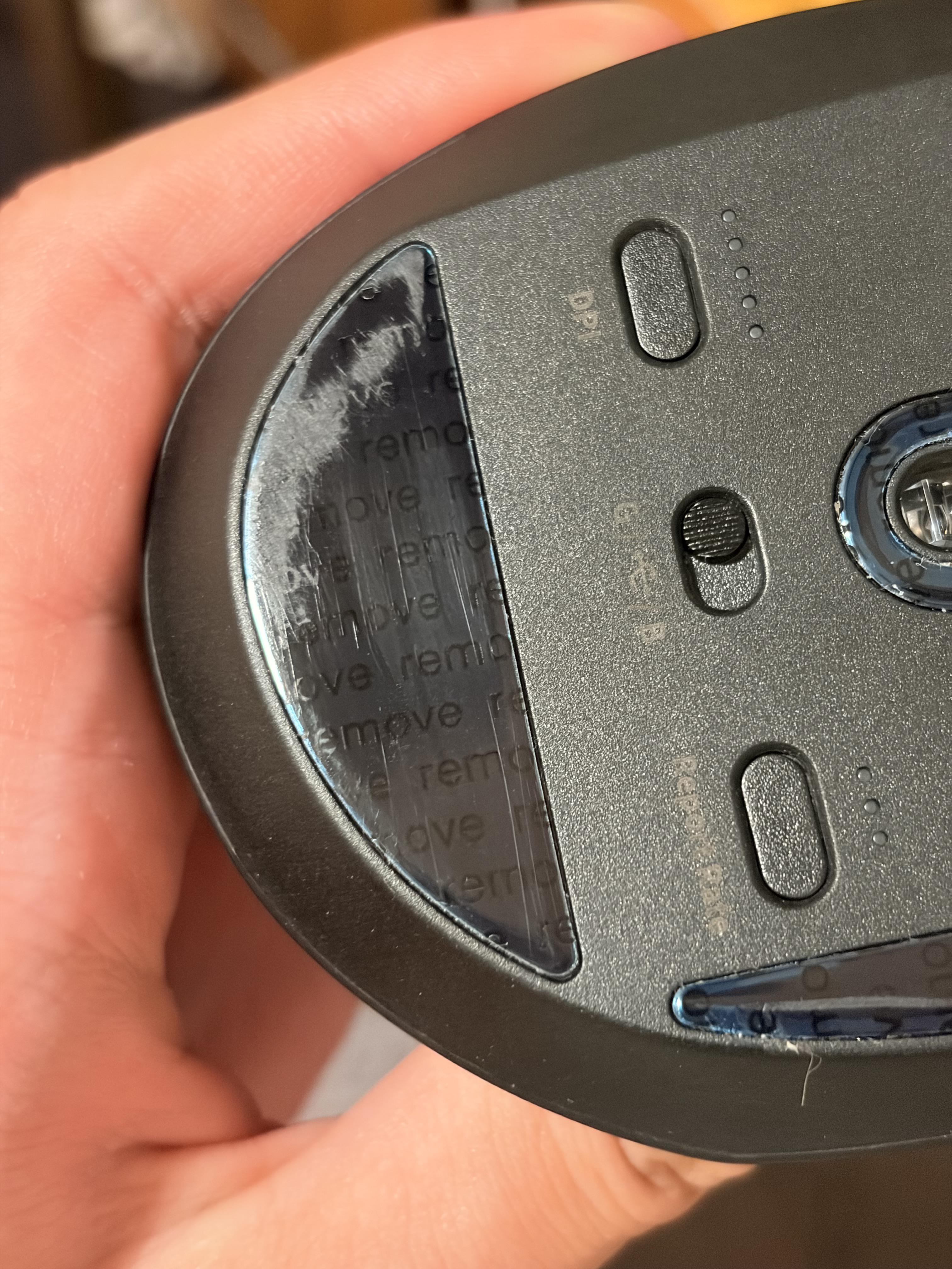
Someone at the hardware design department really said "let's print black text on a black mouse" and nobody stopped them. It's like using #000000 text on a #0a0a0a background and calling it accessible. The sticker wore off just enough to reveal the specs underneath, but good luck reading them without a flashlight and a magnifying glass. It's the physical equivalent of commenting your code in white text on a white background—technically there, but utterly useless. At least CSS gives you color: contrast() ... oh wait, that's still not widely supported. Never mind, we're all doomed.

Frontend Vs Backend

Frontend Vs Backend
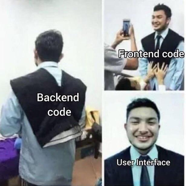
The eternal truth of web development: frontend code is out there posing for Instagram, getting all the attention and praise from users who think the whole app is just pretty buttons. Meanwhile, backend code is doing the actual heavy lifting—database queries, business logic, authentication—basically holding the entire operation together with duct tape and prayers. And the user interface? Blissfully unaware of the chaos happening behind the scenes, just vibing. Backend devs are basically the unsung heroes who make sure your "smooth" user experience doesn't crash and burn every time someone clicks a button. But sure, let's give all the credit to that gradient button with a 0.3s hover transition.

Rename It Ship It

Rename It Ship It
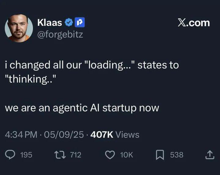
Behold the ultimate UX revolution! Just slap "thinking..." instead of "loading..." on your spinners and BOOM—you've basically invented sentient software. Who needs actual AI when you can just... rebrand the waiting experience? It's giving "we have AGI at home" energy. The best part? This is literally how half of Silicon Valley operates. Change the copy deck, update the pitch deck, raise another round. Pure genius. Chef's kiss to this level of innovation theater.

Annoying Asf

Annoying Asf
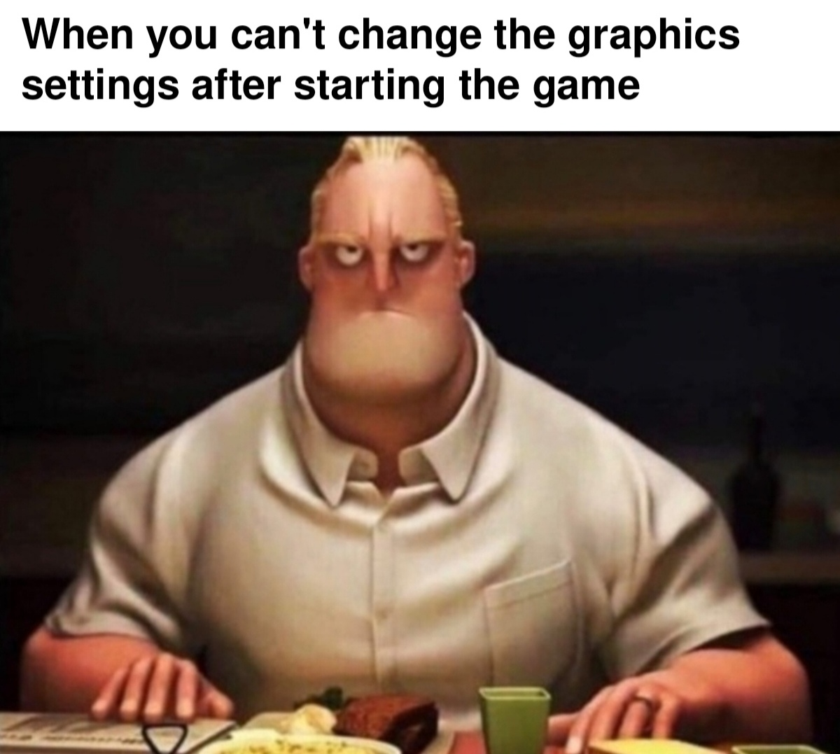
Ah yes, the classic game dev power move: locking graphics settings behind a "you must restart the game" wall. Nothing says "optimized code" quite like forcing players to close everything, relaunch, and pray their potato PC can handle ultra settings. Bonus points if the game takes 10 minutes to load and you picked the wrong resolution, so now you're stuck staring at a distorted mess until you restart... again. The face says it all—pure, unfiltered rage mixed with the acceptance that some game engines were clearly coded by people who think user experience is just a myth.

NordVPN

NordVPN
Encrypt your traffic on public Wi-Fi, stream from anywhere, and cover up to ten devices with one plan. 30-day money-back guarantee.

One Line Change And We Raised Series A

One Line Change And We Raised Series A
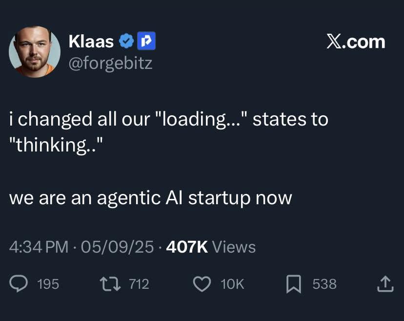
Changing "loading..." to "thinking..." is literally the entire business model of half the AI startups that raised millions in 2023-2025. No model improvements, no actual AI innovation—just a UI text swap and suddenly you're "leveraging advanced agentic reasoning systems." VCs saw that ellipsis animation paired with the word "thinking" and started writing checks faster than a poorly optimized O(n²) algorithm. The best part? It probably works because users genuinely perceive the app as smarter when it says "thinking" instead of "loading." Same API call to OpenAI's GPT, same 3-second delay, but now you're an "agentic AI platform" instead of just another wrapper. Marketing genius meets minimal viable product in its purest form.

Works On My Monitor

Works On My Monitor
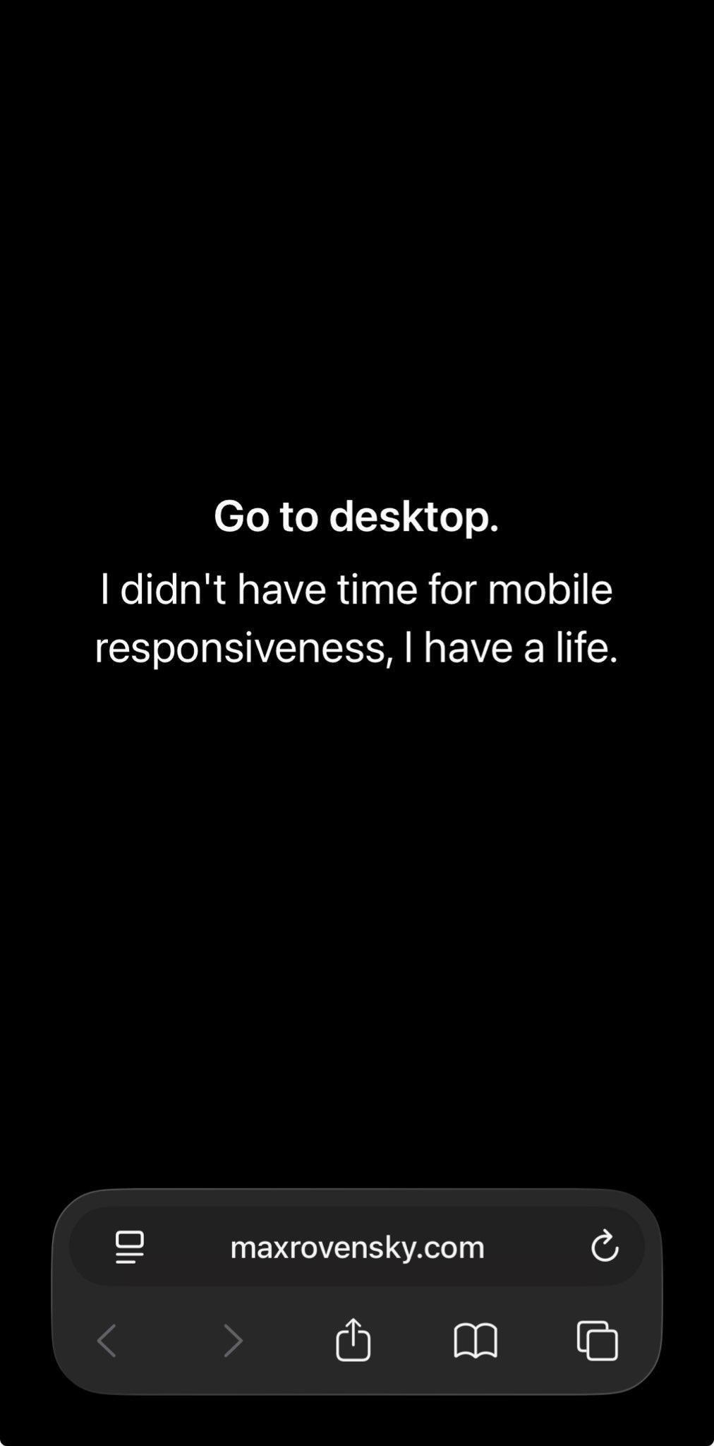
The classic developer excuse "works on my machine" just got a brutal downgrade. Someone built a website that literally tells mobile users to switch to desktop because they couldn't be bothered with responsive design. The audacity to frame laziness as "having a life" is chef's kiss. Imagine shipping a product in 2024 that requires users to physically change devices. That's not having a life—that's having unresolved CSS trauma. Meanwhile, your users are rotating their phones in confusion like it's 2008.

Biggest Youtube L

Biggest Youtube L
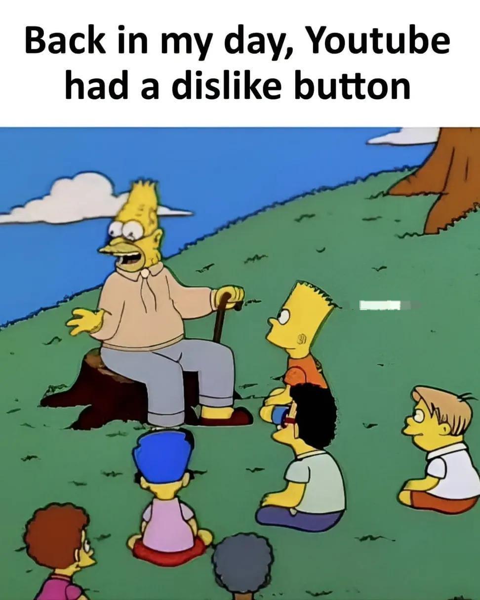
Remember when YouTube actually let you express negative feedback with a visible dislike count? Those were simpler times. Now we're stuck with a thumbs down button that does absolutely nothing except make you feel like you did something. It's like filing a complaint into the void—technically possible, but cosmically pointless. YouTube removed the public dislike counter in 2021, claiming it was to "protect creators," but really it just made it impossible to tell if a tutorial is garbage before wasting 20 minutes of your life. RIP to the days when you could instantly spot clickbait and scam videos. The dislike button now exists purely as a placebo—a UI element with zero transparency. Peak product management right there.

Always Has Been

Always Has Been
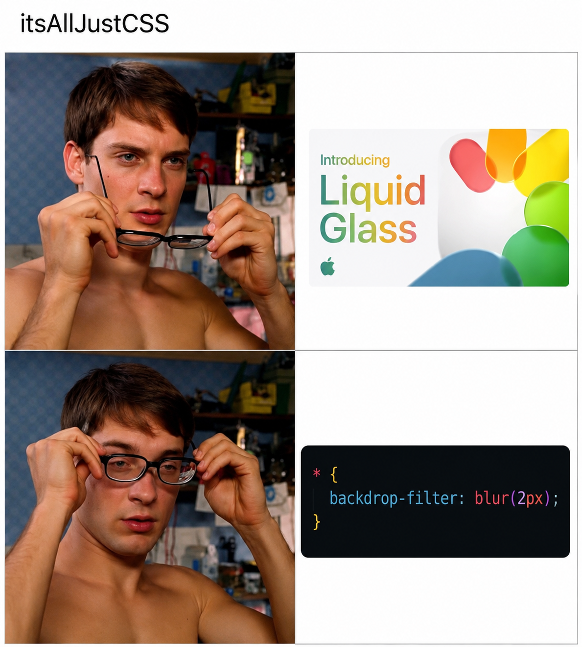
Apple spent millions on marketing and R&D for their "revolutionary" Liquid Glass effect, complete with fancy gradients and a whole WWDC presentation. Meanwhile, some CSS dev in their basement figured out the same thing with backdrop-filter: blur(2px) back in 2015. The best part? Apple probably has a team of engineers maintaining thousands of lines of proprietary code while web devs are out here achieving the same visual effect with literally one CSS property. This is why frontend developers have trust issues with design trends—we've been doing "innovative" UI effects with CSS for years, but slap an Apple logo on it and suddenly it's groundbreaking technology. Marketing budget: $10 million. Actual solution: 30 characters of CSS. Tale as old as time.

Its Absolutely Clean

Its Absolutely Clean
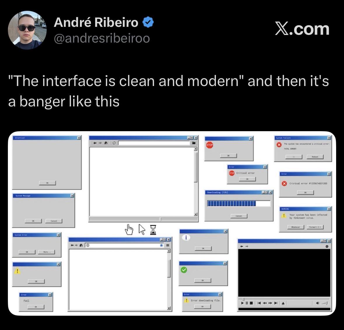
You know that feeling when someone shows you their "clean and modern" UI and you're like "wow, so minimalist!" but then you peek behind the curtain and it's just an ABSOLUTE WARZONE of Windows XP error dialogs? Critical errors, fatal errors, system infections, downloading failures—literally every possible catastrophe happening simultaneously while the frontend sits there looking all innocent and pristine. It's like showing up to a job interview in a perfectly pressed suit while your apartment is literally on fire. The gap between what users see and what's actually happening in production has never been more beautifully illustrated. That blank window in the center? Chef's kiss. Pure chaos masquerading as elegance.